I’ve been on the beat of income inequality since I started blogging here. My theory: We changed the way we make money from one of making it from producing (polishing rocks into tools) to one of making money from money. When you can make money from moving money, you don’t need to compete. Just buy back your stock, just collect rents, just get your tax cuts. The World Bank has a new report out on Inequality 2018. I want to direct you to a chart that appears on page 7. World Bank Inequality 2018 Report Chart Now, here is one half of the chart I posted December 7, 2007. Income vs Consumption 1963 to 2005 Notice the approximate time of the crossing over of the Bottom 99%’s income vs the Less chained Personal Outlay? Look at that top chart from the World
Topics:
Daniel Becker considers the following as important: income inequality, politics, Taxes/regulation, World Bank 2018 Report
This could be interesting, too:
Robert Skidelsky writes Lord Skidelsky to ask His Majesty’s Government what is their policy with regard to the Ukraine war following the new policy of the government of the United States of America.
Joel Eissenberg writes No Invading Allies Act
Ken Melvin writes A Developed Taste
Bill Haskell writes The North American Automobile Industry Waits for Trump and the Gov. to Act
I’ve been on the beat of income inequality since I started blogging here. My theory: We changed the way we make money from one of making it from producing (polishing rocks into tools) to one of making money from money. When you can make money from moving money, you don’t need to compete. Just buy back your stock, just collect rents, just get your tax cuts.
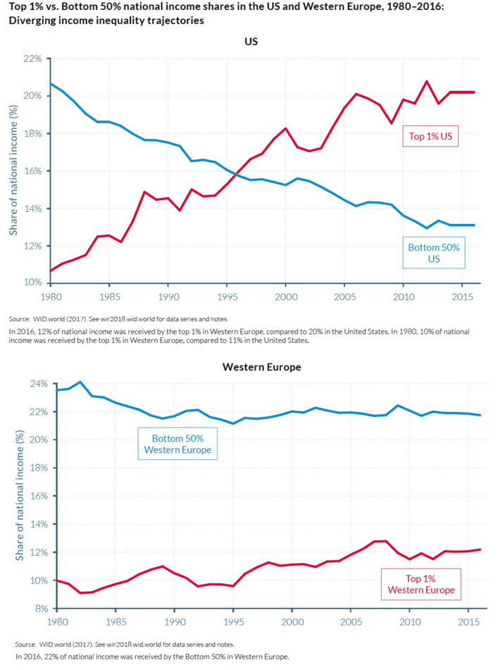
The World Bank has a new report out on Inequality 2018. I want to direct you to a chart that appears on page 7.
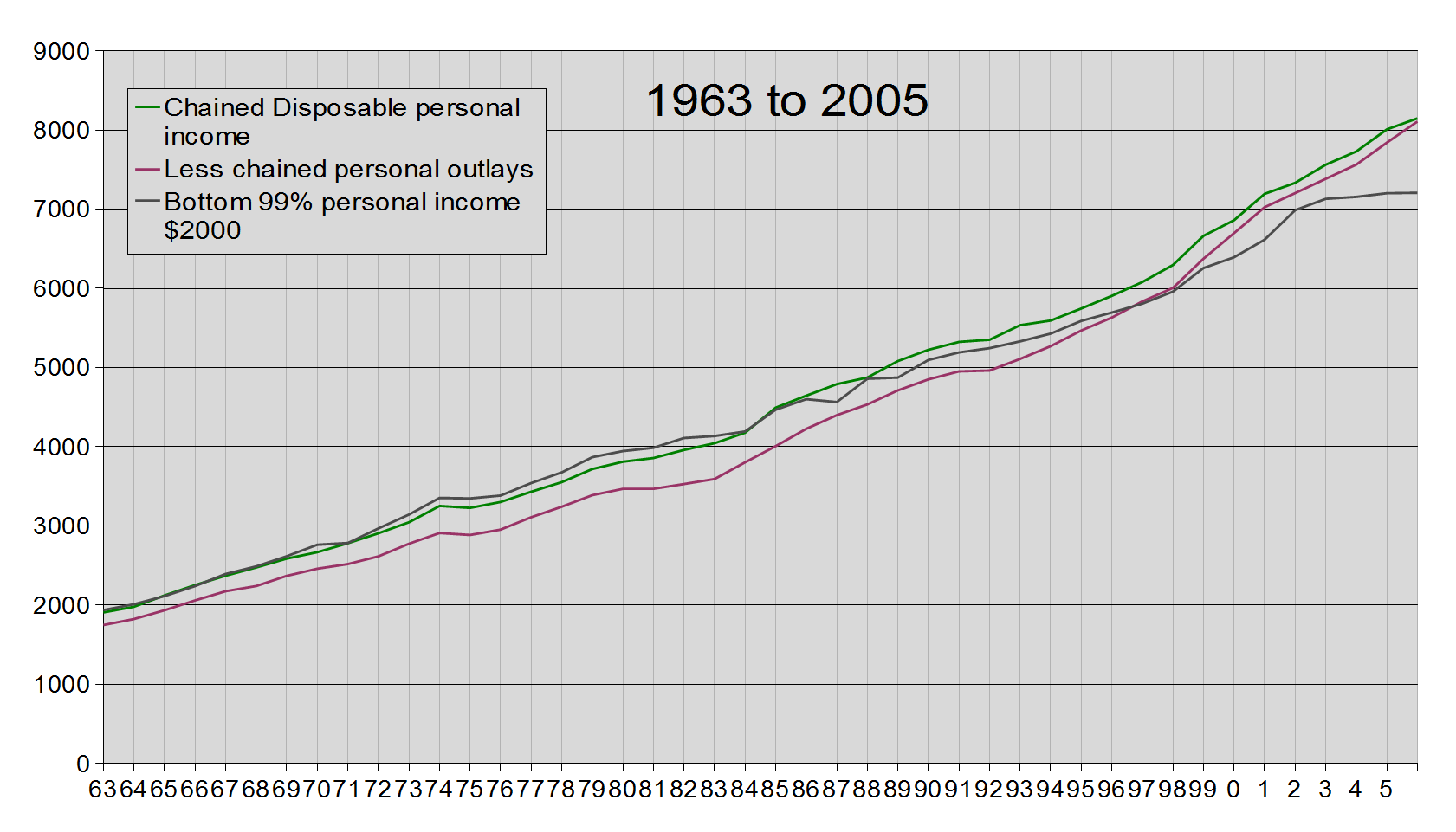
Now, here is one half of the chart I posted December 7, 2007.
Notice the approximate time of the crossing over of the Bottom 99%’s income vs the Less chained Personal Outlay? Look at that top chart from the World Bank. Notice the date?
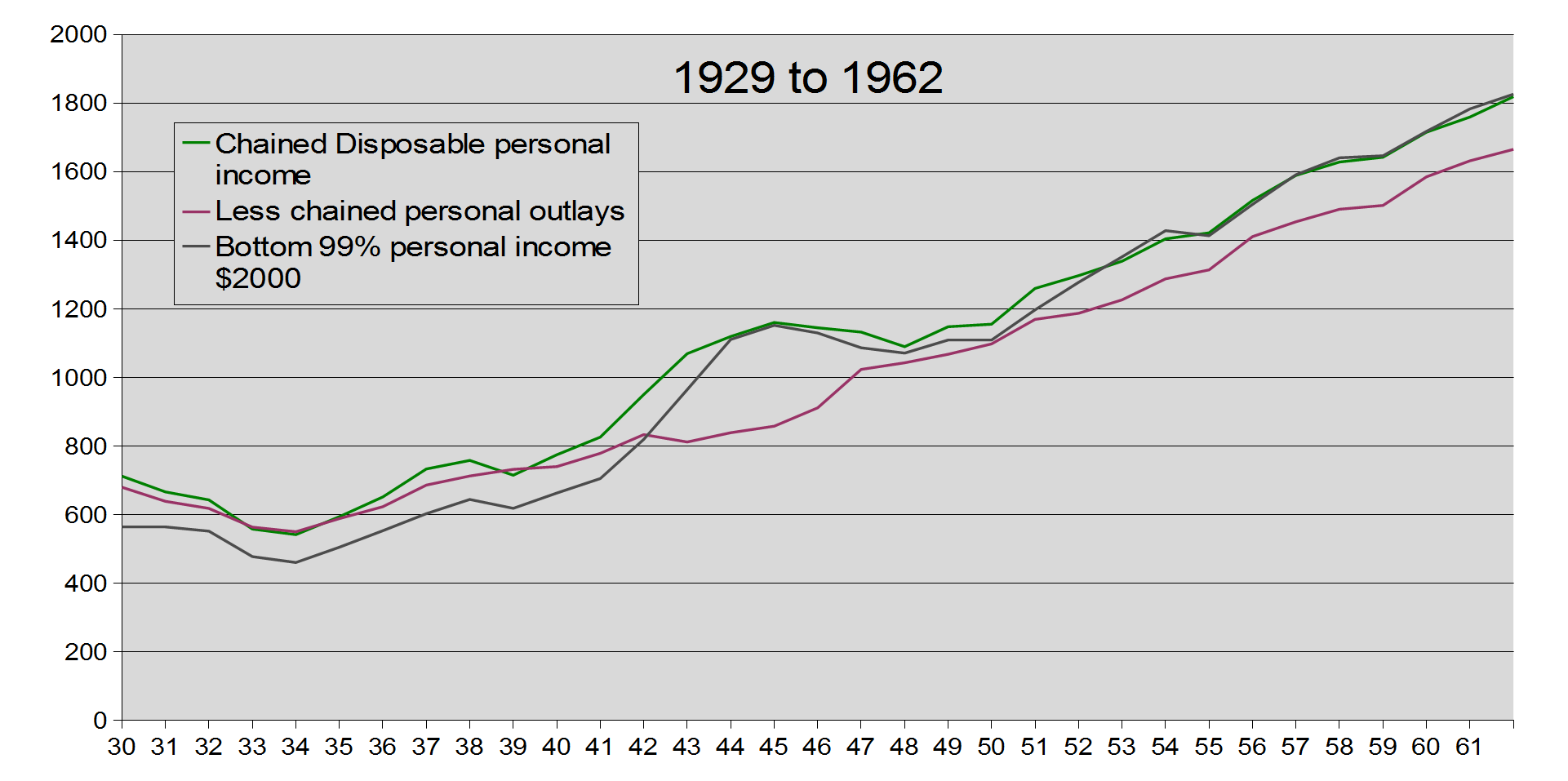
I will tell you, that the 2 dates coincide with one other number. 15%. That is the share of income I calculated at the time of crossing over of my chart for the 1%. All of this was done using Saez’s data. One more chart. The other half of my December 7, 2007 posting.
This is the first half of my data for that December posting. Notice what happens around 1942. At that crossing over, the top 1% share of income falls below 15%. Coincidence?
Prior to 1942, we were coming out of the Great Depression. The relationship of the 3 lines in my chart prior to 1942 look to be the same as after 1996.
One other thing to notice, around 1988. The share of income for the 99% fell below disposable income. Prior to this since 1942 it was riding even to sometimes above the disposable income. You know what happened in 1988? Two years past the 1986 tax law with the reduction of the top tax rates, reduced to 3 brackets and changes made to be able to pay more with stock shares. Prior to that, it became legal in 1982 for companies to buy back stock.
We changed how we make money and no one is pointing this out as to why the nation is in such a mess. It won’t matter if we bring back manufacturing. It won’t matter if we raise the minimum wage. Neither of these things will make the full change we want such that we revert back to post 1942/pre 1988. We have to change the way we make money.
One last thing I wish those running for president would point out: Taxes are not bad. They are not the problem. How we are spending the money is the problem. You know, spend it so we are actually building nations/public capital instead of letting the current capital be sucked dry!


