Steve Hutkins at Save The Post Office, The 2020 Mail Delays: Stats & Charts Preface The inventor of MRPII, Oliver Wight, coined a term for management deliberately obstructing the implementation of MRPII calling them “Cement Heads.” In Louis DeJoy’s case, rather than work with today’s postal system; DeJoy is deliberately sabotaging it with his changes. The end result will lead to its demise and subsequent takeover by private enterprise. Having been on the manufacturing side for decades, I found understanding a present process is necessary in order to implement changes to improve operations. DeJoy has no intention of understanding anything and he uses change to promote the destruction of the USPS. He is trump’s paid assassin. The
Topics:
run75441 considers the following as important: politics, Save The Post Office, Steve Hutkins, US EConomics, USPS
This could be interesting, too:
Robert Skidelsky writes Lord Skidelsky to ask His Majesty’s Government what is their policy with regard to the Ukraine war following the new policy of the government of the United States of America.
NewDealdemocrat writes JOLTS revisions from Yesterday’s Report
Joel Eissenberg writes No Invading Allies Act
Ken Melvin writes A Developed Taste
Steve Hutkins at Save The Post Office, The 2020 Mail Delays: Stats & Charts
Preface
The inventor of MRPII, Oliver Wight, coined a term for management deliberately obstructing the implementation of MRPII calling them “Cement Heads.” In Louis DeJoy’s case, rather than work with today’s postal system; DeJoy is deliberately sabotaging it with his changes. The end result will lead to its demise and subsequent takeover by private enterprise.
Having been on the manufacturing side for decades, I found understanding a present process is necessary in order to implement changes to improve operations. DeJoy has no intention of understanding anything and he uses change to promote the destruction of the USPS. He is trump’s paid assassin.
The following charts, graphs, and commentary by Steve Hutkins defines problems in USPS functionality as measured by data. The data points in a direction needing to be further analyzed to determine whether the direction chosen by DeJoy is leading to the destruction of the USPS. I believe it does.

Annual Compliance Review – Steve Hutkins
The Postal Regulatory Commission’s annual compliance review ordinarily focuses on postal rates, but this year, due to widespread reports of mail delays over the past several months, the Commission has been scrutinizing on-time service performance. Over the past few weeks, the Commission and its newly appointed Chairman have filed a number of information requests seeking data from the Postal Service about the scope and causes of delays.
According to the service performance data provided by the Postal Service, the delays began at a modest level in March 2020 when the pandemic started, deepened noticeably in July when the Postal Service implemented cost-cutting operational changes, improved modestly in the fall, and then got much worse in December with the holiday mail crush.
As for the causes of the delays, the Postal Service has blamed COVID — the surge in packages, employee availability problems, more dependence on surface transportation because of a lack of available space on aircraft, and so on. It has also cited bad weather, the need to prioritize election mail and other factors. The Postmaster General has acknowledged that operational changes made in July caused delays, but the Postal Service says the system adjusted to these changes in a matter of weeks and they were not a factor in the delays that followed.
The various causes are difficult to isolate and quantify, particularly because they interact and compound each other. So the reports submitted to the Commission do not provide a simple explanation of what’s behind the poor service, but they can shed some light on the question and perhaps suggest paths toward a solution.
Service performance
In response to Chairman’s Information Request No. 6, the Postal Service provided two data sets on service performance. The first spreadsheet shows service performance for First-Class Mail, Marketing Mail, and Periodicals on a weekly basis for the period FY 2019, FY 2020, and the first quarter of FY 2021 (Oct. 2018 – Dec. 2020), disaggregated for each USPS geographic Area and the nation.
Normally the Postal Service provides quarterly and annual service performance reports for the fiscal year covered by the compliance review. In this case, however, the Commission has sought weekly performance scores, and the requests go beyond the fiscal year (Oct. 2019 – Sept. 2020) to encompass the first quarter of FY 2021 (Oct.-Dec., 2020).
Here’s a chart based on that data, showing the national scores for First Class Mail from February through December 2020 compared with the same months in 2019. Most of the following charts, by the way, are interactive and you can scroll over them for more stats. If you’re having trouble seeing the

As the chart shows, performance declined noticeably in July and August when the Postal Service implemented operational changes concerning transportation and overtime as part of its Workhour Reduction Plan to cut 64 million hours. Performance scores improved in September, then started going down again in November, precipitously so in December.
Here’s a chart showing the service performance of three main types of Market Dominant mail.

The ups and downs seen throughout the year are roughly the same for each type of mail, with First Class and Marketing Mail performing at similar levels and Periodicals performing at much lower levels.
A second spreadsheet, responding to ChIR No. 6, Question No. 20, shows weekly service performance for First-Class Mail disaggregated into presort and single piece, letters/cards and flats, and mail with an overnight (ON) 1-day service standard, a 2-day standard and a 3-5 day standard.
This 3-5-day mail, it should be noted, consists almost entirely of mail sent and delivered within the continental U.S., which has a 3-day standard. The fourth and fifth day are for mail to and from Alaska, Hawaii, Puerto Rico, and the Virgin Islands.
Here’s a chart, based on that second spreadsheet, showing the national scores for the main types of First Class Mail.

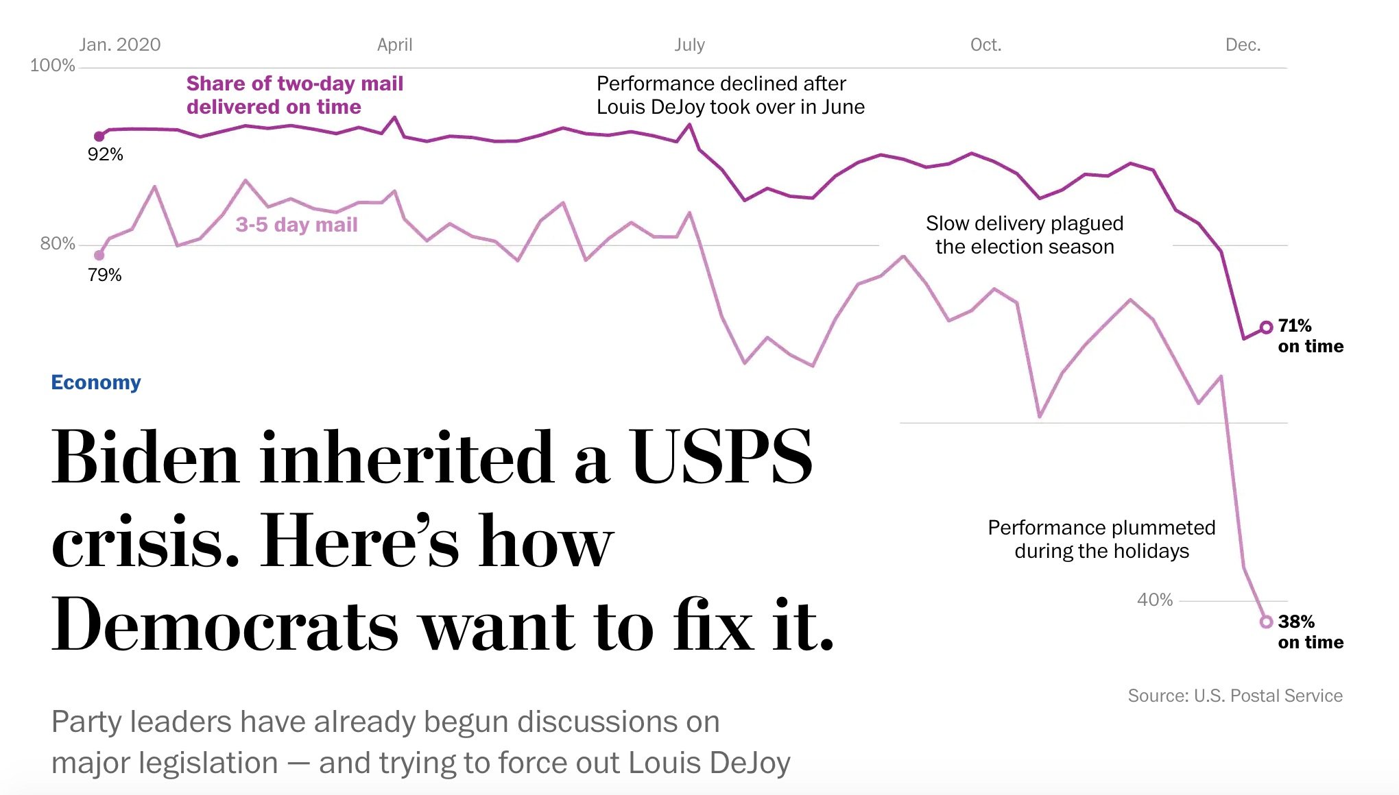
Each type of First Class went through the same ups and downs, with single-piece mail suffering more delays than presort and with 3-5 day single piece doing the worst, declining to 38 percent on time in December.
By the way, the Washington Post used the single-piece 2-day and 3-5-day numbers to make the graphic accompanying its article last week about the delays.

The Post obtained these scores from the reports made public in the Jones v USPS case involving mail delays and the election. Unfortunately, the USPS stopped reporting these scores at the end of 2020. Unless the Commission makes a new information request about performance scores in January and February 2021, we will need to wait until May to see the scores for the second quarter.
The two performance reports submitted by the Postal Service also include variance data that encompass the “tail of the mail” — the mail that was delivered after the service standard’s expectations of 2 or 3 days. Variance data is very important in understanding actual service performance because it shows not simply what percent of the mail was on time but how long the tail is, i.e., how much mail was delivered how many days after the expectation.
The variance reports regularly submitted to the Commission cover one, two and three days after the standard (plus 1, plus 2, and plus 3). In this case, however, the Commission asked the Postal Service to extend the data to plus-ten days or however many days it took until 99 percent of the mail was accounted for.
Table showing the variance data through three additional days

Now here’s a table showing the number of extra days it took to account for 99 percent of First Class single-piece mail with a 3-5 day service standard.

The chart above shows that in the early months of 2020, the 3-day mail was taking 4 or 5 additional days to get to 99 percent. In July, it started taking plus-6 or plus-7 days, and by the end of the year, it was taking 14 extra days.
In some cases, the delays were even longer. For example,
First Class Mail Flats took more than 15 days beyond the standard for 26 weeks in the Northeast Area, 13 weeks in the Great Lakes Area, and 10 weeks in the Eastern Area. Periodicals took more than 15 days beyond the service standard for 15 non-consecutive weeks in the Great Lakes Area and 7 weeks in the Northeast Area.
This suggests that some mail was just sitting waiting to be processed or transported, as was widely reported in news articles.
Late Mail Volumes
The Commission has not asked about the volumes of late mail, but one can estimate late volumes by combining service performance data with the volumes reported in the USPS monthly financial reports.
The following chart shows the estimated volume of late First Class mail, on a weekly basis, from July through December 2020, compared to the same volumes from 2019.

Here are two more charts showing volumes of late mail for Marketing Mail and Periodicals.


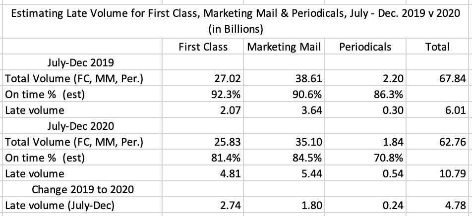
Here’s a summary of the total volumes for First Class, Marketing Mail and Periodicals for the 26-week period, July – December 2020, compared to the same period last year.

There were about 6 billion pieces of late mail during the 26-week period of July – December 2019, and about 10.8 billion late pieces during the same period in 2020 — an increase of about 4.8 billion pieces.
The Postal Service hasn’t shared service performance scores for January or February of this year, and the volume numbers haven’t been published yet, but if we extrapolate these estimates for July-December to include 6 more weeks, as of mid-February we’re probably looking at something on the order of 6 billion more pieces of late mail than there were in the same period last year.
COVID Impacts
The Washington Post has reported that the APWU says that during the week of February 6, “more than 16,000 employees were under quarantine after testing positive for the coronavirus or coming in contact with someone who had.” The Post included this chart:

In a spreadsheet responding to ChIR No. 6, Question No. 3, the Postal Service provided more details about the impacts of COVID on its employees. By the end of January, a total of 154 postal employees had died due to COVID and 47,000 had tested positive or were presumed positive. The spreadsheet provides these monthly totals for positive tests.

If you want to look deeper, the spreadsheet also disaggregates the cases by geographic Area and the nation and by operational function: Function 1 Operations—Mail Processing, Function 2 Operations—Delivery Services, Function 4 Operations—Customer Service, and Labor Distribution Code 79 Mailing Requirements and Business Mail Entry.
The Chairman’s Information Request had also asked for the number of employees reported to be absent related to COVID, including absences due to contraction, quarantine/isolation, and/or caregiving related to COVID-19. The Postal Service did not provide this data, possibly because employees do not always explain their absences specifically enough to determine connections to COVID.
Overall, if about 50,000 employees have tested positive, out of 660,000 employees, that’s about 7.6 percent of the workforce. On a national level, about 25 million out of 210 million adults have tested positive, about 11.9 percent.
Employee Availability
In response to ChIR No. 6, Question No. 2, the Postal Service shared an Excel document concerning employee availability. It contains several sheets:
a. Tab Figure-1b: The Postal Service had previously submitted two charts showing employee availability percentages for each month of FY2020 (Response to Commission Information Request No. 1, question 1.b). One chart showed availability for Function 1 (Mail Processing), the second for Functions 2 (Delivery) and 4 (Customer Service).EMPLOYEE AVAILABILITY FUNCTION 1EMPLOYEE AVAILABILITY FUNCTIONS 2 & 4
The charts are not all that helpful because they simply show availability going up and down through the year, which occurs for various reasons, such as national holidays (a good time for a vacation) and the Christmas holiday (when volumes surge). The Commission wanted to see the data behind the charts anyway, and they’re available in this tab.
b. Tab Figure-6b: In response to that same Commission Information Request, the Postal Service also shared a chart showing employee availability in FY2020, disaggregated by Area. The Commission asked to see the data for this chart as well . This chart is difficult to read in the USPS filing, so here’s a clearer version.

As this chart shows, the timing of the ups and downs was similar for each Area, but some Areas were more impacted with employee availability problems than others. For example, employee availability for mail processing regulars in the Northeast Area fell to only 59 percent in April.
c. Tab Month_Quarter: This data set contains employee availability percentages for each month and quarter of FY 2019, FY 2020, and the first quarter of FY 2021, for each Postal Service geographic Area and for the nation. Because this spreadsheet contains data for FY 2019 as well as FY 2020-21, we can create this chart showing a comparison of calendar years 2019 and 2020.

As this chart shows, employee availability during CY 2020 tracked along similar lines as in 2019, but about 1 or 2 percent lower, with the exception of April 2020, which was about 4 percent lower than in 2019.
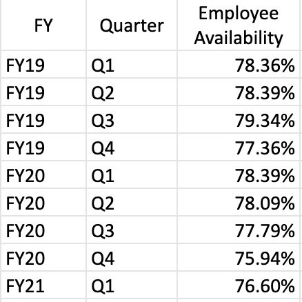
This spreadsheet also contains the following summary of employee availability on a quarterly basis.

Employee availability during the third and fourth quarters of 2020 (April-Sept.) was about 1.5 percent lower than the same quarters in 2019. For the first quarter of 2021 (Oct.-Nov., 2020), employee availability was 1.8 percent lower than the previous year. These may not seem like significant differences, but 1.5 or 2 percent of the total workforce of 660,000 represents 10,000 to 15,000 employees.
d. Tab Month_Quarter_Function: This data set contains shows the same data as shown in the Month_Quarter sheet, but also disaggregated by job function.
e. Tab Area_National: This sheet shows the availability data disaggregated by function and Area, and it also includes the work hours for each function.
f. Tab MidYear+2ndhalf: This table contains employee availability percentages disaggregated into mid-year, second-half, and annualized.
Work Hours and Overtime
Another spreadsheet (responding to ChIR No. 6, Question No. 4) addresses work hours and overtime. It contains the numbers for regular work hours, non-penalty overtime work hours, and penalty overtime work hours for each month of FY 2019, FY 2020, and the first quarter of FY 2021, disaggregated for each geographic Area and the nation as well as by career versus non-career employees and by operational function. Here’s a chart, based on this spreadsheet, showing total workhours for CY 2019 and CY 2020.

As this chart shows, the total number of work hours in each month was roughly the same in both 2019 and 2020. According to the September 2020 financial report (the last of the fiscal year), in FY 2019 work hours totaled 1,173 billion and in 2020, 1.174, an increase of just 0.1 percent. The composition of those work hours did change, however, as indicated by the following charts.
This chart shows the percentage of work hours that went for overtime (regular and penalty combined), from the beginning of FY 2019 to the first quarter of FY 2021.

The chart shows a spike in overtime during the holiday season each year and an overall increase as the months went by. That’s easier to see in the following chart comparing CY 2019 and CY 2020.

This chart shows that when the pandemic began to impact the workforce in March 2020, overtime began to account for an increasingly large percentage of total work hours, about 3 or 4 percent more than in 2019.
As for the size of the workforce overall and according to the December 2020 financial report, at the end of CY 2020 there were 676,782 employees compared to 658,142 in 2019, an increase of 2.8 percent. Virtually all of the additional workers were non-career. As of December 2020, there were 494,575 career employees as compared to 495,419 the previous December, a decrease of 0.4 percent. On the other hand, there were 182,207 non-career employees in December 2020, compared to 162,723 in the previous year. That’s an additional 20,000 employees, an increase of 12 percent.
The Postal Service says it has hired 50,000 temporary seasonal workers to keep up with demand. The monthly financial statements don’t show exactly that, but they do show a significant increase in non-career employees. According to the monthly financial statement, in July 2020 there were 144,547 non-career workers, compared to 182,207 in December — an increase of 37,660.
A bargaining agreement limits the number of non-career employees to 20 percent of the total workforce, but the Postal Service can go beyond that cap during the holiday season, and a recent Memorandum of Understanding with the labor unions lifted the cap due to the pandemic. Non-career workers represented 27 percent of the workforce in December 2020.
Adding new workers obviously helps deal with the employee availability problem, but it’s not a perfect solution. Newly hired workers are not as efficient as experienced employees. When a letter carrier is unavailable, for example, the replacement does not have the same knowledge and will be less familiar with the route and its patrons so deliveries will be slower and less efficient. When a mail processing worker is unavailable, the replacement will not have the same knowledge and experience of, say, operating a sorting machine, making some operations take longer.
Late and Extra Trips
Evidence made public in several lawsuits during the summer of 2020 indicated the Postal Service was trying to cut costs by minimizing the frequency of late and extra truck trips from processing facilities. Sometimes, mail was left behind at the plant. These transportation policies became a matter of great concern because of the potential of mail delays to impact voting by mail.
In ChIR No. 6, Question No. 7, the Commission revisits this issue by asking for data about late and extra trips for each month of FY 2019 and FY 2020, for each USPS geographic Area and the nation. The Postal Service provided this spreadsheet. Here’s a chart showing the national numbers for extra trips, October 2018 through September 2020.

As the chart shows, the number of extra trips jumped in December of each year and fell off in subsequent months. During the summer of 2020, when the Postal Service implemented the changes in transportation policies, the numbers fell in a clearly noticeable way. Overall, during the 21 months from October 2018 through June 2020, there were an average of 64,000 extra trips per month. In the summer of 2020, extra trips fell off — to 45,500 in July, 20,500 in August, and 24,500 in September.
You can see this drop, and what happened subsequently, in the following chart, which is based on exhibits submitted in NAACP v USPS and New York v Trump. It shows the weekly trip numbers for March to December 2020.

This chart shows that extra trips declined significantly in mid-July, and remained below normal until November, when they began to increase gradually. As the holidays approached, the extra trips jumped back up to 20,000 a week. For the final four weeks for which we have data, the total was 64,000, just about the average number of extra trips per month for the two-year period.
Package Volumes

One of the Postal Service’s main explanations for the mail delays is the surge in package volumes. Here’s a chart showing package volumes during calendar years 2019 and 2020.
As this chart shows, since April 2020, package volumes have been at the levels they saw during the holidays in 2019, and during the holidays 2020, they reached record levels.
Air and Surface Transportation
In Response to ChIR No. 2, Question No. 1, the Postal Service explained another cause for the mail delays:
“As commercial air has not returned to pre-COVID-19 service levels, the number of flights has declined significantly, and this constricts the amount of air space available for the transportation of mail. With air capacity constrained, the Postal Service is forced to divert mail to ground transportation.”
This problem has been further exacerbated by the fact the package volume increased across the industry and tractor-trailer operators are in high demand. The Postal Service is competing with other shippers for truck transport.
In response to ChIR No. 1, Question No. 19, the Postal Service provided a table showing the national level percentages of First-Class Mail Single-Piece Letters/Postcards transported using air transit and ground transit.

As this table suggests, the volume of mail transported by air did not vary much during the fiscal year. It is not quite clear how diverting a small amount of mail from air to surface would have contributed much to the mail delays. But the issue is more complicated. The Postal Service sometimes switches to the more costly air transportation to address a foreseeable service issue such as storms coming slowing ground transportation.
Air transportation is apparently going to become a much larger issue in the near future. According to an article in the Washington Post just a few days ago, the Postmaster General plans to ban air transport for all First Class mail.
Weather
In response to ChIR No. 10, Question No. 5, the Postal Service states that service performance was affected by network disruptions caused by
“weather events such as tropical storms, hurricanes and winter storms and natural disasters such as the wildfires in California.”
The Postal Service provided this list of events.
The Postal Service has also produced a trend chart showing the ups and downs of service performance for market dominant products during FY 2020 as different weather events took place.
SOURCE: USPS RESPONSES TO CHIR NO. 10 (2/11/2021). CLICK ON IMAGE FOR LARGER VERSION.
Political & Election Mail
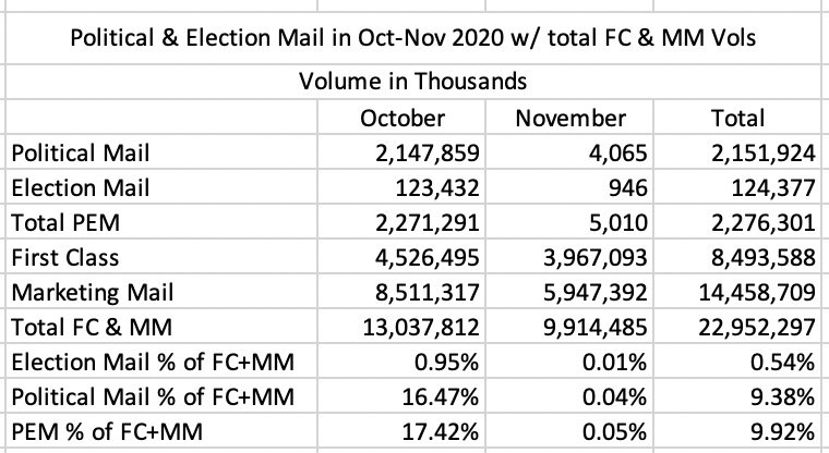
In response to ChIR No. 6, Question No. 10, the Postal Service provided a spreadsheet showing nationwide volumes of the Political Mail (campaign ads) and Election Mail (ballots and voter registration material) that the Postal Service delivered in each month of FY 2020 and the first two months of FY 2021 (Oct. 2019 – Nov. 2020). During this period, the Postal Service handled over 4 billion pieces of Political Mail and 541 million pieces of Election Mail.
As a result of the increased use of voting-by-mail due to the pandemic, the volumes for Election Mail are much larger than they were in 2016. It’s possible that Political Mail volumes also increased. But these volumes still represent a relatively small portion of total mail volumes.
Here’s a table showing the volumes for Political and Election Mail in October and November of 2020, compared to total volumes for First Class and Marketing Mail during these two months.

Prioritizing the delivery of ballots during October and November 2020, as required by several court cases, required a lot of extra effort on the part of postal workers. In some cases, ballots were even treated as Express Mail. But Election Mail volumes were extremely small in the context of total volumes, which suggests that the handling of Election Mail is not likely to have been a major cause of delays. That issue aside, one thing is for certain — postal workers delivered on the election, and they deserve our immense gratitude.
The Commission’s and Chairman’s Information Requests and the Postal Service’s responses, as well as everything else in the Annual Compliance Review docket, can be found on the PRC website here. Many of the statistical reports discussed above were shared in response to Chairman’s Information Request No. 6. which can be found here. The folder containing the data sets can be downloaded from the PRC website here. For easier access, we’ve put them on Google Drive here. In addition, all of the data sets used to make the charts in this article can be found on Google Drive here.

