ACA Signups blog and healthcare author, Charles Gaba does a rewrite of an earlier commentary at his site. If you missed it, Angry Bear blog featured “33 Months of COVID In One Image” also. Recently, this writeup’s stats was used by Prof. Paul Krugman in his recent NYT article, “Will 2024 Be a Vaccine Election?” In it, Prof. Krug explains the political partisanship impact on becoming vaccinated or not and the resulting impact as detailed by Charles Gaba. “Have the vaccines worked? And how. There are multiple ways to evaluate their lifesaving effect, but I’m especially taken with a simple approach promoted by the analyst Charles Gaba, who looks at the correlation across U.S. counties between vaccination rates and Covid death rates.” Prof.
Topics:
run75441 considers the following as important: ACA Signups.net, Charles Gaba, Education, Healthcare, politics
This could be interesting, too:
Robert Skidelsky writes Lord Skidelsky to ask His Majesty’s Government what is their policy with regard to the Ukraine war following the new policy of the government of the United States of America.
Joel Eissenberg writes No Invading Allies Act
Ken Melvin writes A Developed Taste
Bill Haskell writes The North American Automobile Industry Waits for Trump and the Gov. to Act
ACA Signups blog and healthcare author, Charles Gaba does a rewrite of an earlier commentary at his site. If you missed it, Angry Bear blog featured “33 Months of COVID In One Image” also. Recently, this writeup’s stats was used by Prof. Paul Krugman in his recent NYT article, “Will 2024 Be a Vaccine Election?” In it, Prof. Krug explains the political partisanship impact on becoming vaccinated or not and the resulting impact as detailed by Charles Gaba.
“Have the vaccines worked? And how. There are multiple ways to evaluate their lifesaving effect, but I’m especially taken with a simple approach promoted by the analyst Charles Gaba, who looks at the correlation across U.S. counties between vaccination rates and Covid death rates.”
Prof. Krugman findings using Charles’ data:
“why are some U.S. counties so much less vaccinated than others?
The answer, as Gaba shows, is partisanship. There’s a startlingly close relationship between the share of a county’s voters who supported Trump in 2020 and the percentage of that county’s residents who haven’t received their shots and the percentage who have died from covid.”
At the minimum, the data points in such a direction. Charles Gaba provides the basis for such a conclusion. Charles updates his data in his latest from December 15 commentary.
December Update: COVID Death Rates by Partisan Lean & Vaccination Rate (now including BIVALENT BOOSTER data), ACA Signups, Charles Gaba.
OK, I (Charles) really, really wasn’t planning on updating these graphs yet again; it takes forever and I more than made my point with weekly/monthly updates for a solid year and a half period.
But then . . . this morning (December 15), NY Times columnist & Nobel Prize-winning economics professor Paul Krugman prominently featured my most recent post COVID Death Rate by Partisan Lean & Vaccination Rate analysis from September in his latest column. So, I figured what the hell and decided to dust off my spreadsheet one more time.
I already knew going into this update that the divides in Red/Blue COVID death rates and likely as well as in Vaccination Rate COVID death rates have shrunk over the past few months, for several reasons: First, the overall COVID death rate has dropped dramatically since the summer (which is obviously a good thing); it’s been averaging between 300 – 400 per day since mid-October.
The other reason is not good news: Hardly anyone seems to be masking up anymore regardless of partisan lean, and the vaccination rate of the bivalent booster shot has been anemic for the most part…again, pretty much regardless of other factors. As of this writing, while 69% of the total U.S. population has completed their primary COVID-19 vaccination series (including 94% of those 65+), a mere 14.1% of the total population has also gotten their updated bivalent booster shot as well…and even among seniors it’s only at 35.7% nationally.
The bivalent booster has only been approved for all adults since the end of August, but that’s still pretty bad 3 1/2 months later: By comparison, a full 50% of the U.S. population had gotten their 2nd vaccination dose by August 16, 2021 (the exact same 3 1/2 months after the primary series was approved for all U.S. adults).
However, it’s one thing to know that the gap has shrunk; it’s something else to actually crunch the numbers and confirm that, so I’ve gone ahead and done so once again.
I’ve added two more graphs this time, however: Since we’re so far removed from May 2021, and since the primary vaccination series effectiveness wears off after some time, I’ve also added both the partisan lean and vaccination rate breakout since August 31, 2022…the day that the FDA authorized the bivalent booster for all U.S. adults.
As always, here’s my methodology:
- County-level 2020 Population data via U.S. Census Bureau’s 2020 Census
- County-level 2020 Trump vote data via each state’s Election Commission or Secretary of State websites
- County-level Death data via Johns Hopkins University Center for Systems Science & Engineering for 49 states; NY Times COVID-10 in the United States github UT only
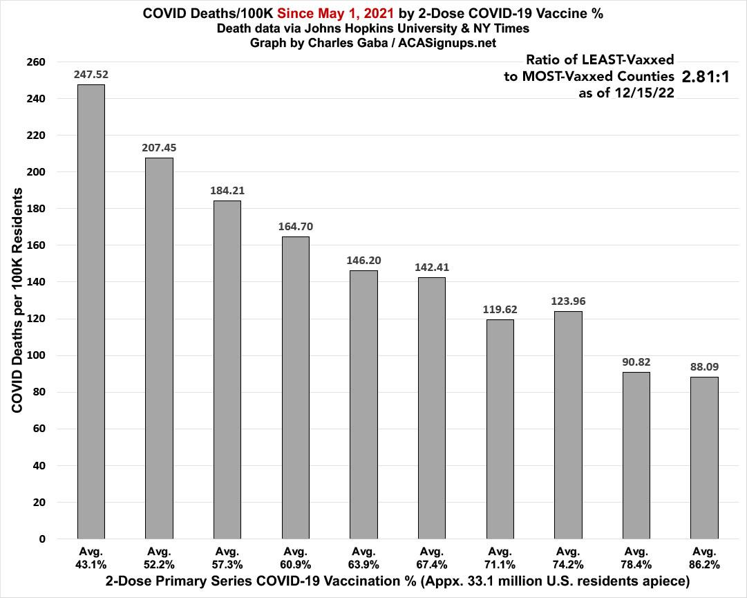
Remember: “Decile” means 1/10th or 10% of the total population (all 50 states + DC).
While it’s dropped significantly since September, there’s still a clear and dramatic correlation between how much of the population has been 2-dose vaccinated and its COVID death rate since May 1, 2021. The least-vaccinated decile still has a death rate ~2.8x higher than the most-vaccinated decile:
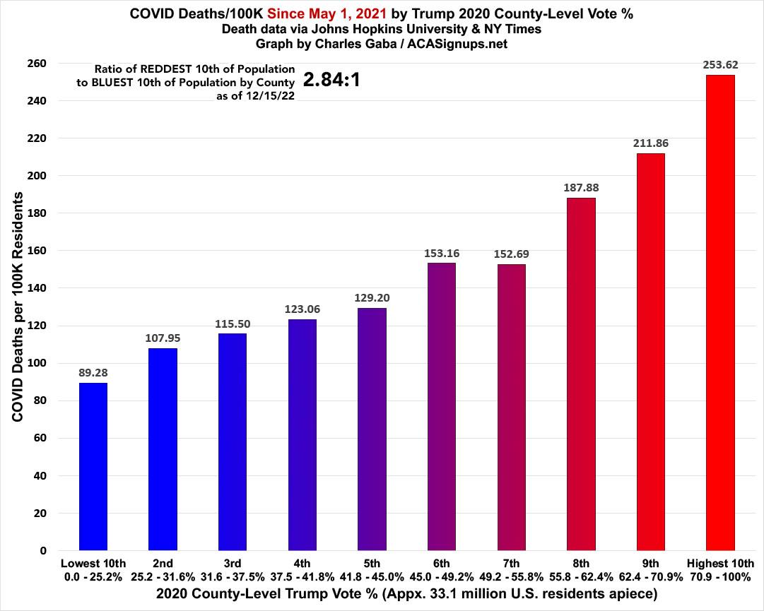
As always, what’s even more disturbing is how closely the death rate by partisan lean matches the death rate by vaccination rate; they’re almost mirror images of each other: Again, while the ratio has dropped since September, the death rate since May 1, 2021 in the reddest tenth of the country is, again, 2.8x higher than in the bluest tenth:
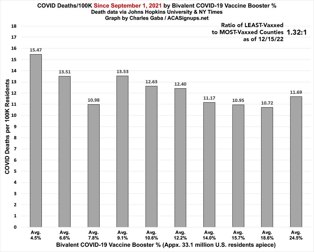
What about starting with the widespread availability of the bivalent booster on September 1st, 2022? As expected, the slope is far less dramatic on both fronts: The death rate since 9/01/22 in the tenth of the U.S. with the lowest levels of up-to-date vaccinations (a pathetic 4.5% of the population) is only 32% higher than in the tenth with the highest up-to-date vaccination rate (a better but still not great 24.5% of the total population):
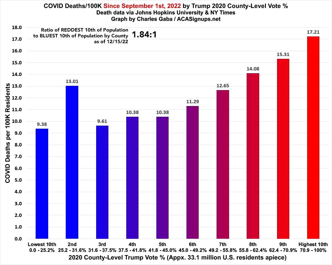
In terms of the partisan divide, this has indeed shrunk dramatically as I expected, with the death rate since September 1st down to just 84% higher in the reddest tenth of the country compared to the bluest tenth. In addition, there’s a significant bump in the 2nd-bluest decile (which includes major urban cities like Los Angeles, Queens and Detroit); if you were to compare the reddest fifth of the U.S. vs. the bluest fifth, it would be more like a 1.45:1 ratio:
In short: Get Vaxxed, Get Boosted, and wear a mask when indoors in crowded public locations.
33 Months of COVID In One Image: One More Look at The Red/Blue Death Rate Divide, Charles Gaba, Angry Bear, as posted at angry bear blog