After eight extensive posts about the Ontario electricity sector, I am expanding my geographic coverage to look at the electricity sectors in selected OECD countries. My focus will be on the historical and relative performance of each country’s sector with respect to decarbonization and prices. As in the case of Ontario, whole volumes could and have been written about each of these countries, and the electricity sector in general, including with respect to current and future reliability and technologies and preferred vs. feasible future decarbonization pathways and other matters. To keep this manageable, my analysis will be a high-level data-driven overview of past and current generation technology mix, sector emissions and prices only, all based on internationally-comparable data
Topics:
Edgardo Sepulveda considers the following as important: Canada, carbon pricing, Decarbonization, electricity, energy, environment, Europe, France, Germany, Japan, OECD, Ontario, Uncategorized
This could be interesting, too:
tom writes The Ukraine war and Europe’s deepening march of folly
Stavros Mavroudeas writes CfP of Marxist Macroeconomic Modelling workgroup – 18th WAPE Forum, Istanbul August 6-8, 2025
Lars Pålsson Syll writes The pretence-of-knowledge syndrome
Dean Baker writes Crypto and Donald Trump’s strategic baseball card reserve
After eight extensive posts about the Ontario electricity sector, I am expanding my geographic coverage to look at the electricity sectors in selected OECD countries. My focus will be on the historical and relative performance of each country’s sector with respect to decarbonization and prices. As in the case of Ontario, whole volumes could and have been written about each of these countries, and the electricity sector in general, including with respect to current and future reliability and technologies and preferred vs. feasible future decarbonization pathways and other matters. To keep this manageable, my analysis will be a high-level data-driven overview of past and current generation technology mix, sector emissions and prices only, all based on internationally-comparable data from reputable sources. Interested readers should check out my earlier posts and other writing as to why my focus on the question of affordable decarbonization. In this blog I start with Canada, France, Germany and Japan. Future editions will cover additional countries.
I look at data from 1990 to 2019/20 to ensure to ensure I capture trends in the sector, which, because of its capital intensity, tend to be relatively slow-moving. I look at electricity generation mix by country based on International Energy Agency (IEA) data. I present it in seven groups: nuclear, hydro, non-hydro renewables (this includes wind, solar), natural gas, petroleum products, coal products and biomass and waste. To control for aggregate generation changes over time within a country and for country size differences, I present these in percentage terms. But these technologies are just means to an end, which is sector decarbonization – I source sector emissions directly from the respective country National Inventory Reports (NIR) submitted annually to the Secretariat to the United Nations Framework Convention on Climate Change (UNFCCC). The UNFCCC format combines emissions from public electricity and heat, which is the same combined manner that the IEA presents emissions data. Ideally, we would only include public electricity emissions but relative few countries present this on a stand-alone basis. Public heat provision, generally in the form of district heat systems, is generally a few percentage points of public electricity. To control for differences over time and country differences I present sector emissions intensity (kg CO2/MWh). From an accounting perspective, so as to not “double count”, the UNFCCC does not allocate emissions from the generation of electricity from the combustion of biomass to electricity (the Energy Sector), but rather to the Land Use, Land-Use Change and Forestry (LULUCF) sector. For this analysis, given that I am focussing on the electricity sector only, and not the economy as a whole, I include emissions from the generation of electricity from the combustion of biomass to the electricity sector. Lastly, I source household electricity prices from the IEA, which include base prices, plus any consumer-oriented or taxes and specific levies, in USD(PPP)/MWh. After I provide an overview of the countries I present some initial comparative analysis, which I expect to fine tune as I cover more countries in future blogs, including with more sophisticated multivariate regression analysis.
Country Overviews: Canada, France, Germany & Japan
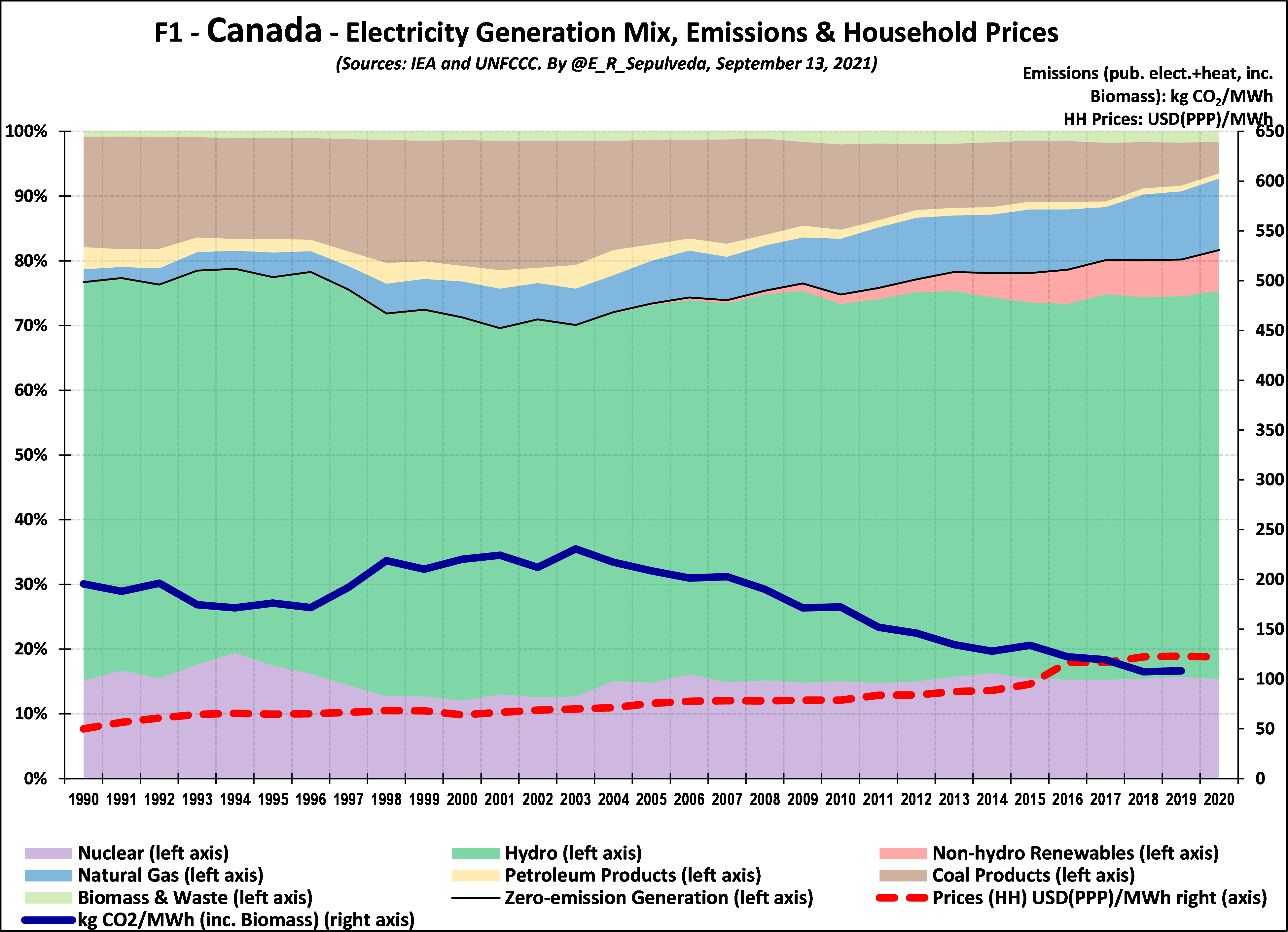
Starting close to home, Figure 1 shows that the technology mix in Canada has been relatively stable over the last 30 years, with a high percentage (ranging between 70% to 80%) of generation coming from zero-emissions technologies (nuclear, hydro and non-hydro renewables). This has resulted in relatively low emissions intensity over the study period, with three phases: a decrease from the displacement of coal by nuclear and hydro from 1990 to 1996; an increase as some nuclear generation went off line from 1996 to 2003; and a steady decline from 2004 to 2019 as nuclear comes back on line and non-hydro renewables are introduced and expand to 6%, which together with gas increasingly displace coal. Household prices increased moderately during almost the entire period, but started to increase in 2015, primarily due to the increase in high-contracted-priced non-hydro renewables in Ontario (see my earlier blogs).
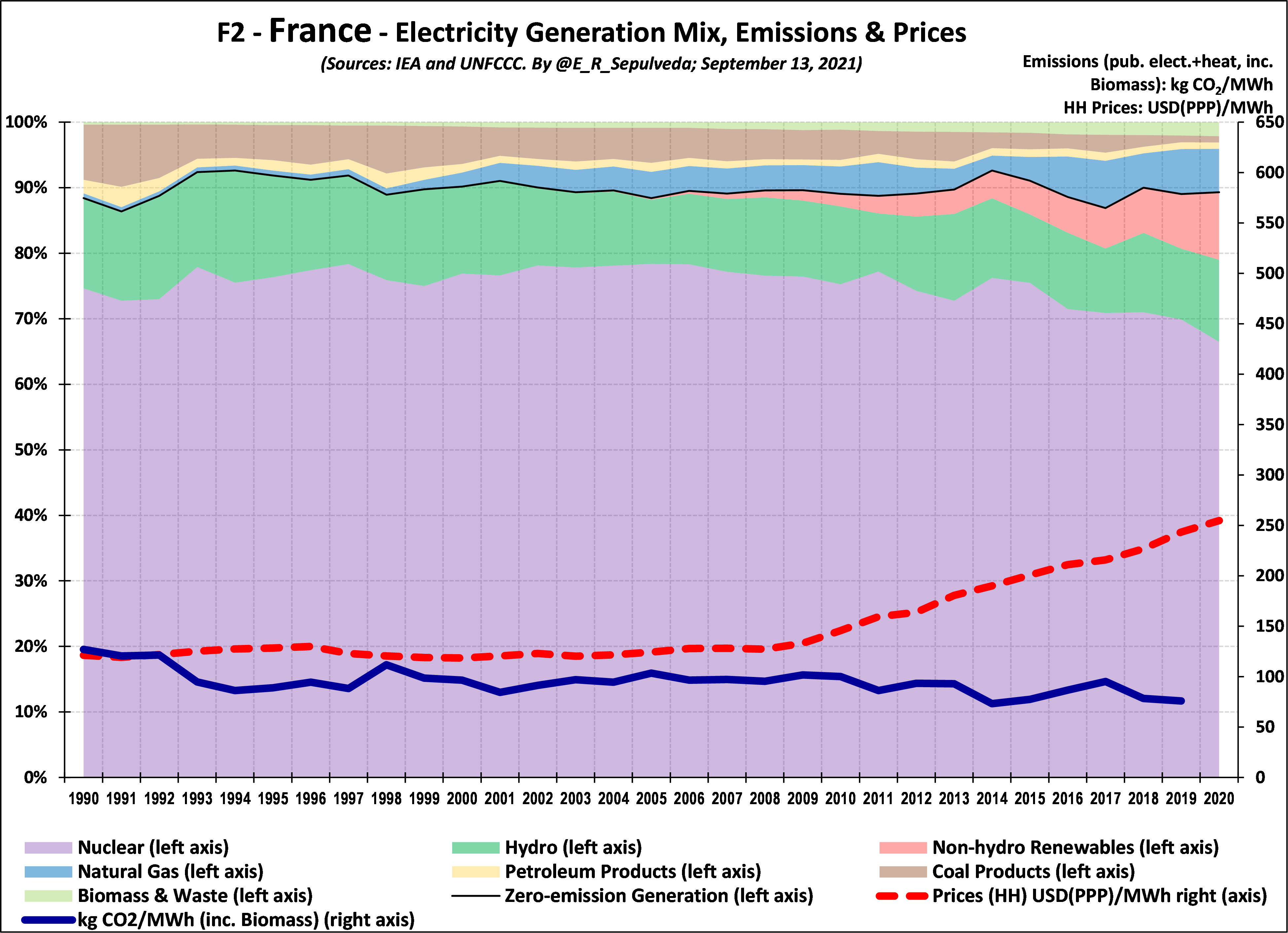
Crossing the Atlantic, Figure 2 shows that the technology mix in France has also been relatively stable over the last 30 years. France has had an even higher percentage (around 90%) of generation coming from zero-emissions technologies, resulting in relatively very low emissions intensity over the study period. Like in Canada, changes in emissions initially relate to the addition/subtraction of zero-emission technologies, but starting in the mid 2000’s there was also substitution away from higher-emitting coal to lower emitting gas. Household prices were stable until about 2009, after which they increased by about 6% per year in the ten years to 2020.
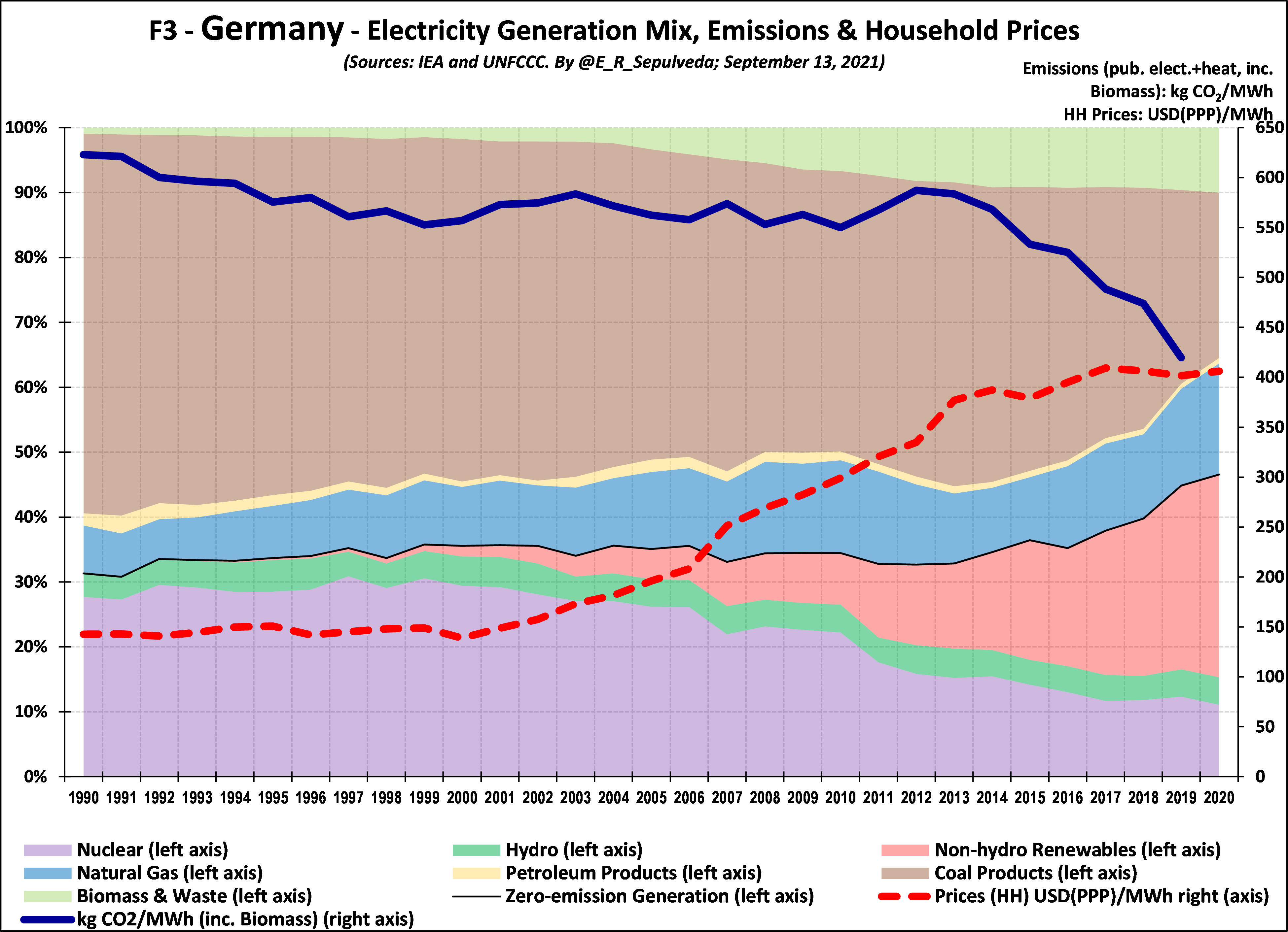
Moving north-east in Europe, Figure 3 shows that the technology mix in Germany has been much more dynamic over the last 30 years. For the period from 1990 to about 2016 Germany had a relatively low percentage (between 30% to 40%) zero-emission generation, resulting in relatively very high emissions intensity. This is specially given the case that its largest emitting generation was coal. Emissions decreased from 1990 to about 1999 as nuclear and hydro increased and gas displaced some coal and then stabilized over the next decade until the large policy-driven decrease in nuclear (in reaction to the Fukushima accident) in 2011 resulted in a large spike in emissions that were not bright back to trend by fast-increasing non-hydro renewables until 2015-16, which by 2020 accounted for 31% of generation. Household prices in Germany were stable until about 2000, after which they increased by more than 8% per year for 13 years to 2013, after which they increased moderately at 1% per year to 2020. As in Ontario, who modeled their Green Energy Act (GEA) on the Energiewende, the increase in prices in Germany are primarily due to the increase in high-contracted-priced non-hydro renewables.
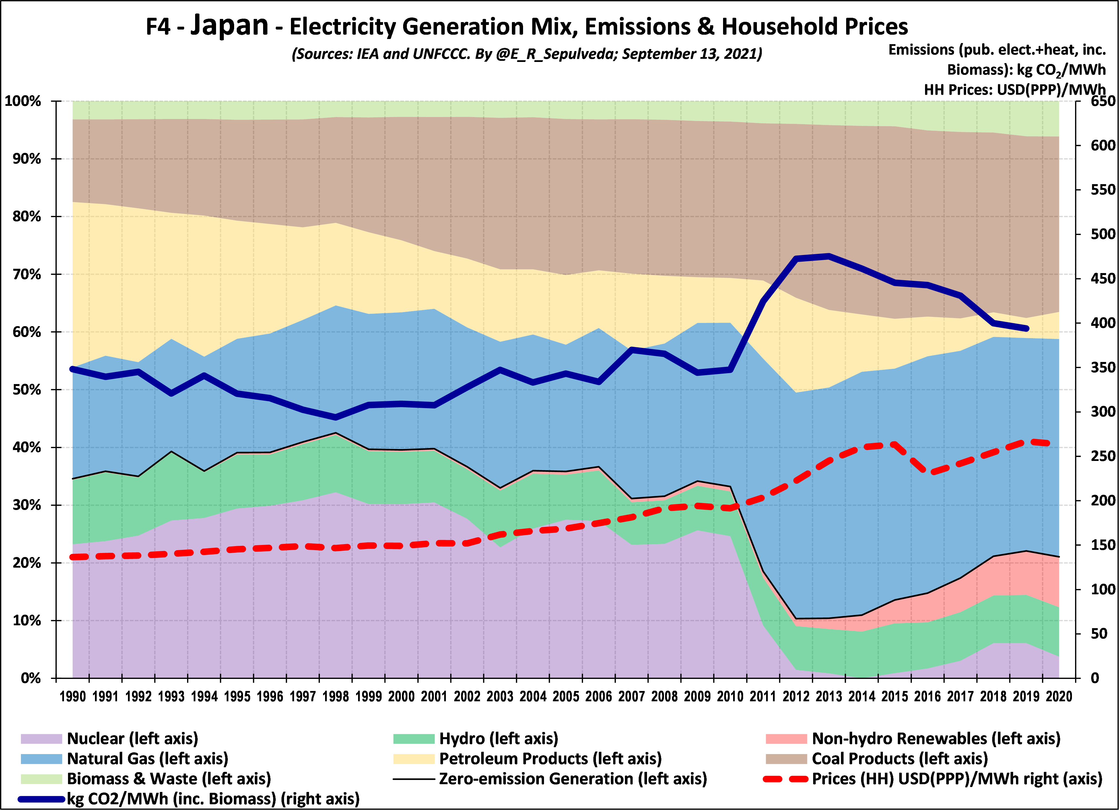
Heading to Asia, Figure 4 shows that the technology mix in Japan has also been relatively dynamic. For the period from 1990 to about 2010 Japan had a relatively low percentage (between 30% to 40%) zero-emission generation, resulting in relatively high emissions intensity. It was lower than Germany, however, because it relied on relatively lower-emitting gas and oil and less on higher-emitting coal. Emissions decreased from 1990 to1999 as nuclear increased and then increased moderately as nuclear decreased slightly until 2010. As a policy matter in reaction to the Fukushima accident in 2011, however, Japan took most of its nuclear generation offline. This decrease resulted in a very large spike in emissions, as zero-emission generation dipped to only 10%. Emissions decreased moderately to 2019 as some nuclear was brought back on line and non-hydro renewables increased to 9% of generation. By 2019 zero-emission generation, at 21% was only half of what Japan had achieved in 1998. Household prices increased moderately until after 2011, when they increased at 4% per year to 2019.
Comparative Analysis and Discussion
Figure 5 shows the emissions intensity for the four countries from 1990 to 2019. It confirms that due to their large legacy zero-emission generation grids of 70%-80% for Canada and 90% for France these are the countries that have already deeply decarbonized their electricity sectors, both hovering around 100 kgCO2/MWh in 2019. After relatively stable but relatively very high emissions for most of the study period, Germany finally broke through the 550 kgCO2/MWh threshold in 2015 and has reduced emissions intensity by 6% since then to reach 420 kgCO2/MWh in 2019. Japan had been unable to make much progress from 350 00 kgCO2/MWh before 2011, after which emissions spiked and have since slowly been reduced to about 400 kgCO2/MW.
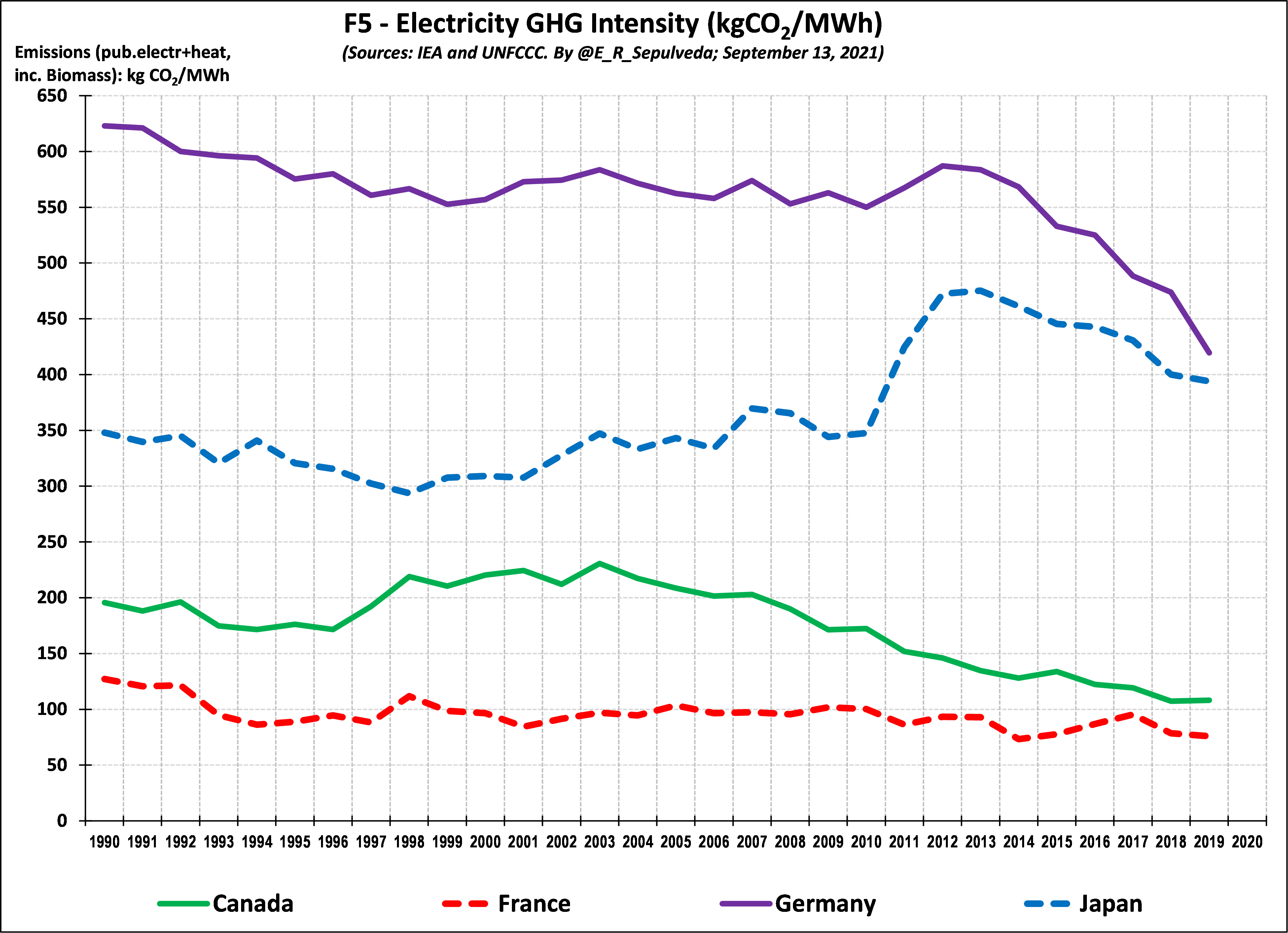
Figure 6 plots emissions intensity against the % of zero-emission generation for every year and country in the study. To give a sense of the direction of the movement in this two-dimensional space, I identify years 1990, 2000, 2010 and 2019 for each country. The strong negative correlation (downward sloping trendline) confirms the almost linear tradeoff between the amount of zero-emission generation and emissions. The time progression, with the exception of Japan, is from higher emission down and to the right. I am interested in seeing whether this linearity holds for the USA, a country for which much of the decarbonization has been attributed to the switch from higher–emitting coal to lower-emitting gas. Stay tuned for future blogs.
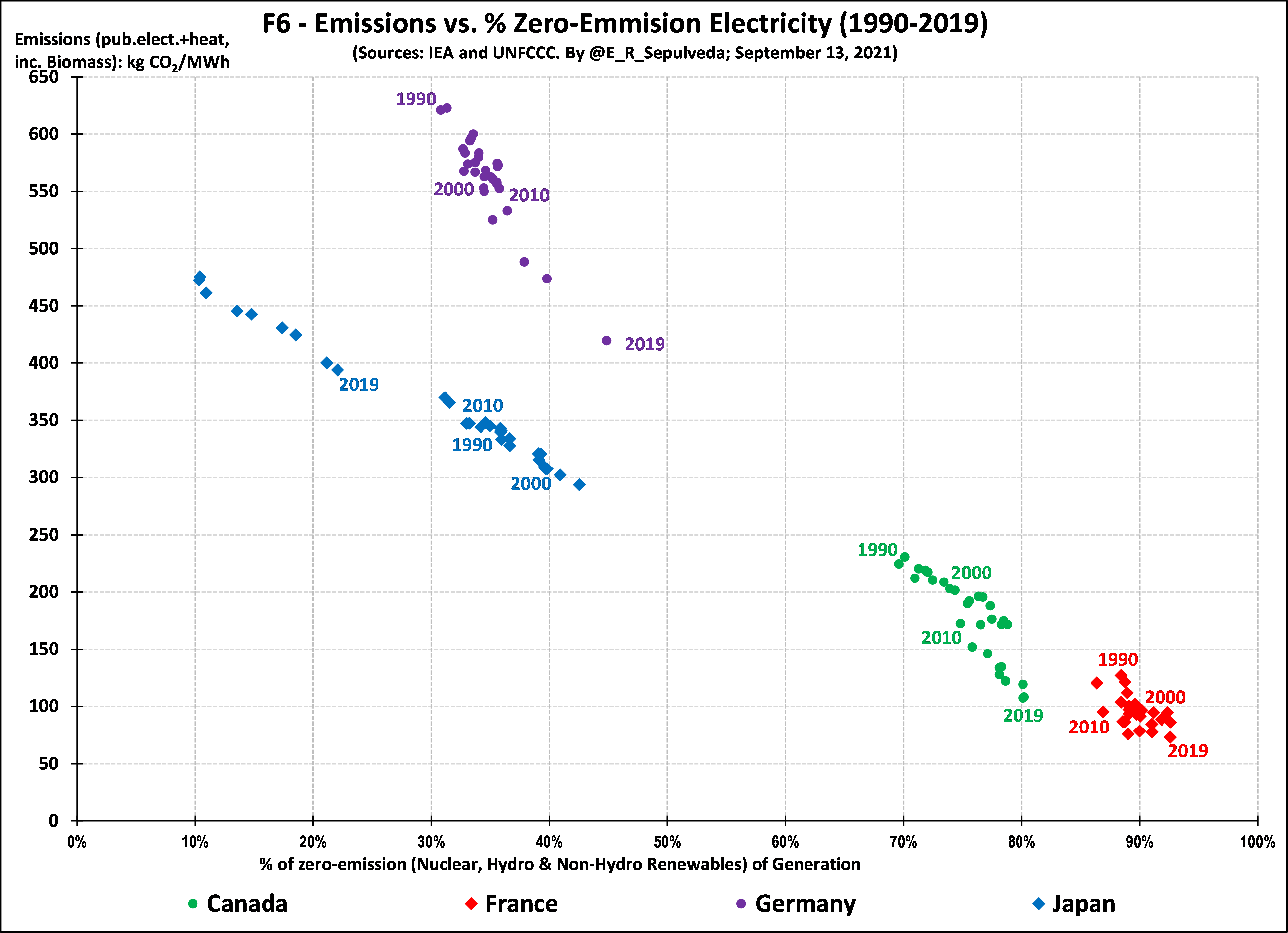
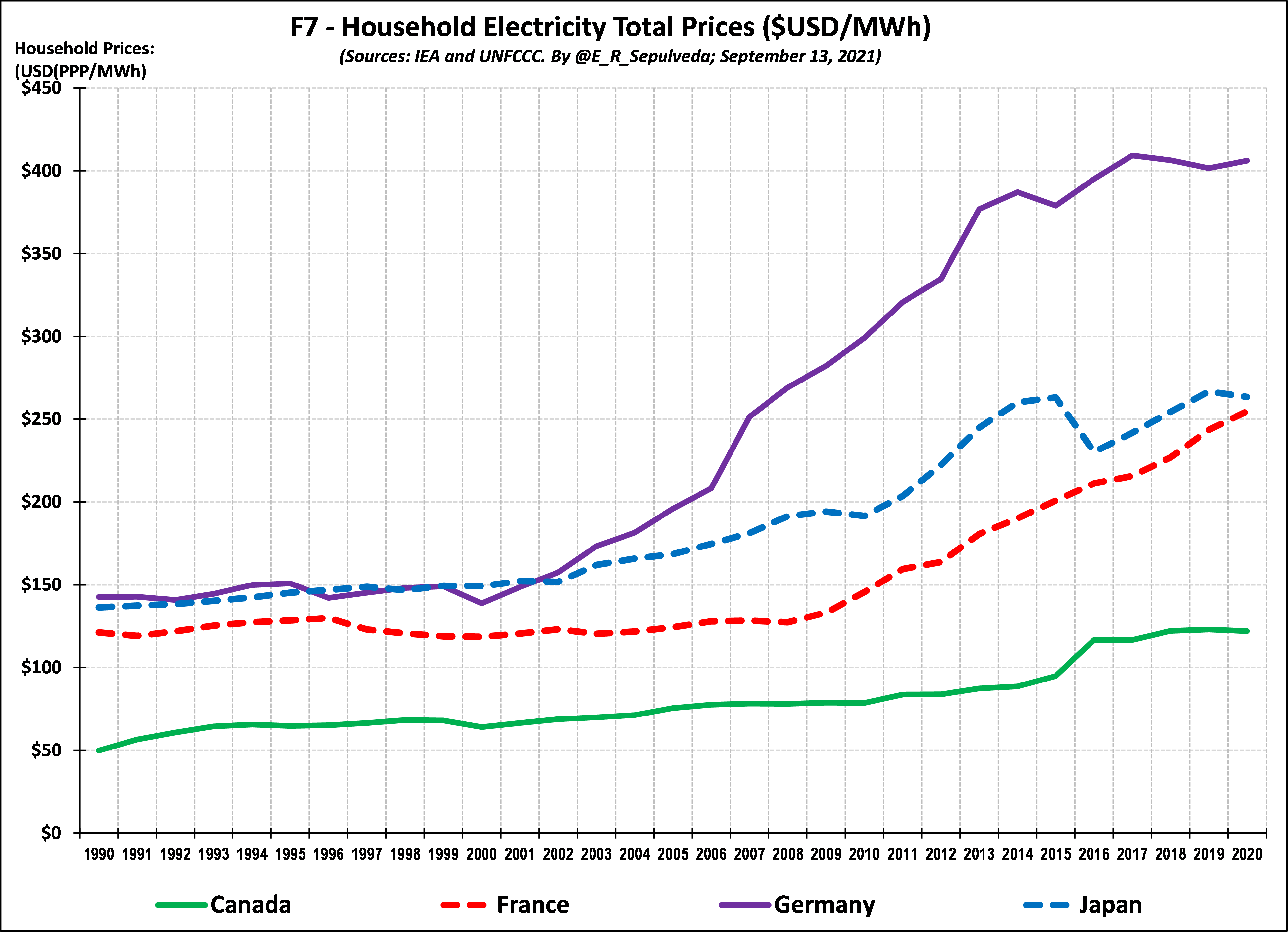
Figure 7 shows household prices for the four countries from 1990 to 2020 and confirms our earlier observation that while all prices have increased after a period of relative stability, the prices in some countries began increasing earlier and faster than in others. Germany is the outlier in this respect, where prices have almost tripled since 1990.
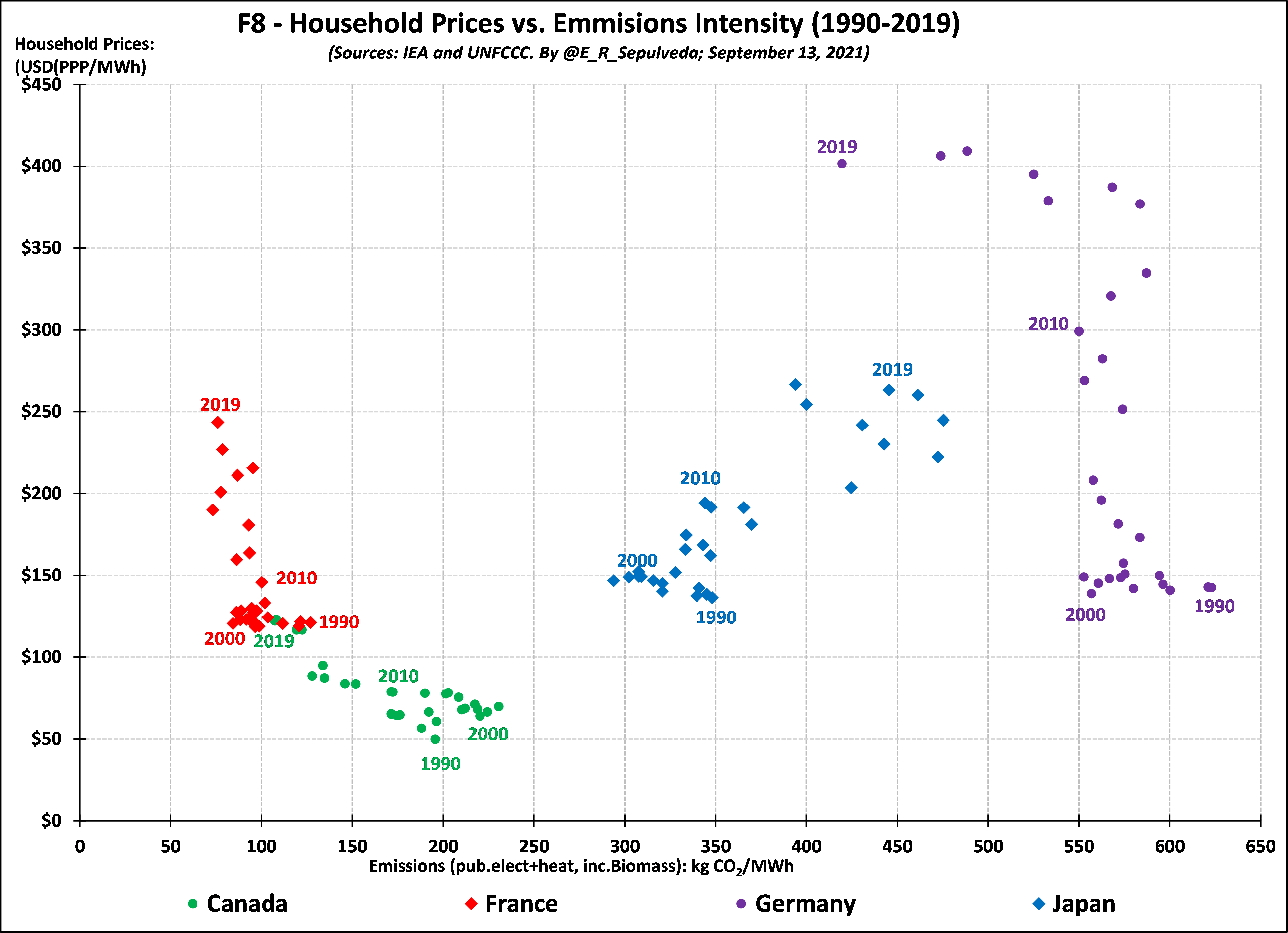
I am interested in exploring affordable decarbonization. From this perspective, both Canada and France had already achieved this by 1990 and so the process of decarbonization, and whether it was affordable, would involve looking further back in time. For Canada that may be 1960s to 1980s when many of current large hydro-electric projects and nuclear generation stations came online to displaced emitting technologies. For France it would be from the mid 1970’s to 1990 when its nuclear fleet displaced fossil technologies. In both cases, however, given that both countries started the period as the two lowest-priced countries in the sample, it is reasonable to assume that the transition was likely affordable, and certainly no less unaffordable than the approaches adopted in Germany and Japan prior to 1990. After that year and specially for Germany from 2000 and the coming into law of the German Renewable Energy Sources Act (EEG) and the introduction of high-contracted-priced non-hydro renewables, we see very significant price increases to 2015 but no reductions in emissions until that year because, as discussed above, Germany was in parallel reducing nuclear generation.
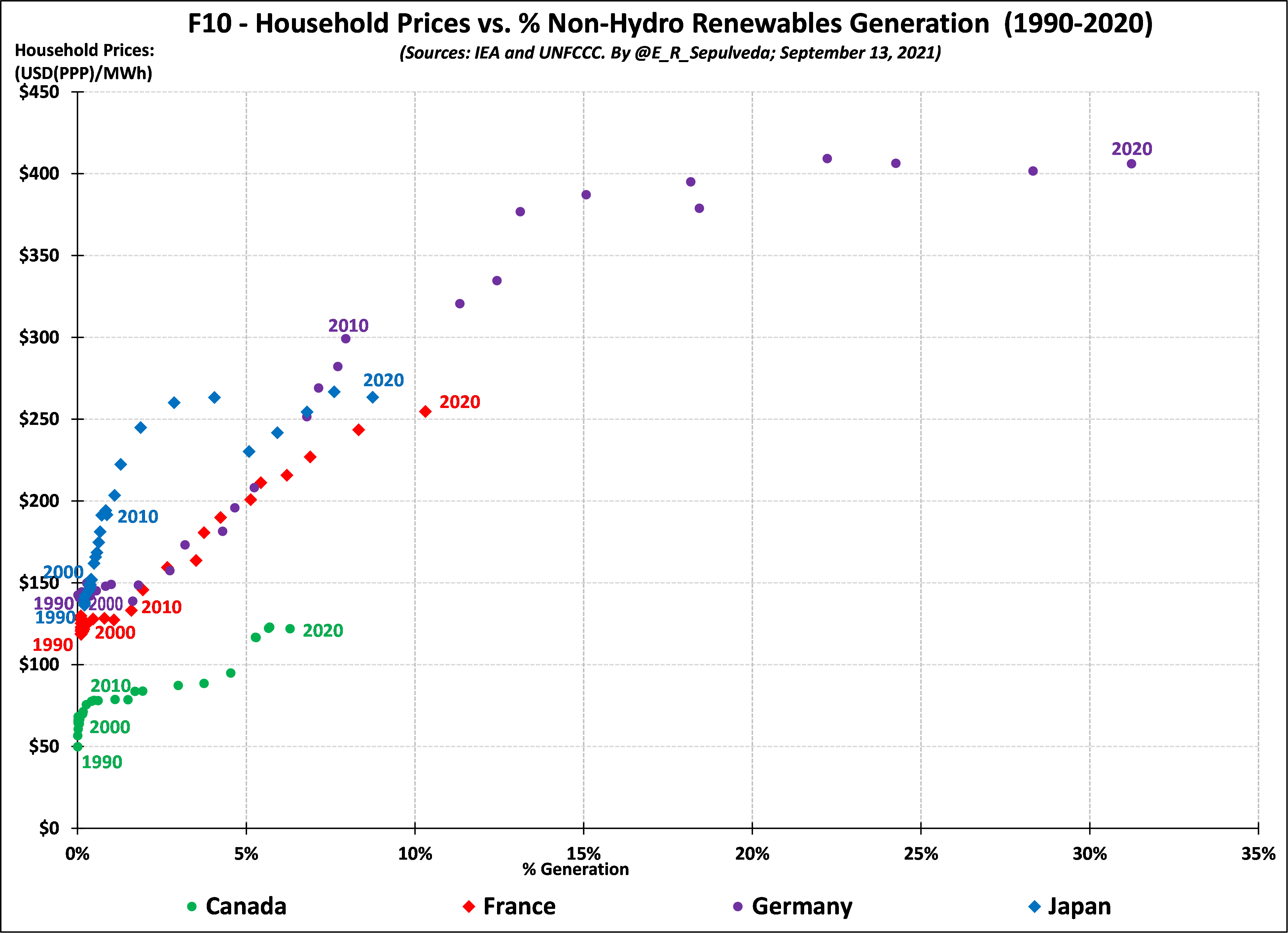
In these last two figures I start an initial correlation analysis, which I expect to fine tune as I cover more countries in future blogs, including with more sophisticated multivariate regression analysis. In my previous blogs I have discussed studies showing that any increases in electricity prices have been mostly due to the introduction and growth of non-hydro renewables, due to their higher-than market contracted prices and broader integration costs. This is certainly the case in Ontario, Canada and Germany. I am interested if this holds in other countries and what is the likely scale of the impact. I begin with the simple correlation analyses in Figures 9 and 10.
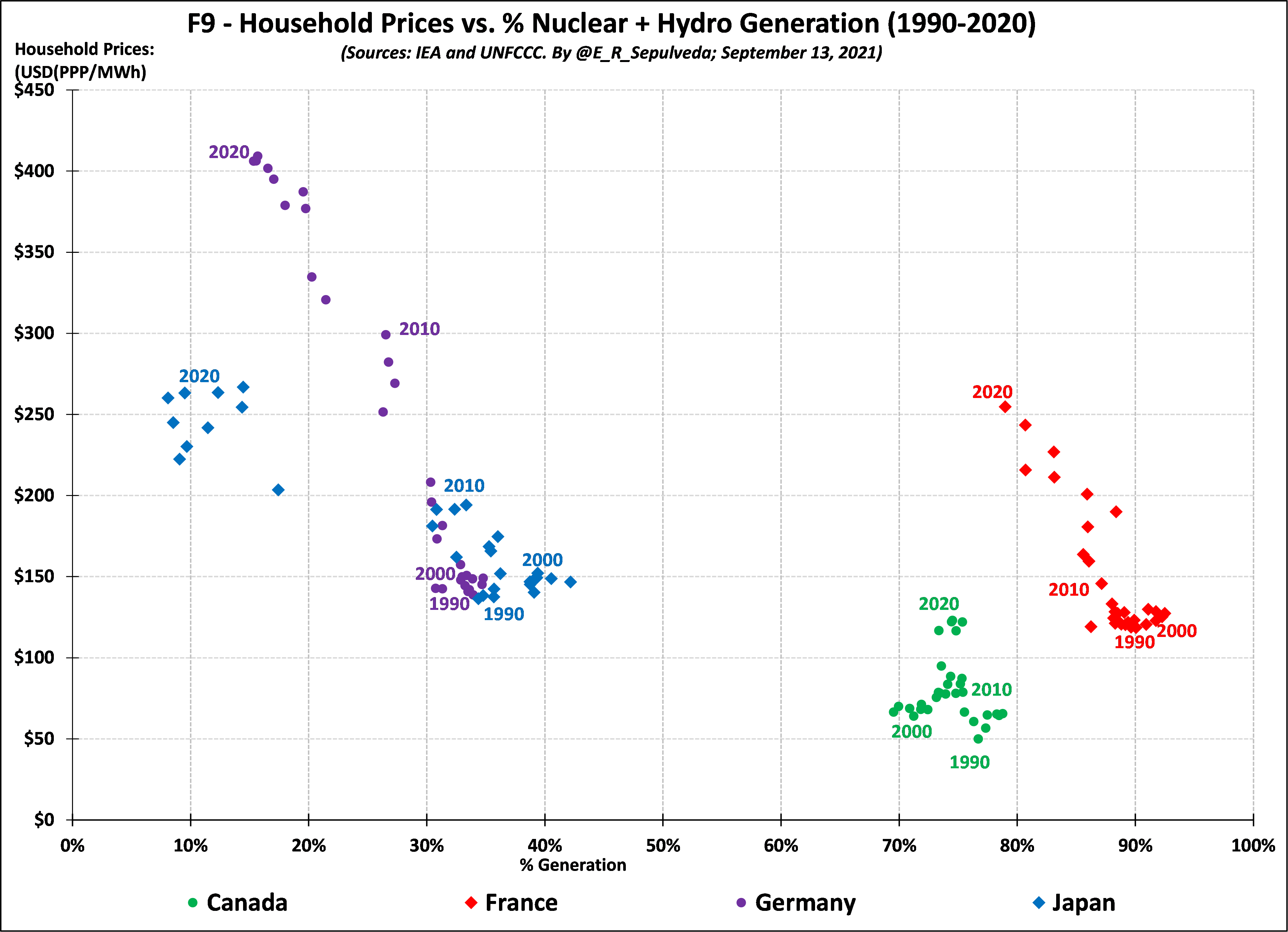
Figures 9 and 10 separate out zero-emission generation into dispatchable nuclear and hydro and intermittent non-hydro renewables and plots them against prices to examine any corresponding correlation. To also provide a sense of the direction of the movement in this two-dimensional space, I identify years 1990, 2000, 2010 and 2019 for each country. Figure 9 shows a generally negative (downward sloping) correlation, indicating that nuclear and hydro are correlated with lower prices. Figure 10, on the other hand, shows a generally positive (upward sloping) correlation, indicating that non-hydro renewable are correlated with higher prices. Based on prior studies, we knew that for Canada (via Ontario) and Germany this non-hydro renewables/higher price association had been shown to be stronger, of statistical significance suggesting causation, but it is good to replicate this via a simple correlation analysis. Looking at Figure 9 and 10 together, this correlation also holds for France and to lesser extent Japan. Note to my inner econometrician – there could be some time effect in the last decade or two (for example the introduction of liberalized electricity markets) that could separately be contributing to higher prices and thus could be a confounding variable to the simple non-hydro renewables/higher price association… That statistical question to be resolved down the road once I review a larger number of countries.
Next Steps
I am expecting to be able to cover four other OECD countries in the edition of this series, hopefully to come out in a few weeks, time permitting. I am aiming to include the USA, either Australia or New Zealand, and two countries in Europe.