Friday , April 19 2024
Home / Tag Archives: Chart Of The Day

Tag Archives: Chart Of The Day

The Psychology of the Stock Market, in One Image

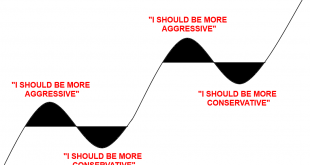
What a wild year it’s been. You could say that the pandemic was like an entire market cycle all rolled into one year. A boom, a bust and a boom. In January I wrote the following piece about how to manage a crazy booming stock market and avoid the temptation to get overly aggressive. Then just 3 months later I wrote this piece about how to manage a crazy collapse and avoid the temptation to get overly conservative. But this is the battle we constantly wage with ourselves. Successful...

Read More »

When “Bonds” Aren’t Bonds

In finance and economics we tend to use oversimplified terms like “money” and “bonds” when the reality is that it’s important to be more nuanced in understanding these terms. That’s why, for instance, I prefer the term “moneyness” when I refer to a money-like instrument. It conveys the proper degree of flexibility about the item. Sometimes cash has more money-like properties than a bank deposit. Sometimes it doesn’t. We can apply the same type of thinking to the financial markets and in...

Read More »

2008 Has Already Happened in the Energy Sector

Share the post "2008 Has Already Happened in the Energy Sector" We’re approaching a level of truly horrific returns in the energy space as the price of oil continues to crumble in the early days of 2016.  There are quite a few people predicting a repeat of 2008, but the reality is that the energy space has already experienced its 2008. To put things in perspective, here’s a chart of the energy sector’s performance over the course of the last two booms and busts.  During the 2003-2008 bull...

Read More »

Three Charts I Think I’m Thinking About

Share the post "Three Charts I Think I’m Thinking About" Here are three charts I think I am thinking about: 1.  Prospects for the 60/40 portfolio don’t look so good.  This is something I’ve talked about in the past, but I have to wonder – given the surging popularity of the 60/40 – are we witnessing one big example of performance chasing?  Given the low interest rate environment and strong recent stock performance (leading to high-ish valuations by many metrics) the 60/40 has entered one...

Read More »

Conflicting Value Indicators Lead to Confusion over Clarity

Share the post "Conflicting Value Indicators Lead to Confusion over Clarity" I’m not a particularly big fan of relying on traditional “value” metrics. It’s not just my mistrust of factor investing. It’s that I just don’t think anyone really knows what the “value” of the market is at any particular time. As I’ve stated in the past, the concept of value is dynamic so the perception of value is much like the perception of beauty. And what’s beautiful to some people in some eras might be ugly...

Read More »