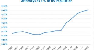
Here’s a graph showing the number of attorneys as a share of the US population: The increase seems pretty inexorable starting around 1970, doesn’t it? For grins and giggles, here’s snide graph on which I will make no comment: If you’re wondering where the lawyers live, a quick google search turned up this post which shows attorneys by state. Needless to say, the share of attorneys as a percentage of the population is greater in the District of Columbia than...
Read More » Heterodox

