Here’s a graph showing the number of attorneys as a share of the US population: The increase seems pretty inexorable starting around 1970, doesn’t it? For grins and giggles, here’s snide graph on which I will make no comment: If you’re wondering where the lawyers live, a quick google search turned up this post which shows attorneys by state. Needless to say, the share of attorneys as a percentage of the population is greater in the District of Columbia than any of the states, by far. Data for (“resident active”) attorneys used in these graphs comes are from the American Bar Association. The ABA’s website seems insistent that anyone referencing their data should state it is “Reprinted by permission of the American Bar Association. All rights reserved.” I am afraid to argue with them. Data and estimates for the US population originates with the Census, but I’m using the set cleaned up by the Texas State Library and Archives Commission since its in an easy to use format. Real GDP per capita comes from NIPA Table 7.1. If you want my spreadsheet, drop me a line at my first name (mike) dot my last name (that’s kimel with one m) at gmail with a dot com.
Topics:
Mike Kimel considers the following as important: attorneys, lawyers, Uncategorized
This could be interesting, too:
tom writes The Ukraine war and Europe’s deepening march of folly
Stavros Mavroudeas writes CfP of Marxist Macroeconomic Modelling workgroup – 18th WAPE Forum, Istanbul August 6-8, 2025
Lars Pålsson Syll writes The pretence-of-knowledge syndrome
Dean Baker writes Crypto and Donald Trump’s strategic baseball card reserve
Here’s a graph showing the number of attorneys as a share of the US population:
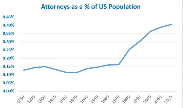
The increase seems pretty inexorable starting around 1970, doesn’t it?
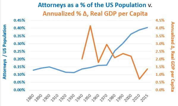
For grins and giggles, here’s snide graph on which I will make no comment:
If you’re wondering where the lawyers live, a quick google search turned up this post which shows attorneys by state. Needless to say, the share of attorneys as a percentage of the population is greater in the District of Columbia than any of the states, by far.
Data for (“resident active”) attorneys used in these graphs comes are from the American Bar Association. The ABA’s website seems insistent that anyone referencing their data should state it is “Reprinted by permission of the American Bar Association. All rights reserved.” I am afraid to argue with them.
Data and estimates for the US population originates with the Census, but I’m using the set cleaned up by the Texas State Library and Archives Commission since its in an easy to use format. Real GDP per capita comes from NIPA Table 7.1.
If you want my spreadsheet, drop me a line at my first name (mike) dot my last name (that’s kimel with one m) at gmail with a dot com.