Coronavirus dashboard for July 28: the “pain threshold” exists, and leads to a decline in new cases Total US coronavirus cases: 4,275,188 Average daily cases last 7 days: 65,896 Total US coronavirus deaths: 140,309 Average daily deaths last 7 days: 1,004 (Source: COVID Tracking Project) Several months ago I wrote: my forecast over the past month [has been] that the population of the US as a whole lacks the political and social will to beat the coronavirus. As a result, the outbreak will continue to wax and wane as complacency alternates with the fear generated by big new outbreaks. The complacency of May gave rise to new outbreaks that showed up in June and deaths that have shown up in July. Case statistics over the past week show that the surge in
Topics:
NewDealdemocrat considers the following as important: Healthcare, Journalism
This could be interesting, too:
Bill Haskell writes Families Struggle Paying for Child Care While Working
Joel Eissenberg writes RFK Jr. blames the victims
NewDealdemocrat writes Constitutional Interregnum
Bill Haskell writes Know Nothings
Coronavirus dashboard for July 28: the “pain threshold” exists, and leads to a decline in new cases
Total US coronavirus cases: 4,275,188
(Source: COVID Tracking Project)
Several months ago I wrote:
my forecast over the past month [has been] that the population of the US as a whole lacks the political and social will to beat the coronavirus. As a result, the outbreak will continue to wax and wane as complacency alternates with the fear generated by big new outbreaks.
The complacency of May gave rise to new outbreaks that showed up in June and deaths that have shown up in July. Case statistics over the past week show that the surge in cases and deaths, in turn, has caused the fear to kick back in, as shown in the below graph of the 7 days average in cases (solid line) and deaths (dotted line, separate scale) per capita for the US:
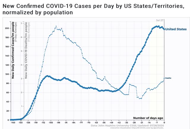
While deaths are still increasing, growth in new cases started to slow down about 12 days ago as the effects of new mask requirements in many States, the re-closing of bars and restaurants in others, and simple fear by people at first slowed the increase, followed by an apparent peak on July 22.
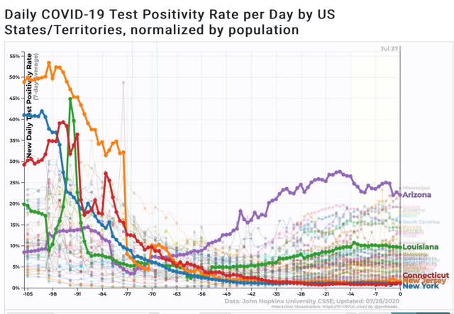
Josh Marshall has speculated, correctly I think, that an important reason why the “cases” and “deaths” scales trends look so different isn’t just demographics, but the fact that testing was so pitiful in March and April that a much larger percentage of cases were missed, citing the % of positive tests which was as high as 47% for NY in April. In other words is there had been more testing available, the trend line for cases would look much more similar to the trend line for deaths. The supporting graph makes the case quite compellingly:
Next, here is the graph of the 10 worst States for new cases, highlighting the top 5 plus Texas, which has declined to #10, and plus NYS for comparison to the early outbreak:
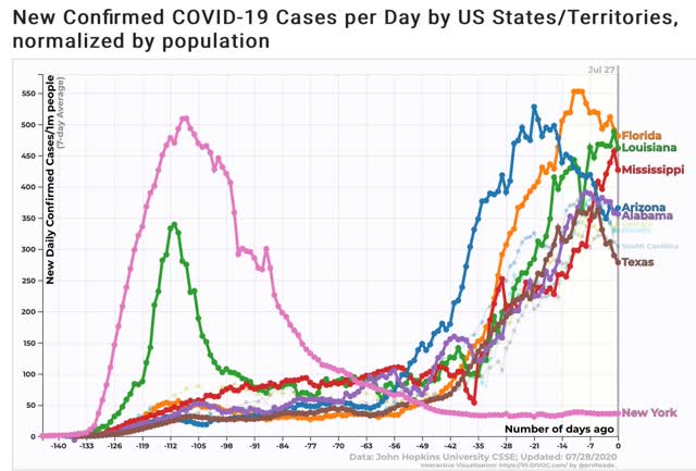
Note that, as I speculated several months ago, once the outbreaks get about as bad as it was in NY and NJ back in March and April, the “pain threshold” kicks in, and both the State and ordinary citizens take action to curb the outbreak.
Here is the latest county by county map of cases per capita from the NYT:
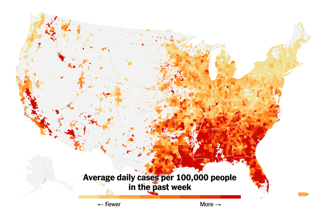
It is manifest that those States which recklessly reopened and/or did not require masks at least in interior spaces have suffered far more in the renewed outbreak than States, like NY and NJ, which were more responsible.
As my German grandmother used to say, “Those who cannot see must feel.”
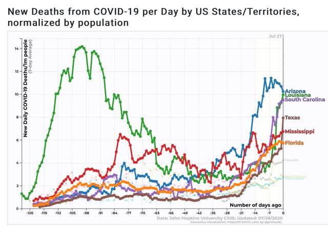
Finally, here is the graph of the 7 day average of deaths per capita, again highlighting the top 5 States, plus Florida, which is #6:
For perspective, here is the same graph plus NY for purposes of scale comparing the present per capita death rate in the current worst States vs. NY’s at its peak:
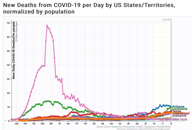
So there is some actual, if very slight and relative, “good news” in that the pain threshold has led to a decline in cases nationally and in some of the worst-hit States. But because national leadership is the same, I expect that any period of waning will give rise to new complacency (vis. a party in Jackson NJ with 700 guests!) and new calls for forced reopening.
