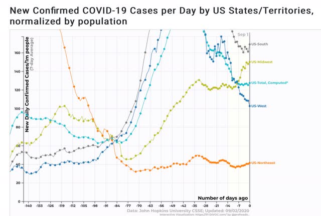
Coronavirus dashboard for September 2: Trumpism still kills Total US cases: 6,073,840 Cases, 7 day average: 42,304 Total US deaths: 184,604 Deaths, 7 day average: 888 Source: COVID Tracking Project US cases by region: US deaths by region: Superficially, this looks somewhat promising, as both cases and deaths have declined. But note that cases have flattened in the past week or so without further declines. This is particularly of concern, because the number of *tests* administered *has* declined somewhat over the past few weeks, as shown in the graph below of tests vs. cases, for the total US In the Northeast, testing has actually *increased,* without finding any more new cases (not shown). That’s good! But here are the other three regions
Topics:
NewDealdemocrat considers the following as important: Healthcare
This could be interesting, too:
Bill Haskell writes Families Struggle Paying for Child Care While Working
Joel Eissenberg writes RFK Jr. blames the victims
Joel Eissenberg writes The branding of Medicaid
Bill Haskell writes Why Healthcare Costs So Much . . .
Coronavirus dashboard for September 2: Trumpism still kills
Total US cases: 6,073,840
US deaths by region:
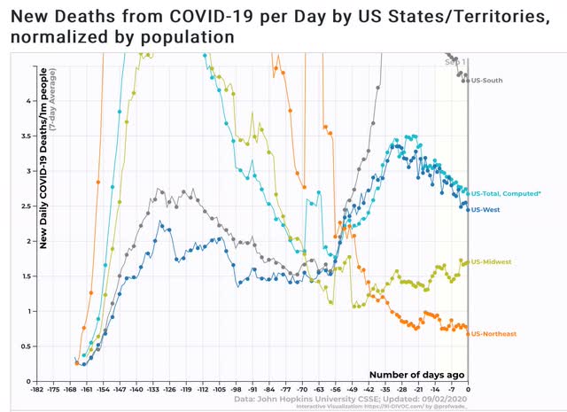
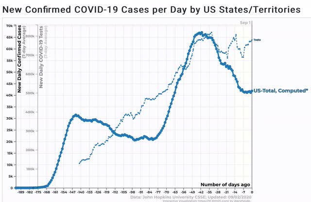
Superficially, this looks somewhat promising, as both cases and deaths have declined. But note that cases have flattened in the past week or so without further declines. This is particularly of concern, because the number of *tests* administered *has* declined somewhat over the past few weeks, as shown in the graph below of tests vs. cases, for the total US
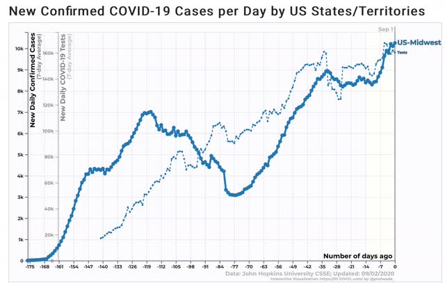
In the Northeast, testing has actually *increased,* without finding any more new cases (not shown). That’s good! But here are the other three regions
Tests vs. cases, Midwest:
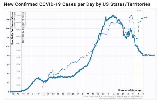
Tests vs. cases, West:
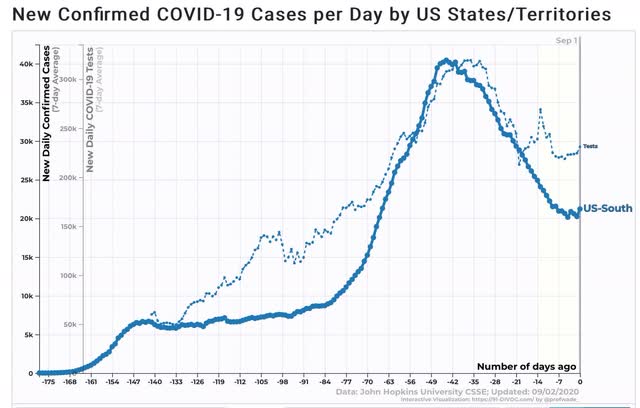
Tests vs. cases, South
In the Midwest, testing and cases have increased essentially in tandem. In the West, testing has plateaued, while new cases have declined, so the decline is probably real.
But in the South, the decline in new cases up until several weeks ago was matched by a similar decline in tests. In other words, had testing not declined, new cases probably would not have declined either. And in the South, the “true” number of cases compared with other regions is probably still substantially higher than shown.
Short version: Trumpism still kills.