From David Ruccio On Wednesday, I referred to the wealth pyramid in the United States. But I didn’t really represent that pyramid in the chart I provided. Here it is, above, with the wealth share of the bottom 50 percent (in red), the middle 40 percent (in blue), and the top 10 percent (in green)—a wealth pyramid for each year, from 1962 to 2014. Or, here’s another, if you prefer a three-dimensional version of the latest year for which data are available. In 2014, the wealth share of the top 10 percent was 73 percent, while the middle 40 percent had 27 percent of net personal wealth. And the bottom 50 percent? It was exactly zero. Now that is a real wealth pyramid!
Topics:
David F. Ruccio considers the following as important: Uncategorized
This could be interesting, too:
tom writes The Ukraine war and Europe’s deepening march of folly
Stavros Mavroudeas writes CfP of Marxist Macroeconomic Modelling workgroup – 18th WAPE Forum, Istanbul August 6-8, 2025
Lars Pålsson Syll writes The pretence-of-knowledge syndrome
Dean Baker writes Crypto and Donald Trump’s strategic baseball card reserve
from David Ruccio

On Wednesday, I referred to the wealth pyramid in the United States. But I didn’t really represent that pyramid in the chart I provided.
Here it is, above, with the wealth share of the bottom 50 percent (in red), the middle 40 percent (in blue), and the top 10 percent (in green)—a wealth pyramid for each year, from 1962 to 2014.
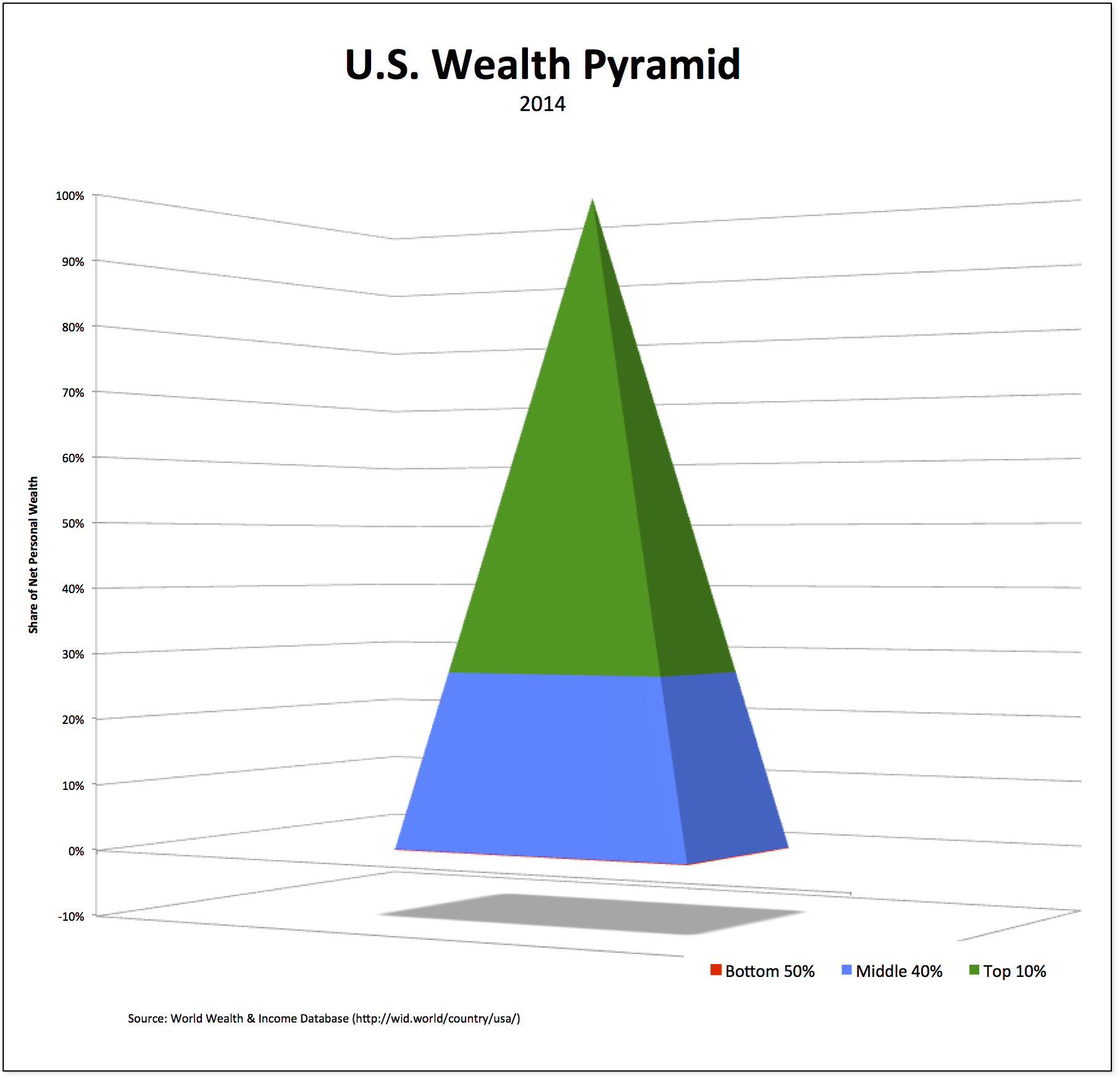
Or, here’s another, if you prefer a three-dimensional version of the latest year for which data are available. In 2014, the wealth share of the top 10 percent was 73 percent, while the middle 40 percent had 27 percent of net personal wealth. And the bottom 50 percent? It was exactly zero.
Now that is a real wealth pyramid!