Here’s a fascinating graph from an article in the Lancet: Click to embiggen. (The figure should show deaths all the way to >95 years) The graph is a bit complicated at first, but it will convey some interesting information if you stare at it. What jumps out at me is how many more people were dying under age 25 in 1990 than in 2016. The number of deaths in 2016 v. 1990 increased dramatically for those above 25, particularly among the older cohorts. Simply put, a lot of people are living a lot longer.
Topics:
Mike Kimel considers the following as important: cause of death, death, mortality, Uncategorized
This could be interesting, too:
tom writes The Ukraine war and Europe’s deepening march of folly
Stavros Mavroudeas writes CfP of Marxist Macroeconomic Modelling workgroup – 18th WAPE Forum, Istanbul August 6-8, 2025
Lars Pålsson Syll writes The pretence-of-knowledge syndrome
Dean Baker writes Crypto and Donald Trump’s strategic baseball card reserve
Here’s a fascinating graph from an article in the Lancet:
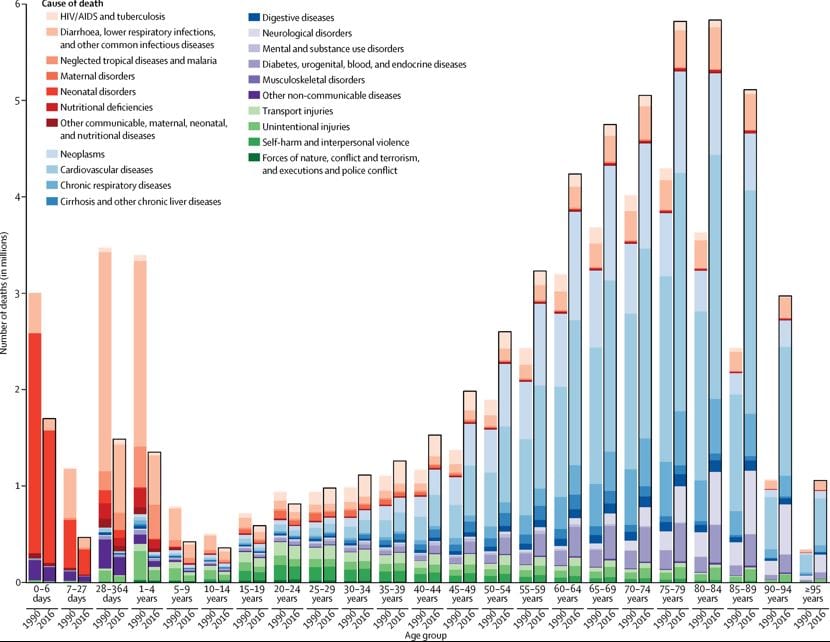
Click to embiggen. (The figure should show deaths all the way to >95 years)
The graph is a bit complicated at first, but it will convey some interesting information if you stare at it. What jumps out at me is how many more people were dying under age 25 in 1990 than in 2016. The number of deaths in 2016 v. 1990 increased dramatically for those above 25, particularly among the older cohorts. Simply put, a lot of people are living a lot longer.