I don’t follow healthcare as much as others at this blog. I started playing around with some graphs at FRED and got a bit confused. I don’t mind being confused, but I like to clear up that confusion eventually. So perhaps someone can tell me what’s going on. First, this graph of healthcare expenditures / GDP which seems to indicate that Obamacare bent the cost curve: (click to embiggenize) But looking at the annual change in healthcare expenditures / GDP, things become less clear: (click to embiggenify) Here, it looks like the rate of increase in costs declined through the early oughts, went up as the economy tanked (i.e., healthcare costs continued rising but GDP fell), and then stayed more or less constant (through 2014,the last year with this
Topics:
Mike Kimel considers the following as important: Healthcare, healthcare costs, Obamacare, PPACA, Uncategorized
This could be interesting, too:
tom writes The Ukraine war and Europe’s deepening march of folly
Stavros Mavroudeas writes CfP of Marxist Macroeconomic Modelling workgroup – 18th WAPE Forum, Istanbul August 6-8, 2025
Lars Pålsson Syll writes The pretence-of-knowledge syndrome
Bill Haskell writes Families Struggle Paying for Child Care While Working
I don’t follow healthcare as much as others at this blog. I started playing around with some graphs at FRED and got a bit confused. I don’t mind being confused, but I like to clear up that confusion eventually. So perhaps someone can tell me what’s going on.
First, this graph of healthcare expenditures / GDP which seems to indicate that Obamacare bent the cost curve:
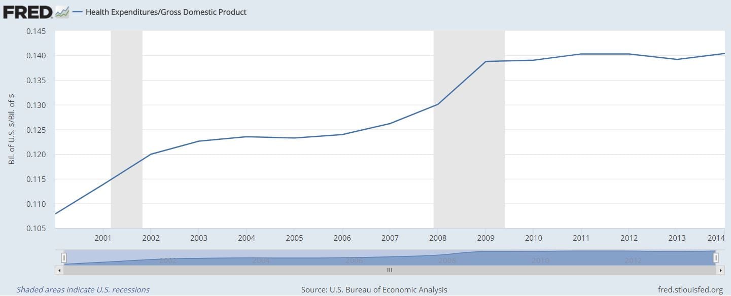
(click to embiggenize)
But looking at the annual change in healthcare expenditures / GDP, things become less clear:

(click to embiggenify)
Here, it looks like the rate of increase in costs declined through the early oughts, went up as the economy tanked (i.e., healthcare costs continued rising but GDP fell), and then stayed more or less constant (through 2014,the last year with this series). This graph doesn’t say Obamacare didn’t help, but it doesn’t scream that it does either.
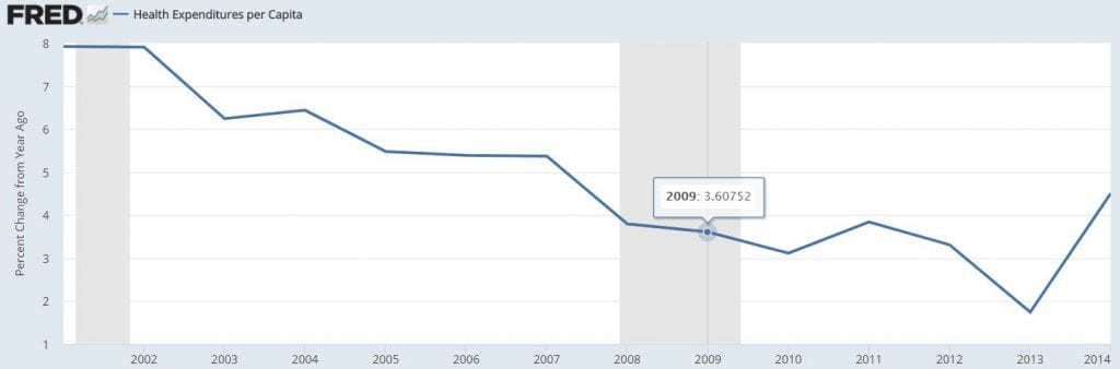
But this next graph is a real problem. It shows healthcare expenditures per capita:
(click to embiggenificate)
The rate of at which healthcare costs per capita have been increasing have been declining since 2001… well before PPACA took effect. Additionally, it kind of looks like healthcare costs per capita stopped declining after the passage of PPACA. Worse, the rate of increase of healthcare costs per capita may have begun picking up since then. That would imply that if there was any bending of the curve, it was the wrong way.
What am I missing?