Summary:
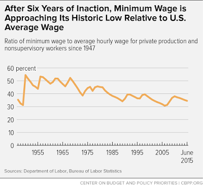
Or close to. The figure below is not just the real minimum wage, which I posted before (most recently here). It is as it says the ratio of the minimum wage to the average wage. The figure neatly shows that while in the 50s and 60s the minimum wage was about 50% of the average wage, since the 1980s it has been closer to a third. Read rest here.
Topics:
Matias Vernengo considers the following as important: Minimum wage
This could be interesting, too:
Or close to. The figure below is not just the real minimum wage, which I posted before (most recently here). It is as it says the ratio of the minimum wage to the average wage.Or close to. The figure below is not just the real minimum wage, which I posted before (most recently here). It is as it says the ratio of the minimum wage to the average wage. The figure neatly shows that while in the 50s and 60s the minimum wage was about 50% of the average wage, since the 1980s it has been closer to a third. Read rest here.
Topics:
Matias Vernengo considers the following as important: Minimum wage
This could be interesting, too:
Angry Bear writes Half of U.S workers Will Live in States with at Least a Minimum Wage by 2027
Nick Falvo writes Economic and social factors associated with the use of homeless shelters
Matias Vernengo writes Minimum wage
Nick Falvo writes The 2021 federal budget
 The figure neatly shows that while in the 50s and 60s the minimum wage was about 50% of the average wage, since the 1980s it has been closer to a third. Read rest here.
