From David Ruccio Last week, to judge by the commentary on the latest Census Bureau report, Income and Poverty in the United States: 2015 (pdf), you’d think the fountain of broadly shared economic prosperity had just been discovered. Binyamin Appelbaum is a good example: Americans last year reaped the largest economic gains in nearly a generation as poverty fell, health insurance coverage spread and incomes rose sharply for households on every rung of the economic ladder, ending years of stagnation. The median household’s income in 2015 was ,500, up 5.2 percent from the previous year — the largest single-year increase since record-keeping began in 1967, the Census Bureau said on Tuesday. The share of Americans living in poverty also posted the sharpest decline in decades. The gains were an important milestone for the economic expansion that began in 2009. For the first time in recent years, the benefits of renewed prosperity are spreading broadly. And while the 5.2-percent increase is nothing to sneeze at (certainly not for the average American whose income, even now, remains below that of 2007 and even 1999), we need to keep things in perspective. First, as is clear from the chart above, the gap between the average incomes of the top 1 percent and median income continues to grow. The ratio between the two has dramatically increased over time—from 8 in 1984 to 15.
Topics:
David F. Ruccio considers the following as important: Uncategorized
This could be interesting, too:
tom writes The Ukraine war and Europe’s deepening march of folly
Stavros Mavroudeas writes CfP of Marxist Macroeconomic Modelling workgroup – 18th WAPE Forum, Istanbul August 6-8, 2025
Lars Pålsson Syll writes The pretence-of-knowledge syndrome
Dean Baker writes Crypto and Donald Trump’s strategic baseball card reserve
from David Ruccio
Last week, to judge by the commentary on the latest Census Bureau report, Income and Poverty in the United States: 2015 (pdf), you’d think the fountain of broadly shared economic prosperity had just been discovered.
Binyamin Appelbaum is a good example:
Americans last year reaped the largest economic gains in nearly a generation as poverty fell, health insurance coverage spread and incomes rose sharply for households on every rung of the economic ladder, ending years of stagnation.
The median household’s income in 2015 was $56,500, up 5.2 percent from the previous year — the largest single-year increase since record-keeping began in 1967, the Census Bureau said on Tuesday. The share of Americans living in poverty also posted the sharpest decline in decades.
The gains were an important milestone for the economic expansion that began in 2009. For the first time in recent years, the benefits of renewed prosperity are spreading broadly.
And while the 5.2-percent increase is nothing to sneeze at (certainly not for the average American whose income, even now, remains below that of 2007 and even 1999), we need to keep things in perspective.
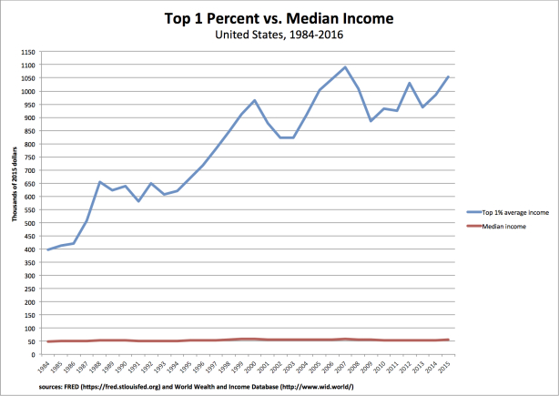
First, as is clear from the chart above, the gap between the average incomes of the top 1 percent and median income continues to grow. The ratio between the two has dramatically increased over time—from 8 in 1984 to 15.7 in 1999 and 19 in 2007—and remained very high (at 18.6) in 2015.
That’s not a story of broadly shared prosperity.
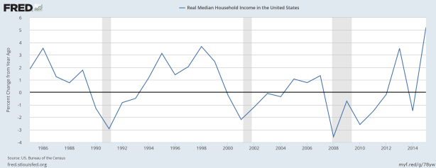
Second, while the 2015 increase in median household income was dramatic, it followed a year when median income actually fell (by 1.5 percent), after a previous increase (of 3.5 percent in 2013) and years of negative growth (from 2008 to 2012).
I hate to spoil the party. But, me, I’d keep the champagne on ice until we actually see sustained, broadly shared prosperity in the United States. And, to judge by recent years and indeed decades, that may be a very long wait.
Update
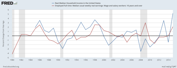
Good question, Bruce. I actually started by comparing the change in median income and real earnings—finding that there was a correlation during some periods but not in others.
What I found particularly interesting is that in 2008 and 2009 the change in real earnings was positive while median income fell. And then, in 2013, real earnings fell while median income rose. The interpretation? I think a lot has to do with unemployment—or, if you prefer, the Reserve Army. Real earnings rose in 2008 and 2009 for those workers who were employed (because of low inflation/deflation) but, of course, many workers were thrown out of work. The result? Median household income fell. Exactly the opposite in 2013: real earnings barely changed but the increase in employment raised median household income. Make sense?


