From David Ruccio This is my own chart—showing the dramatic changes in the average incomes of the bottom 90 percent, the top 10 percent, and the top 1 percent—from the World Wealth and Income Database. Incomes are in thousands of real 2015 dollars. Thus, for example, the average income of the bottom 90 percent fell between 1979 and 2015 (from .6 thousand to .2 thousand), while the average income of the top 10 percent rose (from 9.1 thousand to 3.8 thousand) and that of the top 1 percent soared (from 0.2 thousand to over million). Other charts in this series can be found here, here, and here. Emmanuel Saez, Thomas Piketty, and the rest of the team need to be credited for making their data available. Readers should feel free to use this chart and reproduce it as they wish. . .
Topics:
David F. Ruccio considers the following as important: Uncategorized
This could be interesting, too:
tom writes The Ukraine war and Europe’s deepening march of folly
Stavros Mavroudeas writes CfP of Marxist Macroeconomic Modelling workgroup – 18th WAPE Forum, Istanbul August 6-8, 2025
Lars Pålsson Syll writes The pretence-of-knowledge syndrome
Dean Baker writes Crypto and Donald Trump’s strategic baseball card reserve
from David Ruccio
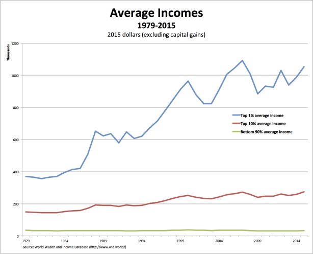
This is my own chart—showing the dramatic changes in the average incomes of the bottom 90 percent, the top 10 percent, and the top 1 percent—from the World Wealth and Income Database.
Incomes are in thousands of real 2015 dollars. Thus, for example, the average income of the bottom 90 percent fell between 1979 and 2015 (from $34.6 thousand to $33.2 thousand), while the average income of the top 10 percent rose (from $149.1 thousand to $273.8 thousand) and that of the top 1 percent soared (from $370.2 thousand to over $1 million).
Other charts in this series can be found here, here, and here.
Emmanuel Saez, Thomas Piketty, and the rest of the team need to be credited for making their data available. Readers should feel free to use this chart and reproduce it as they wish. . .

