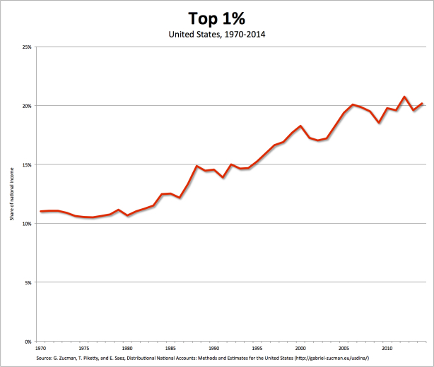
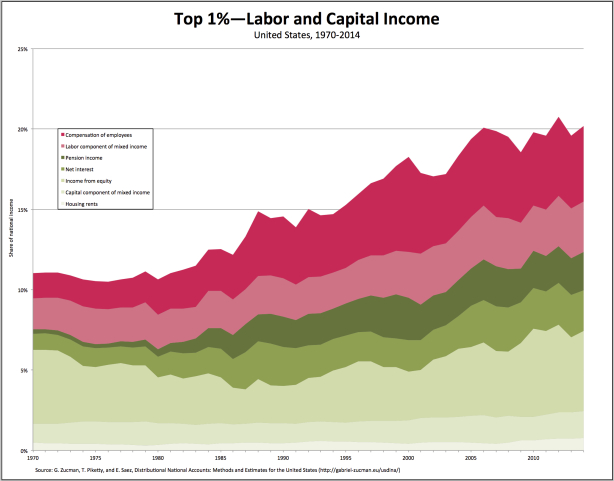
From David Ruccio Where does all the surplus in the U.S. economy go? Well, a large chunk of it is captured by the top 1 percent, whose share of national income almost doubled between 1970 and 2014—from 11 percent to 20.2 percent. Equally interesting is the composition of that growing share of national income, which we can decompose thanks to new data from Thomas Piketty, Emmanuel Saez, and Gabriel Zucman. One way of making sense of the way the top 1 percent manages to capture a portion of the surplus is by distinguishing between a labor component (in shades of red in the chart above) and a capital component (in shades of green). Together, when calculated in terms of shares of national income, they represent the total share of national income that goes to the top 1 percent. (Thus, the top lines in the two charts are equal.) The labor component comprises two categories: employee compensation (e.g., payments to CEOs and executives in finance) and the labor part of noncorporate business profits (e.g, partnerships and sole proprietorships). Capital income can be similarly decomposed into various categories: interest paid to pension and insurance funds, net interest, corporate profits, noncorporate profits, and housing rents (net of mortgages). As can be seen in the chart above, by 2014 the top 1 percent derived over half of their incomes from capital-related sources.
Topics:
David F. Ruccio considers the following as important: Uncategorized
This could be interesting, too:
tom writes The Ukraine war and Europe’s deepening march of folly
Stavros Mavroudeas writes CfP of Marxist Macroeconomic Modelling workgroup – 18th WAPE Forum, Istanbul August 6-8, 2025
Lars Pålsson Syll writes The pretence-of-knowledge syndrome
Dean Baker writes Crypto and Donald Trump’s strategic baseball card reserve
from David Ruccio
Where does all the surplus in the U.S. economy go?
Well, a large chunk of it is captured by the top 1 percent, whose share of national income almost doubled between 1970 and 2014—from 11 percent to 20.2 percent.
Equally interesting is the composition of that growing share of national income, which we can decompose thanks to new data from Thomas Piketty, Emmanuel Saez, and Gabriel Zucman.
One way of making sense of the way the top 1 percent manages to capture a portion of the surplus is by distinguishing between a labor component (in shades of red in the chart above) and a capital component (in shades of green). Together, when calculated in terms of shares of national income, they represent the total share of national income that goes to the top 1 percent. (Thus, the top lines in the two charts are equal.)
The labor component comprises two categories: employee compensation (e.g., payments to CEOs and executives in finance) and the labor part of noncorporate business profits (e.g, partnerships and sole proprietorships). Capital income can be similarly decomposed into various categories: interest paid to pension and insurance funds, net interest, corporate profits, noncorporate profits, and housing rents (net of mortgages).
As can be seen in the chart above, by 2014 the top 1 percent derived over half of their incomes from capital-related sources. In earlier decades, from the late-1970s to the late-1990s, a much larger share of their income came from labor sources. They were the so-called “working rich.” This process culminated in 2000 when the capital share in top 1 percent incomes reached a low point of 49.4 percent. Since then, however, it has bounced back—to 58.6 percent in 2014. Thus, the “working rich” of the late-twentieth century may increasingly be living off their capital income, or are in the process of being replaced by their offspring who are living off their inheritances.
What this means, in general terms, is the growth of inequality over decades is due to the ability of the 1 percent to capture a large portion of the growing surplus. But there has also been a change in the nature of that inequality in recent years—which is not due to escalating wages at the top, but to a boom in income from the ownership of stocks and bonds. The high incomes of the “working rich,” it seems, have increasingly been used to purchase financial assets.
It looks then as if the working rich are either turning into or being replaced by rentiers—thus mirroring, after a short interruption, the structure of inequality last seen during the first Gilded Age.


