From David Ruccio Who’s running away with the surplus, those at the top or those at the very top? In a new study on “income inequality in the 21st century,” Fatih Guvenen and Greg Kaplan note that recent increases in inequality in the United States need to be understood in terms of trends of and, especially, within the top 1 percent. That’s particularly true when, instead of using Social Security data (which capture labor income), they turn to Internal Revenue data (which capture all forms of income). While I agree with Guvenen and Kaplan that historically there have been significant differences between the incomes of the top 1 percent and the top 0.1 percent—those at the top and those at the very top—in my view, they tend to exaggerate the differences and lose sight of the fact that the two groups have become one. Clearly, as can be seen in the chart above (based on data from Thomas Piketty, Emmanuel Saez, and Gabriel Zucman), the average income of those in the top tenth of one percent has risen much more than that of the top one percent. From 1979 to 2014, the average income of those at the very top has risen 277 percent compared to an increase of 183 percent for those at the top. But, of course, the average incomes of both groups have soared compared to that of the bottom 90 percent, which has increased only 27 percent over the same period.
Topics:
David F. Ruccio considers the following as important: Uncategorized
This could be interesting, too:
tom writes The Ukraine war and Europe’s deepening march of folly
Stavros Mavroudeas writes CfP of Marxist Macroeconomic Modelling workgroup – 18th WAPE Forum, Istanbul August 6-8, 2025
Lars Pålsson Syll writes The pretence-of-knowledge syndrome
Dean Baker writes Crypto and Donald Trump’s strategic baseball card reserve
from David Ruccio
Who’s running away with the surplus, those at the top or those at the very top?
In a new study on “income inequality in the 21st century,” Fatih Guvenen and Greg Kaplan note that recent increases in inequality in the United States need to be understood in terms of trends of and, especially, within the top 1 percent. That’s particularly true when, instead of using Social Security data (which capture labor income), they turn to Internal Revenue data (which capture all forms of income).
While I agree with Guvenen and Kaplan that historically there have been significant differences between the incomes of the top 1 percent and the top 0.1 percent—those at the top and those at the very top—in my view, they tend to exaggerate the differences and lose sight of the fact that the two groups have become one.
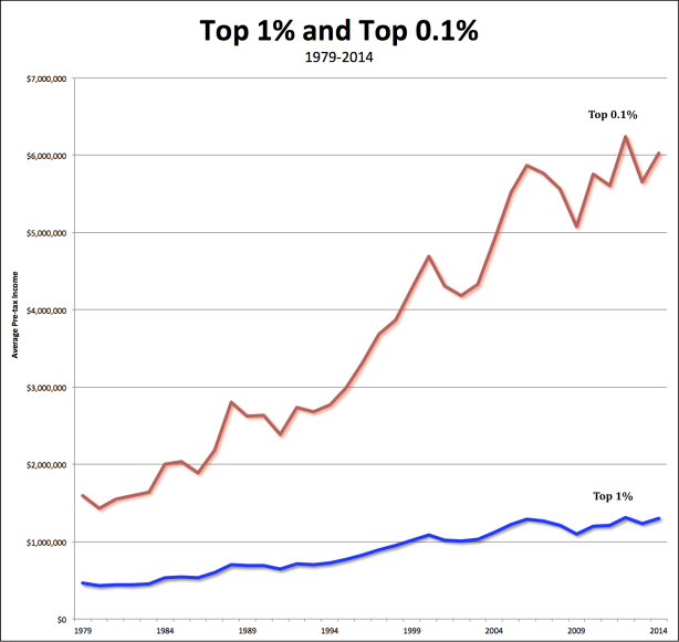
Clearly, as can be seen in the chart above (based on data from Thomas Piketty, Emmanuel Saez, and Gabriel Zucman), the average income of those in the top tenth of one percent has risen much more than that of the top one percent. From 1979 to 2014, the average income of those at the very top has risen 277 percent compared to an increase of 183 percent for those at the top. But, of course, the average incomes of both groups have soared compared to that of the bottom 90 percent, which has increased only 27 percent over the same period.
And while they’re right, the rise in capital income much more than labor income helps explain the rising share of income of those at the very top, especially in recent decades, the fact is both groups—whether in the form of labor or capital income—have managed to capture a rising share of the surplus.
Where do those incomes come from?
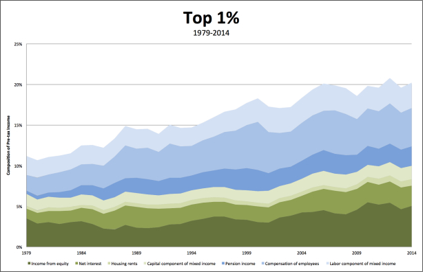
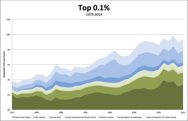
The following two charts illustrate the composition of incomes of the top 1 percent and top 0.1 percent, respectively.
One way of making sense of the way those at the top and those at the very top manage to capture a portion of the surplus is by distinguishing between a labor component (in various shades of blue in both charts) and a capital component (in shades of green). When added together, the two components represent the total share of national income that goes to the top 1 percent (which rose from 11.1 to 20.2 percent) and the top 0.1 percent (which rose from 3.9 to 9.3 percent) between 1979 and 2014.
The labor component comprises two categories: employee compensation (e.g., payments to CEOs and executives in finance) and the labor part of noncorporate business profits (e.g, partnerships and sole proprietorships). Capital income can be similarly decomposed into various categories: interest paid to pension and insurance funds, net interest, corporate profits, noncorporate profits, and housing rents (net of mortgages).
As can be seen in the top chart above, by 2014 the top 1 percent derived over half of their incomes from capital-related sources. In earlier decades, from the late-1970s to the late-1990s, a much larger share of their income came from labor sources. They were the so-called “working rich.” This process culminated in 2000 when the capital share in top 1 percent incomes reached a low point of 49.4 percent. Since then, however, it has bounced back—to 58.6 percent in 2014. Thus, the “working rich” of the late-twentieth century are increasingly living off their capital income, or are in the process of being replaced by their offspring who are living off their inheritances.
Much the same trend, in an even exaggerated fashion, is true of those at the very top, the top 0.1% (in the lower chart). More than half of their income has always come from capital-related sources. They were never the “working rich”; they were always for the most part “coupon clippers.” The share of their income from capital-related sources was already 60 percent in 1979 and continued to grow (to 63 percent) by 2014.
What this means, in general terms, is the growth of inequality over decades is due to the ability of those at the top and those at the very top to capture a large portion of the growing surplus. But there has also been a change in the nature of that inequality in recent years, at least for those at the top—which is not due to escalating wage inequality, but to a boom in income from the ownership of stocks and bonds. They’ve now joined the ranks of the “coupon clippers,” who are able to use their accumulated wealth to get their share of the surplus.
It looks then as if those at the top have either turned into or been replaced by rentiers, thus joining the existing owners of capital at the very top—thereby mirroring, after a short interruption, the structure of inequality last seen during the first Gilded Age.


