Summary:
Where are the millionaires? (Figures in thousands, US$) Source: Credit Suisse Global Wealth Databook 2018 How does inequality in the US compare? (Most recent Gini coefficient scores) Source: World Bank Where the 1% have the largest wealth share Source: Credit Suisse Global Wealth Databook 2018 More income in America is going to 1% of the population Income share of the top 1% Source: World Inequality Database https://www.bbc.co.uk/news/world-us-canada-47456308
Topics:
Editor considers the following as important: Uncategorized
This could be interesting, too:
tom writes The Ukraine war and Europe’s deepening march of folly
Stavros Mavroudeas writes CfP of Marxist Macroeconomic Modelling workgroup – 18th WAPE Forum, Istanbul August 6-8, 2025
Lars Pålsson Syll writes The pretence-of-knowledge syndrome
Dean Baker writes Crypto and Donald Trump’s strategic baseball card reserve
Where are the millionaires?
(Figures in thousands, US$)

Source: Credit Suisse Global Wealth Databook 2018
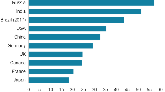
How does inequality in the US compare?
(Most recent Gini coefficient scores)

Source: World Bank
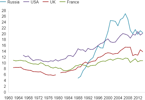
Where the 1% have the largest wealth share
Source: Credit Suisse Global Wealth Databook 2018
More income in America is going to 1% of the population
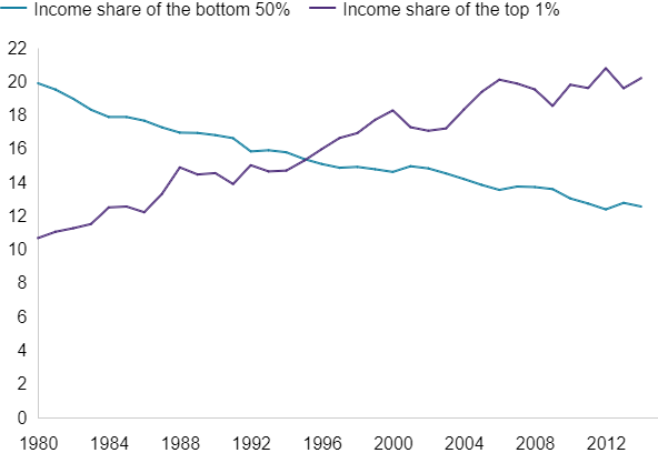
Income share of the top 1%
Source: World Inequality Database
https://www.bbc.co.uk/news/world-us-canada-47456308
