From Jason Hickel In a recent Twitter post, Max Roser of Our World In Data claimed that the narrative about rising inequality within countries is incorrect. Inequality has been falling in as many countries as it has been rising, he said, “which should be really embarrassing for many news stories that suggest the opposite with great certainty.” Roser’s tweet referred to an interesting blog post by Joe Hasell, with a graph illustrating the change in the Gini index within countries from 1990 to 2015. Countries above the 45-degree line have seen rising inequality, while countries below the line have seen falling inequality. It’s a pretty even split (although the majority of the world’s population live in countries that have seen rising, not falling inequality). This
Topics:
Editor considers the following as important: Uncategorized
This could be interesting, too:
tom writes The Ukraine war and Europe’s deepening march of folly
Stavros Mavroudeas writes CfP of Marxist Macroeconomic Modelling workgroup – 18th WAPE Forum, Istanbul August 6-8, 2025
Lars Pålsson Syll writes The pretence-of-knowledge syndrome
Dean Baker writes Crypto and Donald Trump’s strategic baseball card reserve
from Jason Hickel
In a recent Twitter post, Max Roser of Our World In Data claimed that the narrative about rising inequality within countries is incorrect. Inequality has been falling in as many countries as it has been rising, he said, “which should be really embarrassing for many news stories that suggest the opposite with great certainty.”
Roser’s tweet referred to an interesting blog post by Joe Hasell, with a graph illustrating the change in the Gini index within countries from 1990 to 2015. Countries above the 45-degree line have seen rising inequality, while countries below the line have seen falling inequality. It’s a pretty even split (although the majority of the world’s population live in countries that have seen rising, not falling inequality).
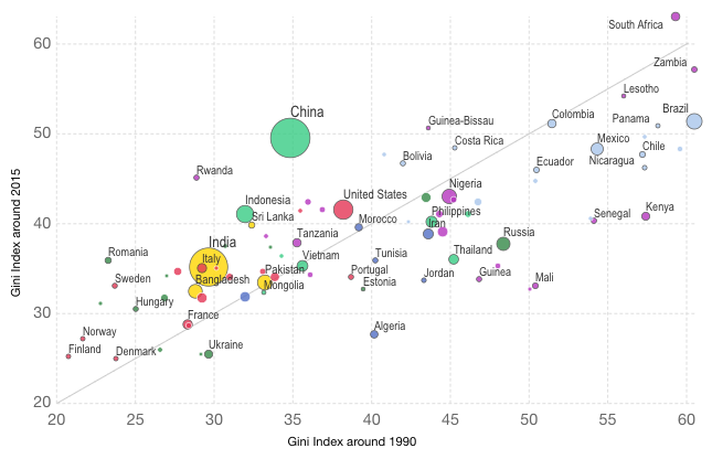
This seems like good news indeed. So which is it? Is inequality getting better or worse?
What Roser doesn’t mention in his tweet is that the Gini index used here is a relative measure. If the incomes of the poor increase at a faster rate than the incomes of the rich, the Gini index shows a decline in inequality even if the absolute income gap between the rich and poor continues to widen. Hasell is aware of this issue, however, and mentions at the end of his post that calculations of absolute inequality suggest that inequality has been increasing over the same period.
So what’s going on here? Imagine that person A has an income of $1 per day while person B has an income of $100 per day. If A’s income grows by 100% (to $2) while B’s income grows by only 90% (to $190), the Gini index shows that inequality is decreasing even though the absolute gap between the two has increased substantially, from $99 to $188.
We can correct for this by using the absolute Gini: simply take the Gini index and multiply it by the average income of each country. Doing so gives us a very different picture of inequality. The graph below shows that the vast majority of the world’s countries have seen increasing absolute inequality from 1990 to 2015. Click through to explore an interactive version developed by Huzaifa Zoomkawala in conversation with Hasell and me.
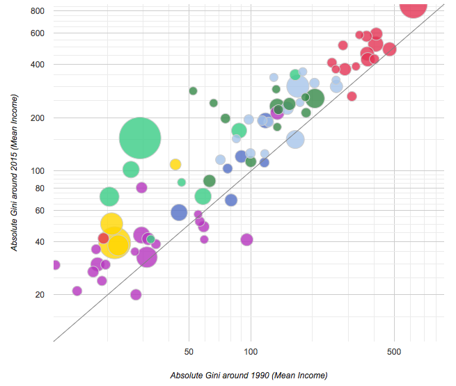
There are various ways to calculate the absolute Gini. One can use Gross National Income (GNI) per capita, measured in either constant or PPP terms, or – to be more consistent with the underlying Gini data from Povcal – one can use mean income as captured by household surveys (as in the image above). The interactive graph gives users the option to pick between these various multipliers. But no matter which one you pick, the conclusion is the same: absolute inequality has been getting worse virtually everywhere.
These results are in keeping with recent research showing that the absolute Gini increased for the world as a whole as well as in most world regions from 1975 to 2010.
Keep in mind that the graph above is represented on a logarithmic scale. The linear scale (the default option on the interactive graph) has poor countries clumped together in the bottom left with rich countries soaring away. This skewed distribution is due to the vast differences in average incomes between countries, and illustrates the significant inequality that continues to persist between Western countries and the rest of the world.
There is no “correct” way to measure inequality. Both relative and absolute measures are important. For some reason the relative measure has become the most dominant by far (i.e., in the work of Branko Milanovic and in World Bank reports). But it is misleading to develop a narrative about inequality using the standard Gini index without (a) stating that it is a relative measure, and (b) providing the absolute measure for comparison.
This is important, because in my experience when most ordinary people (i.e., non-experts) think about inequality, they think of income gaps instead of ratios. I tested this recently with an online poll that gave respondents the chance to explain, in their own words, what they think when they hear someone say that inequality is “getting worse” or “diminishing”. Among 174 respondents, the vast majority (some 95%) indicated that they think of inequality in absolute terms.
This needs more formal research, of course; but if these preliminary results are anything to go by, then we risk seriously misleading the public by telling them that inequality is decreasing when in fact, according to common sense definitions, it is getting worse.