The Bank of England has a 28 MB Excel dataset containing: “A millenium of macro economic data”. A treasure trove. A good thing about it: as it are long term series and as these are roughly based on national accounts data and not just on economics 101 it’s not only focused on GDP but also on sectoral developments and flows between and within sectors. I can’t show it all, and… will leave, to name only one (!) major part of it, the Flow of Funds data, which, among other things, show which sector provides loans and credits to other sectors, out of the discussion. Another major part which won’t be covered: international trade. The dataset is incredibly rich as you can see for yourself on the second Excel worksheet. I won’t discuss conceptual issues (the meaning and nature and
Topics:
Merijn T. Knibbe considers the following as important: Uncategorized
This could be interesting, too:
tom writes The Ukraine war and Europe’s deepening march of folly
Stavros Mavroudeas writes CfP of Marxist Macroeconomic Modelling workgroup – 18th WAPE Forum, Istanbul August 6-8, 2025
Lars Pålsson Syll writes The pretence-of-knowledge syndrome
Dean Baker writes Crypto and Donald Trump’s strategic baseball card reserve
The Bank of England has a 28 MB Excel dataset containing: “A millenium of macro economic data”. A treasure trove. A good thing about it: as it are long term series and as these are roughly based on national accounts data and not just on economics 101 it’s not only focused on GDP but also on sectoral developments and flows between and within sectors. I can’t show it all, and…
will leave, to name only one (!) major part of it, the Flow of Funds data, which, among other things, show which sector provides loans and credits to other sectors, out of the discussion. Another major part which won’t be covered: international trade. The dataset is incredibly rich as you can see for yourself on the second Excel worksheet. I won’t discuss conceptual issues (the meaning and nature and significance of for instance ‘work’ changed in the course of centuries). I also won’t go into the issues caused by changing borders. I’ll just give some very short comments on a number of not too carefully chosen macro economic graphs – just like the Bank of England I do consider all of these, including the 7th one, to be macro by nature. The goal of this post is just to show the richness of these data (one data set, on productivity, has been updated using ONS data).
Comments on the 3 graphs above and the 4 below:
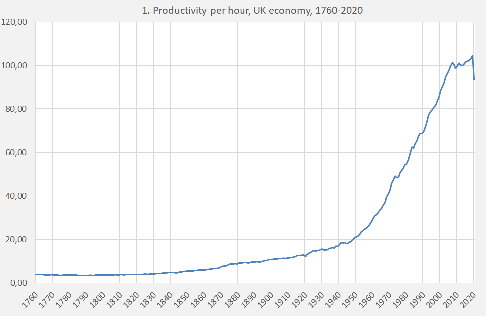
- Productivity (total production divided by hours). Remarkable: the post WW II acceleration in productivity growth, the post 2008 slowdown and the Covid crisis.
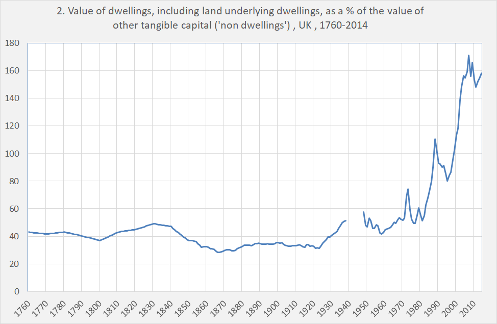
- The value of dwellings (including land underlying dwellings) as a % of the value of other ‘tangible capital (probably excluding the value of intellectual property). Remarkable: the increase of this metric. Some reasons: less people per house meaning on average more houses per capita and an increase in size and quality of houses. But the implicit value of the land underlying dwellings might explain more: a ‘Pure’ asset price increase.
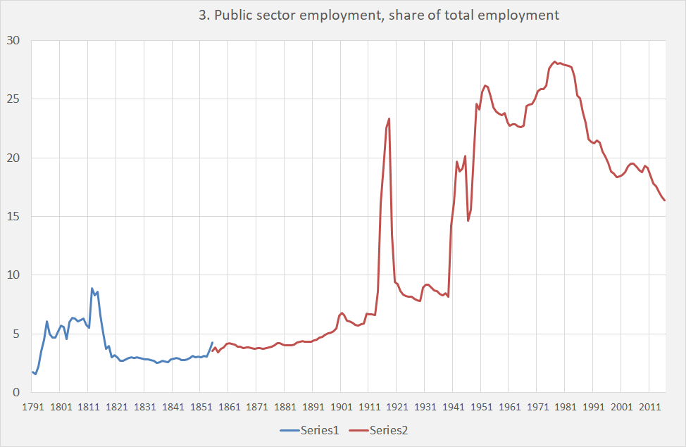
- Public employment as a share of total employment. Mind the peaks during the Napoleonic war and WW I. Mind the decline after 1980, which continues and continues… This is what you get when you sell your railways to Deutsche Bahn en privatize the postal services. Pub Quiz question: when will the NHS follow?
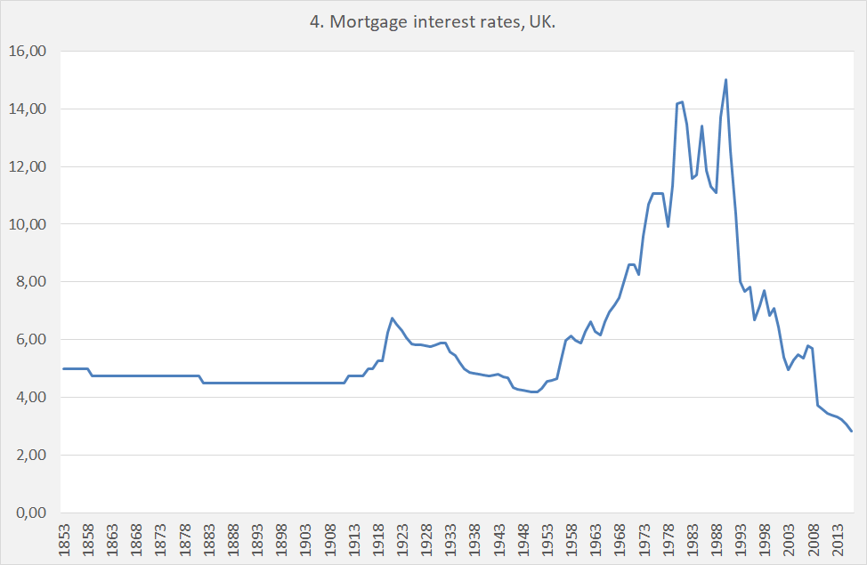
- Mortgage interest rates, showing the very low level of present rates. Prices like these are part of macro, too.
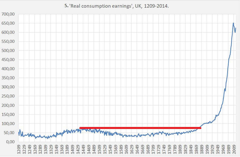
- “Real consumption Earnings” – what does a days work buy? Fogel seems to have been right when he stated that it was only after about 1895 when real earnings and prosperity increased above the max. pre-industrial level, high mortality declined and hunger became less prevalent.
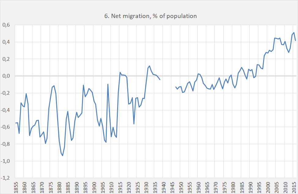
- Net migration from the UK: for a long time, people left the British islands! At least, more people left then came to stay. Migration can however only be understood from a ‘gross’ point of view. Some people come and stay, others leave. Net out migration up to around 1985 (a situation quite different from, for instance, Germany!) was quite consistent with an inflow of people from the Caribbean and South Asia. The net inflow after around 2000 coincides with the expansion of the European Union and larger inflows of East European workers.
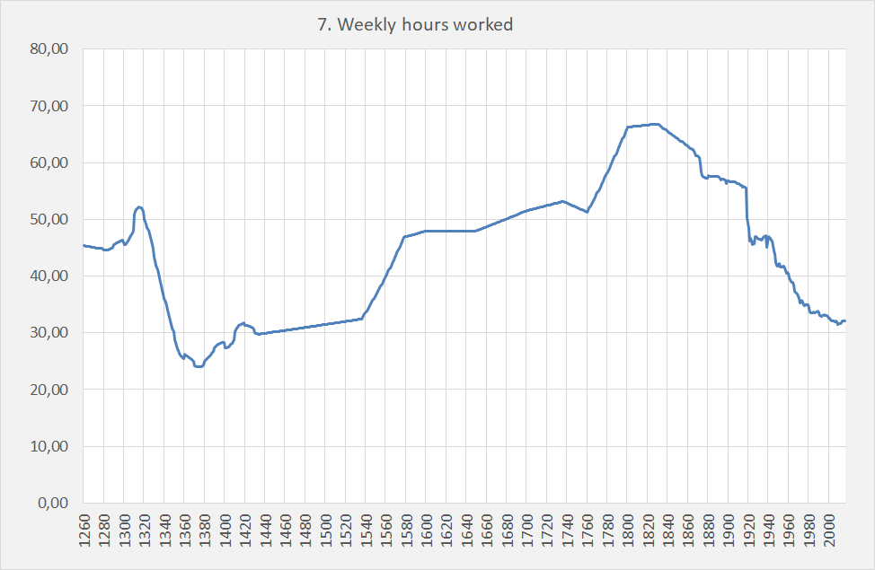
- Weekly hours worked. An addendum to Fogel: it is only since recently that we have to work less than our ancestors in the 14th century…
