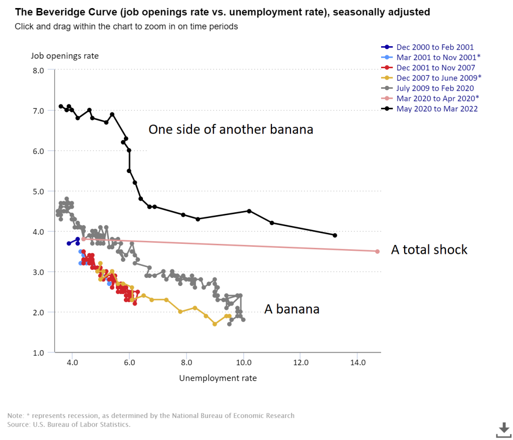
Beveridge curves are graphical representations of the historical relationship between unemployment and the job openings/job vacancy rate. They should be called ‘Beveridge Ellipsoids‘ as they are banana shaped (an ellipsoid with one bent axis, aside of banana-shaped there does not seem to be an official name for such an ellipsoid). Just calling it a ‘curve’ is somewhat misleading as the banana-shape is no coincidence but caused by labor market dynamics: high unemployment leads to an outward shift (away from the origin) of the relation between vacancies and unemployment. Calling it the ‘Beveridge ellipsoid’ (or, when explaining it to students, ‘The Beveridge Banana‘) catches these dynamics much better than calling it a curve. Anyway: How does that work and how is it related to the
Topics:
Merijn T. Knibbe considers the following as important: Uncategorized
This could be interesting, too:
tom writes The Ukraine war and Europe’s deepening march of folly
Stavros Mavroudeas writes CfP of Marxist Macroeconomic Modelling workgroup – 18th WAPE Forum, Istanbul August 6-8, 2025
Lars Pålsson Syll writes The pretence-of-knowledge syndrome
Dean Baker writes Crypto and Donald Trump’s strategic baseball card reserve
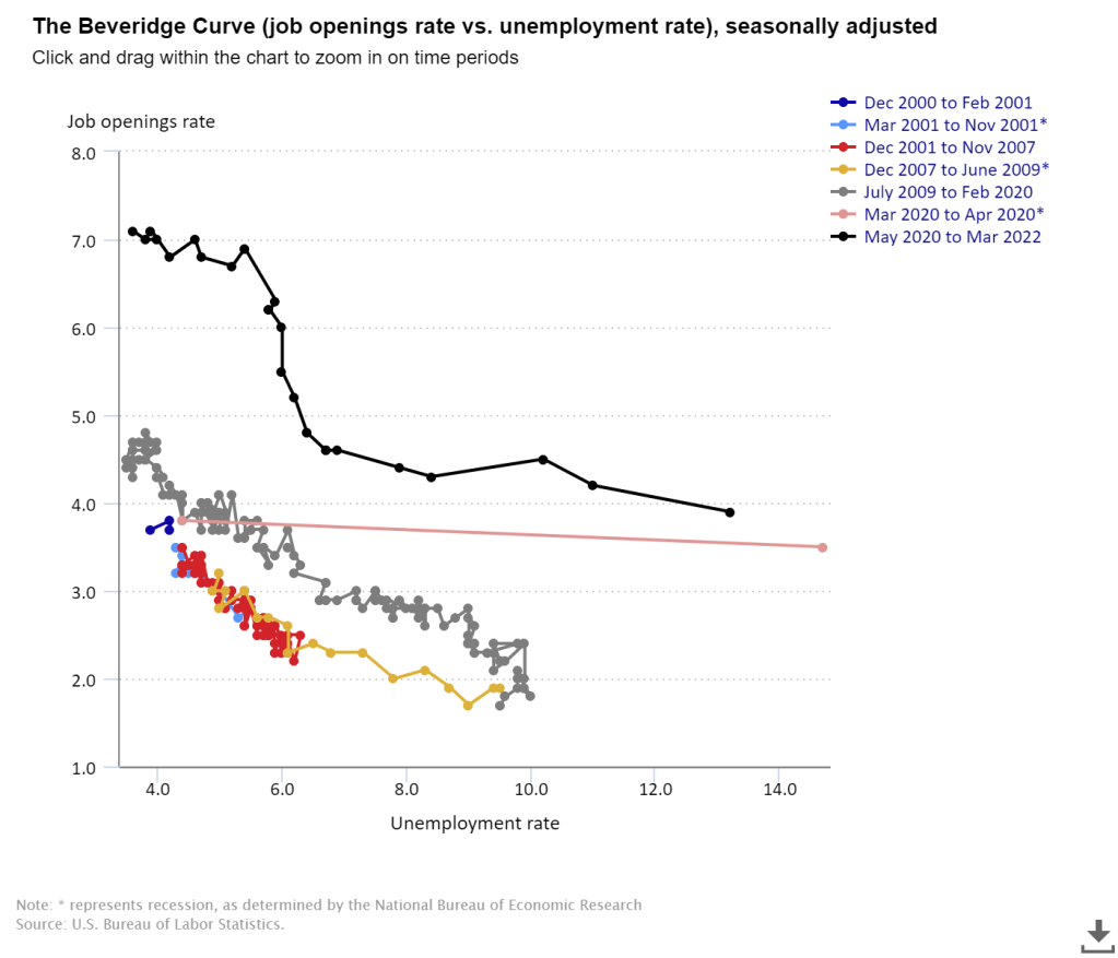
Beveridge curves are graphical representations of the historical relationship between unemployment and the job openings/job vacancy rate. They should be called ‘Beveridge Ellipsoids‘ as they are banana shaped (an ellipsoid with one bent axis, aside of banana-shaped there does not seem to be an official name for such an ellipsoid). Just calling it a ‘curve’ is somewhat misleading as the banana-shape is no coincidence but caused by labor market dynamics: high unemployment leads to an outward shift (away from the origin) of the relation between vacancies and unemployment. Calling it the ‘Beveridge ellipsoid’ (or, when explaining it to students, ‘The Beveridge Banana‘) catches these dynamics much better than calling it a curve. Anyway: How does that work and how is it related to the present, unprecedented labor market and the very large outward shift of the curve in at least the USA (Figure 1 shows USA data, below I’ll also show EU data)?
Figure 1. Beveridge Ellipsoids in the USA
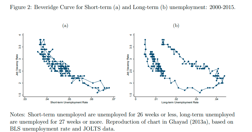
Gabriel Mathy shows (Figure 2) that the outward shift of the relationship is especially manifest for the long term unemployed. As an increase in long term unemployed is caused by cyclical declines, it are these declines which cause this outward shift.
Figure 2.
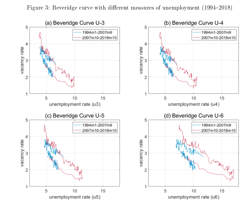
The same pattern is visible when we look at the partially employed. Andrew Crawley, Sarah Welch and Julieta Yung show that when we, instead of using ‘normal’ U3 unemployment, we use measures of broad unemployment like U4, U5 and U6 it turns out that especially when we include the people working part time for economic reasons (i.e. going from U5 to U6) we see an outward shift of the relationship (unusually high unemployment after 2009 also lead to unusually large number of people who were working part time for economic reasons). Labor market dynamics themselves lead to (at least) a considerable part of the outward shift. It’s called hysteresis: unemployment leaves scars which influence the efficiency of the labor market.
Figure 3.
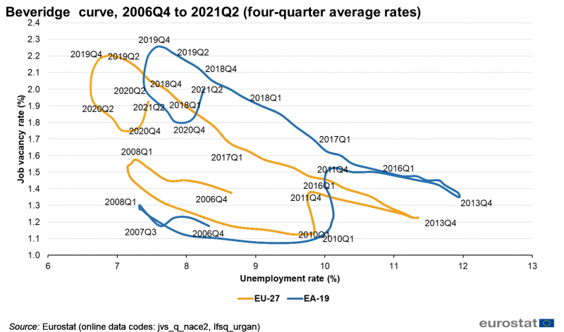
At least, for the USA. I do not have such neat data for the EU. But the banana shape is clear as is the (compared with 2008) unusually high rate of the vacancies/unemployment rate in 2022 Q1.
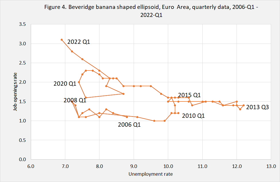
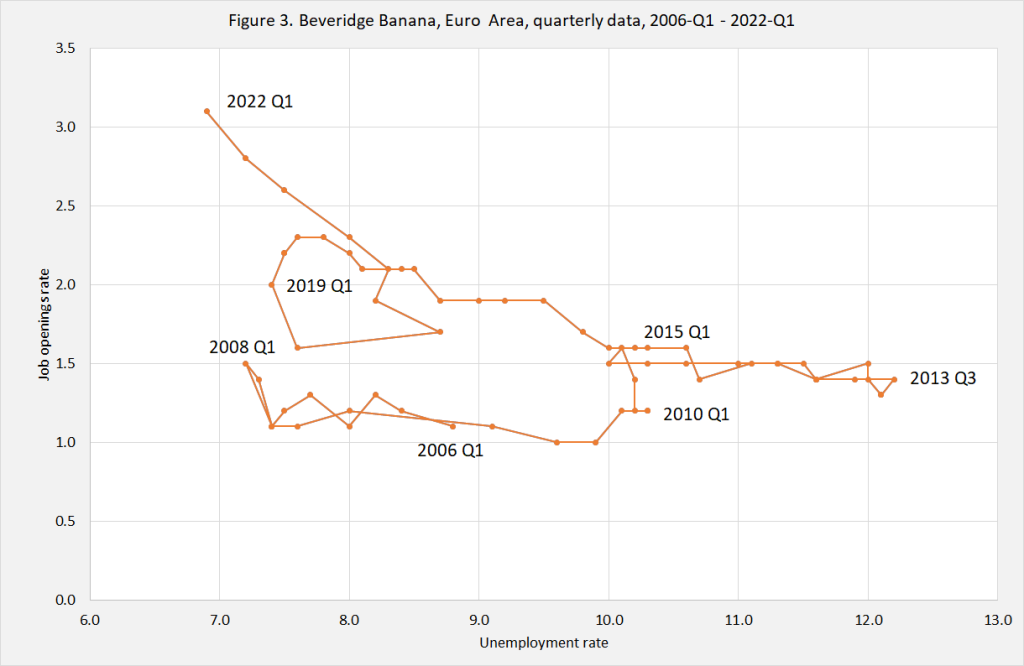
As can be seen, there sure is some kind of banana shape even when the banana is, between 2008 and 2015, rather flat. A permaslump. On the country level this is, at the moment, visible in Spain and Greece. Despite considerable declines of unemployment the vacancy rate hardly moves. Above, say, 9% unemployment there are only ‘frictional’ vacancies, no business cycle related vacancies. Events after 2020 Q1 however show that the banana shape is present in Europe, too (even when it’s the ‘Apple Banana‘ from Hawaii). The unusually high level of vacancies, compared with the still rather elevated level of unemployment, however suggests quite a bit of ‘hysteresis’. Just like in the USA (in the Euro Area, national differences may play a role, too). There might however be more than normal scarring especially as ‘normal’ unemployment in the EU has, thanks to all kinds of generous financial schemes, has not been as high as feared (the number of hours actually worked however did deteriorate massively, look here, chart 1)). Hundreds of millions have been infected with Covid, meaning that ten million people or more may have ‘long Covid’. In the Netherlands (which has 2 year sick leave) the first people long Covid patients are entering permanent disability. But others, with a milder case, may be just less employable. An increase in the number of (in the eyes of employers) ‘non-perfect’ unemployed seems to be related with outward shifts of the Beveridge ellipsoid. I’m afraid… Does anybody has evidence on this?
