From James McMahon and Blair Fix The most important feature of private ownership is not that it enables those who own, but that it disables those who do not.— Jonathan Nitzan and Shimshon Bichler A key aspect of Jonathan Nitzan and Shimshon Bichler’s theory of ‘capital as power’ is that it treats property not as a productive asset, but as a negative social relation. Property, Nitzan and Bichler argue, is an institutional act of exclusion. It is the legal right to sabotage. If this idea sounds odd to you, it is because (like most people) you think of property in terms of the things that are owned. But if you focus instead on the act of ownership, you realize that property rights are legalized exclusion, pure and simple. Nitzan and Bichler explain: Technically, anyone can get into
Topics:
Editor considers the following as important: Uncategorized
This could be interesting, too:
tom writes The Ukraine war and Europe’s deepening march of folly
Stavros Mavroudeas writes CfP of Marxist Macroeconomic Modelling workgroup – 18th WAPE Forum, Istanbul August 6-8, 2025
Lars Pålsson Syll writes The pretence-of-knowledge syndrome
Dean Baker writes Crypto and Donald Trump’s strategic baseball card reserve
from James McMahon and Blair Fix
— Jonathan Nitzan and Shimshon Bichler
A key aspect of Jonathan Nitzan and Shimshon Bichler’s theory of ‘capital as power’ is that it treats property not as a productive asset, but as a negative social relation. Property, Nitzan and Bichler argue, is an institutional act of exclusion. It is the legal right to sabotage.
If this idea sounds odd to you, it is because (like most people) you think of property in terms of the things that are owned. But if you focus instead on the act of ownership, you realize that property rights are legalized exclusion, pure and simple. Nitzan and Bichler explain:
Technically, anyone can get into someone else’s car and drive away, or give an order to sell all of Warren Buffet’s shares in Berkshire Hathaway. The sole purpose of private ownership is to prevent us from doing so. In this sense, private ownership is wholly and only an institution of exclusion, and institutional exclusion is a matter of organized power.
Of course, Nitzan and Bichler are not the first to highlight the exclusionary nature of private property. (Enlightenment thinker Jean-Jacques Rousseau did so at length in his 16th-century treatise on inequality.) But what’s new in the theory of capital as power is the focus on capitalist property rights as a form of ubiquitous social ‘sabotage’.
Nitzan and Bichler’s notion of ‘sabotage’ is inspired by the work of political economist Thorstein Veblen. Veblen was a strident social critic who wrote during the early 20th century. He took the concept of ‘sabotage’, which was associated with workers destroying their bosses’ machinery, and inverted it. Workers certainly rebelled against their bosses, but Veblen saw that a more pervasive act of sabotage came from business itself. That’s because property rights gave business the power to exclude workers from doing their job. This ‘legal right of sabotage’, Veblen argued, was the ‘larger meaning of the Security of Property’.1
Back to Nitzan and Bichler. In their theory of capital as power, Nitzan and Bichler have taken Veblen’s idea of sabotage and greatly expanded it. For Veblen, business sabotage mostly took the form of enforcing unemployment (which he called ‘discretionary idleness’). But for Nitzan and Bichler, sabotage is far more general. It is a ubiquitous outcome of private property.
It is easy to highlight specific acts of corporate sabotage. For example, Nitzan and Bichler point to the time (during the early 20th century) when US auto companies systematically bought up electric railways for the sole purpose of dismantling them. (Effective public transit, they surmised, would cut into their profits.) Or more recently, take the time when these same companies developed electric vehicles, but then shredded them (fearing they might undercut the sale of gas guzzlers). You can also see the effects of business-led sabotage in the financial and aesthetic histories of Hollywood cinema. Nefarious business behavior surrounds us.
That said, it is difficult to move from individual instances of corporate sabotage to the more general affect that capitalist property rights have on society. Still, if we want the concept of ‘sabotage’ to be scientific, we ultimately have to measure it. Doing so is our goal here.
In this series, which we are calling ‘In Search of Sabotage’, we will investigate how capitalists’ success relates to various social outcomes. If Nitzan and Bichler’s sabotage thesis is correct, a win for capitalists ought to come at the detriment of society at large.
With this idea in mind, here is the road ahead. In each installment of this series, we will pick something that we think is a social ‘bad’. (In this post we look at income inequality.) Then we’ll see how this social bad relates to capitalists’ success, as measured by Bichler and Nitzan’s power index. (We’ll explain this index in a moment.)
As we work through the data, we have no idea what we’ll find. So join us in this journey of science in action.
Quantifying capitalist power
According to the sabotage hypothesis, wielding property rights is not something to celebrate. It is a form of obstruction that harms society.
Part of this hypothesis is a simple truism. The law defines private property as the right to exclude. (The word ‘private’, Nitzan and Bichler note, comes from the Latin privatus, meaning ‘restricted’, and from privare, which means ‘to deprive’.) What is controversial about the sabotage hypothesis is the claim that private property’s exclusionary nature causes more harm than good.
To test the sabotage hypothesis, the first step is to measure capitalists’ success at enforcing corporate property rights. But how do we do that? Such a measurement sounds difficult, until we realize that capitalists do the work for us. Every day, capitalists use the ritual of capitalization to convert their property rights to a number. Then they broadcast the result far and wide. Of course, capitalists don’t call the result a ‘property-rights measurement’. They call it a ‘stock price’.
Looking at stock prices, Bichler and Nitzan propose that they offer a simple way to benchmark capitalist power. We take stock prices (which measure the ability to earn income from property rights) and compare them to wages (which measure the ability to earn income from working). Bichler and Nitzan call the result the ‘power index’:
| displaystyle text{power index} = frac{text{stock price index}}{text{average wage}} | (1) |
We will use Bichler and Nitzan’s power index as our benchmark of capitalist power.
Some power-index history: Bichler and Nitzan proposed the index in 2016 and measured its long-term history in the United States. In 2020, Joseph Baines and Sandy Hager calculated the power index for Germany, France, the United Kingdom, and Japan. In 2021, James McMahon widened the sample to 12 countries. Here we have expanded the power-index sample to 42 countries. Figure 1 shows the data.
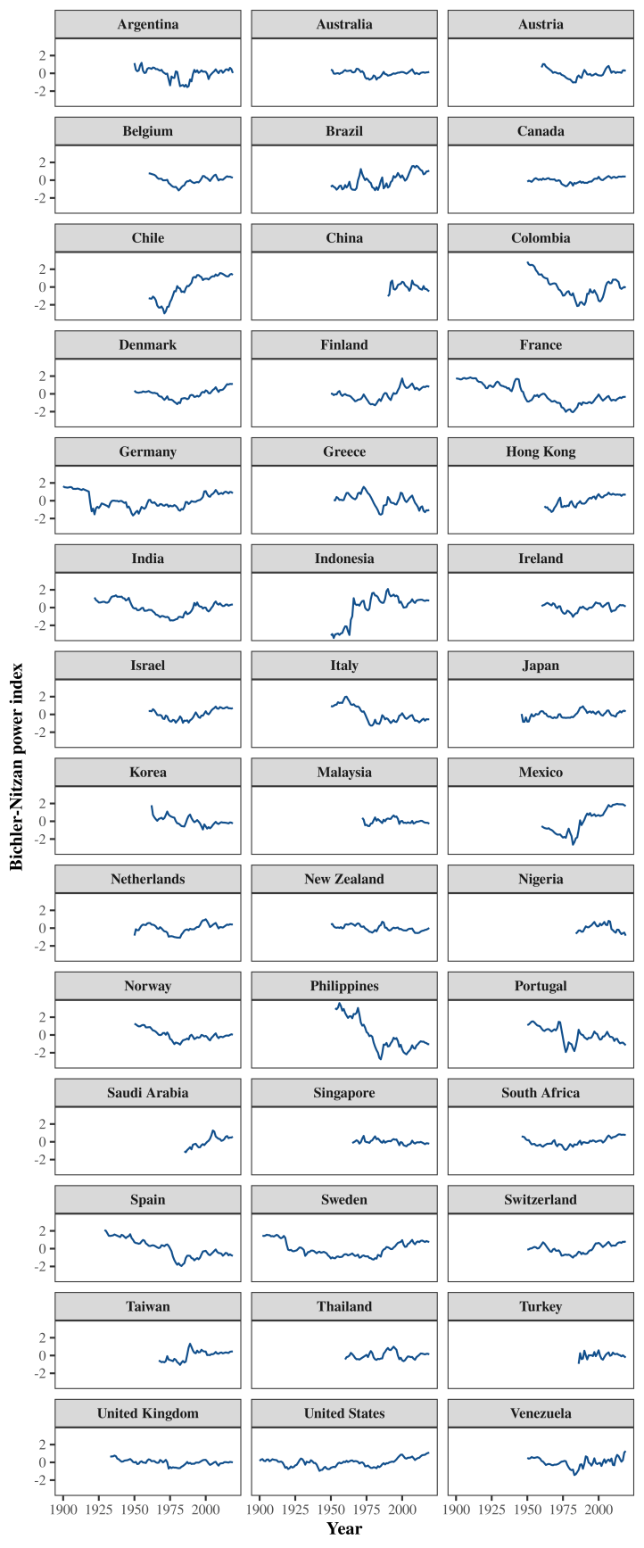
There are a few things to note about our power-index data. First, we have used national income per capita as a proxy for the average wage. (We do this because national income data is more widely available than average wage data.) Second, the absolute value of the ‘raw’ power index (as defined by Equation 1) is not comparable across countries. That’s because each country’s stock index is defined differently. Third, the power index can vary greatly over time, which means that it is more useful to study its logarithm.
In Figure 1 we plot what we call the ‘normalized power index’, which is the natural logarithm of the raw power index, normalized so that it averages 0 in each country. (For calculation details, see the Sources and methods.) It is this normalized power index that we use for the calculations that follow.
Social Bads
With our power index in hand, the next step is to see how it compares to social ‘welfare’.
We’ve used scare quotes here because in mainstream economics, the term ‘welfare’ is used in a dubious way. It is code for ‘aggregate utility’ — the sum of every individual’s utility function. The goal of ‘welfare’ economics is to optimize well-being by maximizing aggregate utility. The (embarrassing) problem is that no one has ever measured ‘utility’ — not for a single person, let alone a whole society.
In reality, ‘welfare’ has many dimensions and is defined in social-political terms. That makes its measurement inherently subjective. To measure ‘welfare’ we must define what we think is good or bad for a society, and then decide how to weight the various outcomes. It is ultimately an exercise in political theory.
To test the sabotage hypothesis, we will select things that we think are social ‘bads’, and see if they correlate with Bichler and Nitzan’s power index. We acknowledge that our decisions are based on our own values, with which you are free to disagree. (One person’s sabotage is another person’s endowment.)
Income inequality
In this first installment of ‘In Search of Sabotage’, we will test how Bichler and Nitzan’s power index relates to the social ‘bad’ of income inequality.
A host of evidence suggests that inequality is socially corrosive. Over the last two decades, epidemiologists Richard Wilkinson and Kate Pickett have shown that income inequality correlates with a wide variety of social ills. (See their book The Spirit Level for a summary of this research.) Faced with this evidence, it is hard to argue that inequality is good in itself.
With income inequality as our social ‘bad’, the next step is to decide how we will measure it. To quantify inequality, we use the income share of the top 1%. We favor this measure (over the Gini index) for a few reasons. First, an income share is easy to interpret. Second, the evidence suggests that inequality dynamics play out mostly among the rich. Measuring the top 1% income share is a simple way to capture this action.
Our inequality data comes from the World Inequality Database, which contains the most comprehensive measurements of income distribution ever compiled. Figure 2 shows the inequality trends among our 42 countries.
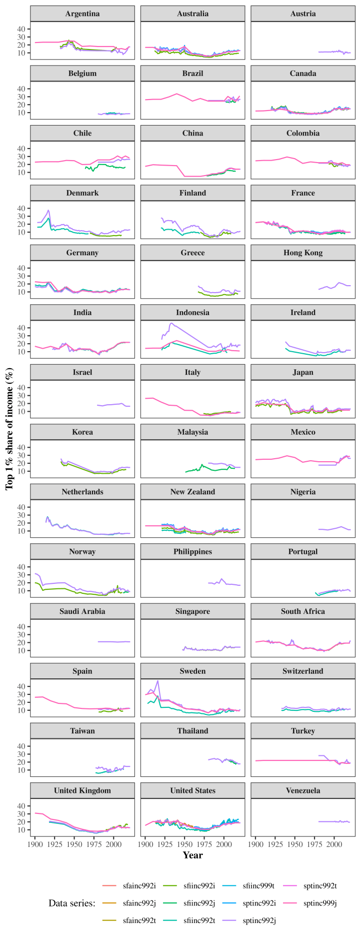
Note that there are a variety of ways to calculate the top 1% share of income, as shown by the different colored lines in Figure 2. (These various measurements use different accounting definitions, discussed in the Sources and methods.) For the analysis that follows, we use all of the available top 1% data.
Powering inequality
With our metrics for the power index and top 1% share of income in hand, we are ready for our first test of the sabotage hypothesis. Before we get to the data, though, a brief word about statistics.
We measure correlation using the Pearson correlation coefficient, which varies from -1 (perfect negative correlation) to +1 (perfect positive correlation). For each country, we calculate the correlation between the power index and all estimates for the top 1% income share. To interpret this correlation, we also estimate its uncertainty using the bootstrap technique. (For details, see the Sources and methods.)
Figure 3 shows our results. Each point indicates the correlation between the power index and the top 1% share of income within a given country, measured over the time period shown in brackets. (Note that the data coverage within this period may be incomplete.) Error bars indicate our estimates for uncertainty in the correlation.
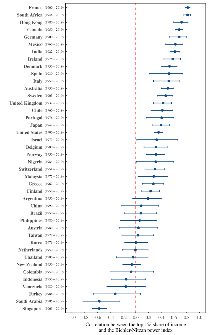
Looking at Figure 3, let’s tally the results. We find that for 15 countries (36% of our sample), there is no significant correlation between inequality and the power index. (We deem the correlation ‘not statistically significant’ when error bars cross the zero-correlation line.) In 2 countries, Singapore and Saudi Arabia, we find a significant negative correlation. And in the remaining 26 countries (62% of our sample) the power index shows a significant positive correlation with inequality.
At first glance, these results may appear less than compelling. Yes, in roughly two thirds of countries, the power index correlates positively with inequality. (This is the result we expect if capitalist property rights drive income inequality.) But what should we make of the remaining third of countries, where the power-inequality correlation is either non-significant or negative?
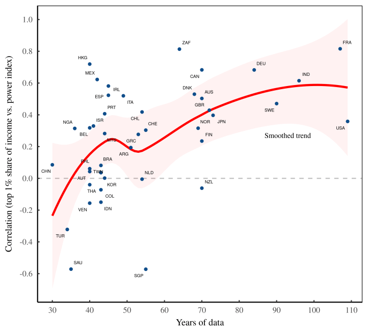
Before we cast judgement on the sabotage hypothesis, we should note that the data shown in Figure 3 are not all equal. Some correlations are based on a century of data. But other correlations are based on only a few decades of observation. Perhaps the length of the observation window affects the outcome?
To see if this is the case, let’s look at Figure 4. Here we plot the correlations from Figure 3 (this time without error bars) as a function of the number of years on which the correlation is based. The red line shows the smoothed trend. The results are clear: the longer we observe the correlation between the power index and income inequality, the more likely it is to be positive. This trend suggests that inequality moves with the power index mostly over the long term.
Summarizing the power-inequality trends
Continuing with our analysis, let’s now look at the country-level trends as a whole. In Figure 5, we show three different ways to summarize the evidence.
In this chart, we’ve taken the country-level correlations shown in Figure 3, and used box plots to represent their distribution. Each panel shows a different way to weight the results. In Panel A, we weight each country’s power-inequality correlation equally. In Panel B, we weight each country’s correlation by the number of years on which it is based. And in Panel C, we weight each country’s correlation by the total number of observations in our database. (We weight both the length of the observation window and the number of time series for income inequality.) For reference, we’ve also plotted the correlations for individual countries as points, with size indicating weight.
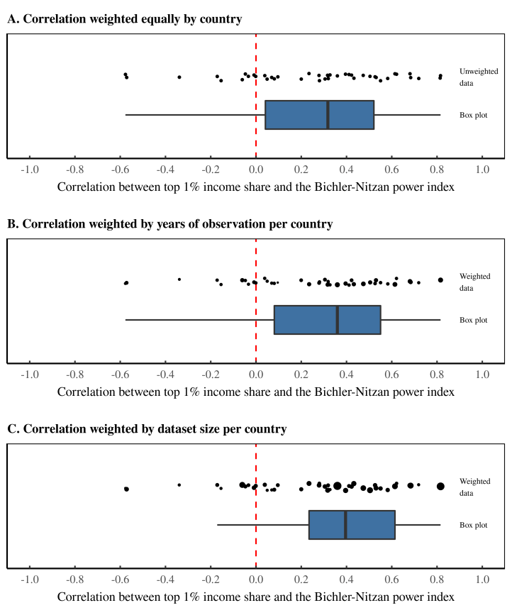
Regardless of how we weight our results, we find that the power-inequality correlation is mostly positive. But what is interesting is that when we weight for data quantity, the correlation becomes more positive. Weighting for the number of years of observation shifts the box plot to the right. And weighting for the total dataset size shifts it even more.
Why might this be?
One possibility is that there is something unique about the countries for which we have the most data. Alternatively, it could be that weighting for data quantity highlights data quality. In other words, countries that have more data might give a better representation of the ‘true’ relation between the power index and income inequality. That said, to understand why weighting for data quantity increases the power-inequality correlation, we need to … gather more data.
More generally, we should note that there are basic limitations of the power index itself. The problem, in a nutshell, is that capitalism is a global system, but the power index is a national measurement. By construction, the power index defines capitalist power in terms of a national stock market. Yet local elites need not invest solely in national stock. Germany elites, for example, could own stocks listed on the Toronto Stock Exchange. And Canadian elites could own stocks listed on the Frankfurt Stock Exchange.
To complicate things further, the ‘nationality’ of large firms is not easy to pin down. Many multinational corporations have headquarters outside the United States, yet are nonetheless listed on the S&P 500, which is ostensibly a ‘US stock index’. And regardless of ‘nationality’, S&P 500 firms as a whole earn more than half of their profit outside the United States.
In short, the global nature of capitalism means that national estimates of capitalist power are necessarily incomplete. So when possible, we should attempt to move beyond the nation-state.
Cross-country trends
With the global nature of capitalism in mind, we switch gears now to look at cross-country trends in the power index and income inequality.
We start with some caveats. When working with international data, a common approach is to directly compare values between countries. For instance, if we were studying the connection between energy use and GDP, we’d plot each country’s energy use per capita against its GDP per capita. If the two variables were related, we’d see a correlation across countries.
Unfortunately, we cannot use this method to test the sabotage hypothesis. The problem is that the power index is based on stock-market data that is not meant to be directly compared. You cannot, for instance, directly contrast the value of Japan’s Nikkei 225 index with the value of the American S&P 500. (In science speak, the two indexes have different units.) What you can do, however, is compare the relative movement of the two indexes. It is this type of comparison that you hear daily in the financial press. (As in ‘the S&P is up 5%, while the Nikkei is down 2%.’)
We can apply the same thinking to the power index. Although we cannot compare the power index’s absolute value across countries, we can compare its movement. With that in mind, let’s turn to Figure 6A. Here we have plotted the average movement of the power index across our sample of countries. (In this average, we give equal weight to each country. Note, though, that the size of the sample changes with time, as shown in Figure 6C.)
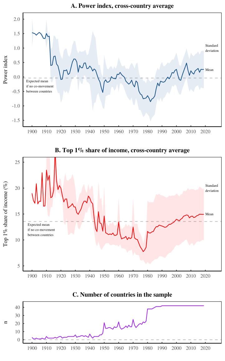
Looking at Figure 6A, let’s start with what is most interesting: the fact that there is any long-term trend in the average power index. The presence of this pattern indicates that the power index tends to move cohesively across countries. (If the power index did not move cohesively, its average would fluctuate randomly around the dashed horizontal line.) Also intriguing is the form of the long-term trend. It follows a U shape — decreasing until the 1980s, and increasing thereafter.
If you follow recent research in income inequality, the power index’s U-shaped trend should be familiar. This pattern first appeared two decades ago, when economists Thomas Piketty and Emmanuel Saez measured the long-term history of US inequality. The U shape became famous when Piketty popularized his research in 2014. And since then, the weight of evidence behind this trend has only grown stronger.
With the U shape in mind, let’s turn to Figure 6B. Here we have plotted the average inequality trend across our sample of 42 countries. (We’ve measured the average income share of the top 1%, weighted equally by country.) Again, what is surprising is that there is any long-term pattern. Given the complexities of national politics, it seems reasonable that inequality would have no coherent trend across countries. And yet it does. Moreover, the long-term trend mirrors the pattern found in the power index.
Although we should treat the trends in Figure 6 with appropriate uncertainty, it’s worth speculating about the significance of the U-shaped pattern. It effectively divides the last century into two periods:
- Before 1980, during which the power index and income inequality both declined;
- After 1980, during which the power index and income inequality both increased.
What is so important about the year 1980? The answer is obviously complicated, but can perhaps be summarized as follows: during the 1980s, there was a seismic change in the world order.
Let’s start with politics. Prior to the 1980s, there was a tense ideological battle between capitalism and communism. Frightened by the specter of communism, capitalist leaders sought to keep workers happy, leading to the expansion of the welfare state. But by the 1980s, capitalist cheerleaders had started to declare victory. (Remember Margaret Thatcher’s slogan “There is no alternative.”) The formal celebration came in 1990, when the Soviet Union collapsed. With the ‘evil empire’ gone, neoliberalism became the de facto dogma of global elites. Social-safety nets were bad. Capitalist greed was good.
This shift in global politics also came with more localized changes in capitalist-worker relations. Prior to the 1980s, the labor movement was quite strong. Year after year, it seemed that unions won more rights for workers. After the 1980s, however, unions were beaten back. Union membership plummeted, as did the propensity to strike. Unsurprisingly, wages stagnated. At the same time, the 1980s marked the beginning of a prolonged series of bull markets. Stock prices rose steadily.
All of these trends have been documented before, and their significance debated extensively. That said, we think that Bichler and Nitzan’s theory of capital as power offers a compelling way to connect the evidence. According to this theory, when stocks rise relative to wages, it signals that capitalists are consolidating power. So what we are seeing, in Figure 6A, is a U-shaped trend in global capitalist power.
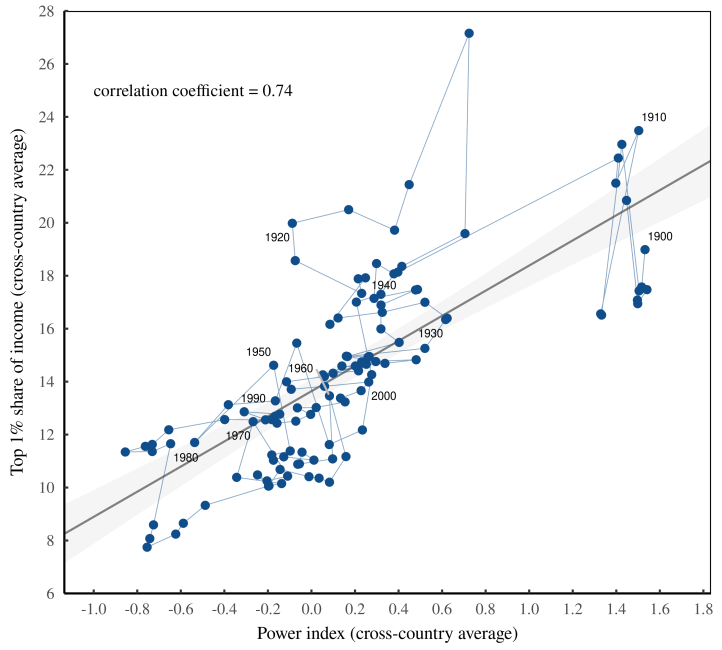
That trend, it seems, is related to inequality. Figure 6 illustrates the connection. Here we’ve taken the average power index and the average top 1% share of income and plotted them against each other. The correlation is easy to spot.
Yes, but in theory …
Looking at the evidence, we find a clear connection between Bichler and Nitzan’s power index and the rise and fall of income inequality. We think this evidence is consistent with the sabotage hypothesis — the idea that enforcing corporate property rights is a form of social sabotage.
That said, it’s worth reviewing what other theories might say about this evidence. The answer, we believe, is very little. To review, Bichler and Nitzan’s power index consists of the ratio between a country’s main stock-price index and its average wage. To our knowledge, no one prior to Bichler and Nitzan thought to focus on this ratio.2 Why? Likely because prevailing orthodoxies gave no compelling reason to do so.
Let’s start with neoclassical economics, which is the dominant school of political economy. According to neoclassical theory, stock prices and wages are both measures of ‘productivity’. (Stock prices measure the productivity of capital. And wages measure the productivity of workers.) Since any form of productivity is treated as ‘good’, there is no reason to care about the balance between stock prices and wages.
Although its logic is different, Marxist theory also overlooks the ratio at the heart of the power index. For Marx, stock prices did not indicate the productivity of capital. Instead, stocks were ‘fictitious capital’ that was unrelated to the ‘real’ economy. And since Marx based his theory of capitalism on the ‘real’ production of commodities, it followed that stock prices were of little interest.
In contrast to neoclassical and Marxist theory, Nitzan and Bichler view stock prices as neither ‘fictitious’ nor a measure of productivity. Stock prices, they argue, are an indicator of capitalists’ power to enforce property rights. And this enforcement, they continue, is a form of social ‘sabotage’. From this thinking comes the ‘power index’, and the hypothesis that its ups and downs ought to correlate with the rise and fall of social malaise.
At least when it comes to the ill of income inequality, it appears that Bichler and Nitzan are on the right track.
