From Blair Fix Economists are not known for their literary imaginations. Flip through any economics textbook and you’ll find a barrage of terms like the ‘Philips curve’ and the ‘Fisher effect’. The jargon is simple enough — empirical relations are usually named after the person who discovered them. But this convention is neither descriptive nor fun. The exception to this vanilla naming practice is a pattern called the ‘Great Gatsby curve’.1 It’s named after F. Scott Fitzgerald’s famous book The Great Gatsby, which explores the roiling inequality and tumultuous class dynamics of the 1920s. The Great Gatsby curve is an empirical relation between social inequality and social mobility. As inequality rises, social mobility tends to decline. In this post, we’ll look at the The Great Gatsby
Topics:
Editor considers the following as important: Uncategorized
This could be interesting, too:
tom writes The Ukraine war and Europe’s deepening march of folly
Stavros Mavroudeas writes CfP of Marxist Macroeconomic Modelling workgroup – 18th WAPE Forum, Istanbul August 6-8, 2025
Lars Pålsson Syll writes The pretence-of-knowledge syndrome
Dean Baker writes Crypto and Donald Trump’s strategic baseball card reserve
from Blair Fix
Economists are not known for their literary imaginations. Flip through any economics textbook and you’ll find a barrage of terms like the ‘Philips curve’ and the ‘Fisher effect’. The jargon is simple enough — empirical relations are usually named after the person who discovered them. But this convention is neither descriptive nor fun.
The exception to this vanilla naming practice is a pattern called the ‘Great Gatsby curve’.1 It’s named after F. Scott Fitzgerald’s famous book The Great Gatsby, which explores the roiling inequality and tumultuous class dynamics of the 1920s. The Great Gatsby curve is an empirical relation between social inequality and social mobility. As inequality rises, social mobility tends to decline.
In this post, we’ll look at the The Great Gatsby curve among America’s über rich. As it turns out, these folks are not immune from inequality. Nor are they immune from an ossifying social ladder. In other words, among America’s richest people, the Great Gatsby curve is alive and well.
The Forbes rat race
To make sense of what’s ahead, let’s start by recapping my work so far. In my last post, ‘How the Rich Get Richer’, I dove into the rising wealth of the Forbes 400. Figure 1 summarizes the trend. Since the 1980s, America’s über rich have gotten vastly richer. And Forbes was there to document the disease.
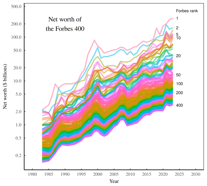
Figure 1: The net worth of the Forbes 400.
Each colored line plots the net worth of a particular rank in the Forbes 400. (The richest individual is always on top, followed by the second richest individual, and so on). Note that the vertical axis uses a log scale. [Sources and methods]
Now as usual, I Tweeted this chart; and as usual, I made some people angry. In particular, a fellow named Bryant accused me of trickery:
You do know that each line is not one/same person, right? Very misleading.
As it happens, I do know that each line is not a single person. In fact, that’s the focus of this post. While America’s über rich were getting richer, they were also playing a vicious game of thrones.
Let’s take a look at the competition.
A game of thrones
Back in 1983, Gordon Getty was the richest American. But don’t worry if you’ve never heard of him. Getty was (and is) the heir to J. Paul Getty’s oil fortune. And yes, Gordon Getty is still alive. But he’s no longer anywhere near the top of the Forbes charts. When he last graced the Forbes list in 2020, Getty sat in the 394th position. (He’s since dropped off the Forbes 400 entirely.)
Here’s the point. Yes, the richest Americans have gotten richer over the last four decades. But that doesn’t mean that the über rich of the 1980s are the same people as the über rich of today. For the most part, they are not.
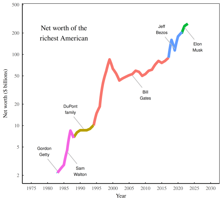
Let’s use the top spot as an example. Since 1983, six men (yes, all men) have crowned themselves the ‘richest American’. Figure 2 documents their reign, and their rising net worth.
After Gordon Getty’s brief stint at the top, Walmart owner Sam Walton assumed the richest-American throne for much of the 1980s. He was then succeeded by Pierre DuPont II (and family).2 In 1995, Bill Gates claimed the top spot, riding the coat tails of his Microsoft monopoly. After a two decade reign, Gates was dethroned in 2018 by Amazon owner Jeff Bezos. Bezos wore the crown until 2022, when it was taken by Elon Musk.
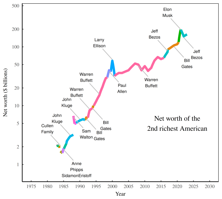
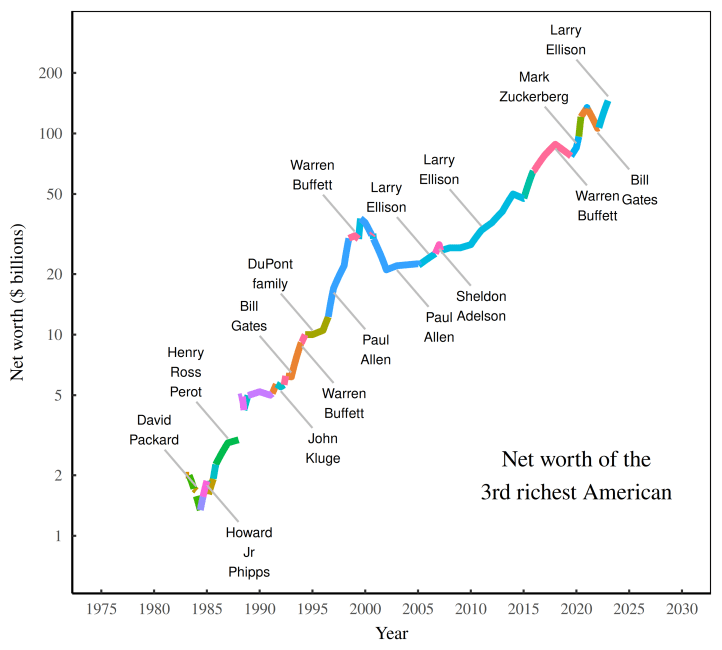
Looking at Figure 2, we could paint a similar picture for every rank within the Forbes 400. But since making four hundred charts would be a bit tedious, let’s only gaze at two more graphs. Figures 3 and 4 show the succession history for the 2nd and 3rd richest American. The story is familiar:
- There’s been a series of successions;
- Despite these successions, the rich have gotten richer.
Looking ahead, I’m going to try to connect these two patterns.
Fractal inequality
Now that we’ve watched the game of thrones among the three richest Americans, let’s return to the rise of wealth inequality. Since the 1980s, the wealthiest Americans have gotten richer, both in dollar terms, but also relative to other Americans.
Figure 5 shows one way to look at the pattern. The colored lines plot the net worth of the three richest Americans, measured relative to the American median wealth. The trend may look linear, but don’t be fooled. The vertical axis uses a log scale. Since 1983, the relative net worth of the richest American increased by about a factor of forty. The second and third spots were not far behind.
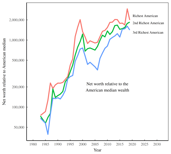
So in modern American, the rich have gotten richer relative to the average person. But that’s not all. It turns out that there’s a fractal pattern to this rising inequality. No matter where we look, we find that the rich have pulled away from their less-fortunate brethren.
Take the Forbes 400 as an example. By any reasonable standard, every member of the Forbes 400 is jaw-droppingly rich. Yet even within this menagerie of elites, the rich have gotten richer.
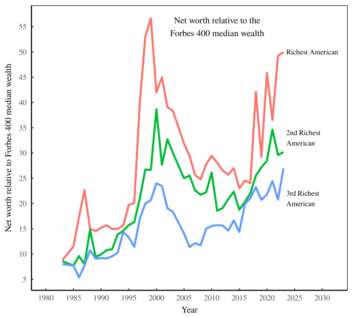
Figure 6 shows the trend. Again, the colored lines plot the net worth of the three richest Americans. But check out what their net worth is pegged against. That’s right, I’ve plotted the net worth of the three richest Americans relative to other extremely rich people — in this case, the median wealth of the Forbes 400.
Let’s have a taste of some of these numbers. In 1983, the richest American was worth about 10 times more than the median member of the Forbes 400. Fast forward to 2023, and that value has increased to a factor of 50. Let’s say that again. Elon Musk is so rich that he’s 50 times richer than the Forbes 400 median. (And that’s not even the most extreme observation. In the late 1990s, Bill Gates was over 55 times richer than the Forbes 400 median.)
Richer and more unequal
To summarize our story, rising American inequality has had a fractal form. Over the last 40 years, the rich have pulled away from the average American. At the same time, the über rich have pulled away from the merely mega rich.
Now I recognize that there’s going to be little sympathy for the declining (relative) status of the mega rich. Outside of their posh circle, no one cares that the mega rich are losing ground to the ultra rich. Still, the fractal nature of inequality means that the mega rich are good for at least one thing: they can be our inequality guinea pigs.
In particular, I want to know if, like the rest of us, the mega rich experience the Great Gatsby curve — the tendency for growing inequality to come with ossifying social mobility. But I’m getting ahead of myself. Before we can look at wealth mobility among the mega rich, we need to measure wealth inequality.
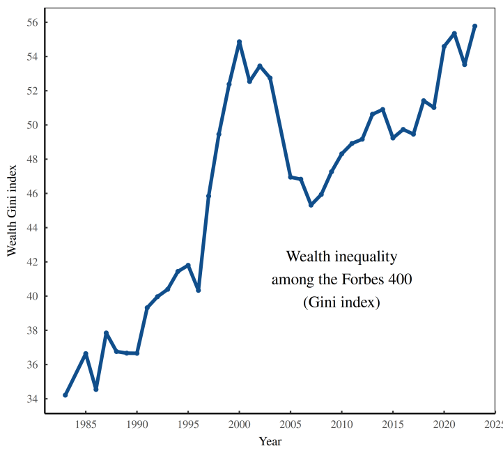
Let’s do that now. Figure 7 shows wealth inequality among the Forbes 400, measured using the Gini index. The pattern is consistently upwards, albeit with a big jump in the late 1990s. In my next post, I’ll investigate what’s driving this rising Forbes inequality. But for now, let’s just take it as an empirical fact. In modern America, the rich have gotten more unequal.
From rat race to rat regime
Let’s return to the rich-person rat race. In Figures 2 – 4, we saw how wealthy Americans battled to maintain their spot at the top of the Forbes list. Some individuals lasted longer than others. But no one held their throne indefinitely.
What we’ll do now is get more rigorous with our analysis of this game of thrones. Sure, thrones have changed hands. But has the pace of the game changed? In other words, what’s happened to wealth mobility among the Forbes elite?
As you’ll see, the über-rich game of thrones seems to have ossified. But before we get to this pattern, we need to review some technical details. I need to show you how I measure wealth (im)mobility. With that in mind, let’s look at Figure 8.
Here, each point represents a person — a onetime member of the Forbes 50 (the fifty richest Americans). On the x–y axes, I’ve plotted the person’s Forbes rank in two consecutive years. The horizontal axis shows rank in 1985, while the vertical axis shows rank in 1986. (Note that both scales are reversed.)
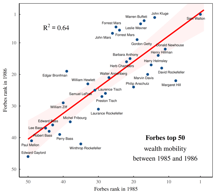
Looking closely at the blue points in Figure 8, you can see that the dot in the upper right corner is Sam Walton — America’s richest person in 1985 and again in 1986. Now, if everyone was like Sam, retaining their wealth rank year to year, our chart would have no jitter. The blue points would form a perfect diagonal line, up and to the right. But obviously that’s not what happens.
Instead, the points have significant scatter, indicating that the Forbes rat race was fairly dynamic. Year to year, most people changed ranks. For example, oil heiress Margaret Hunt Hill dropped from the 8th to 22nd spot. And TV mogul John Werner Kluge jumped from the 14th to the 2nd spot. This jumping creates scatter in our chart. And the scatter is how we’ll quantify wealth (im)mobility.
But I’m getting ahead of myself again. To judge whether wealth (im)mobility is large or small, we need context, meaning we need to compare different observations. So let’s redo the analysis by moving the clock ahead a few decades to 2019/2020. Figure 9 shows the results. Again, I’ve plotted Forbes ranks in two consecutive years (this time in 2019 and 2020). But note how compared to Figure 8, there’s palpably less jitter. In other words, by 2019, members of the American über rich were changing ranks much less than they did forty years ago. The game of thrones seems to have ossified.
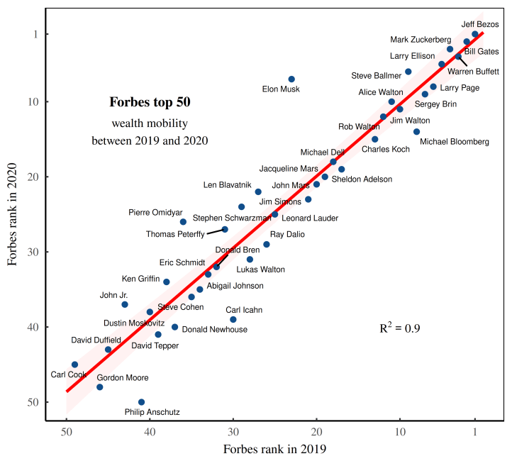
Now to the numbers. Looking at Figures 8 and 9, the amount of scatter in each chart indicates the degree of wealth mobility among the Forbes 50. Or put the opposite way, the lack of scatter indicates the degree of wealth immobility.
We want to quantify this lack of scatter. We’ll do it using the R2 value of a linear regression, which puts the scatter on a one-point scale. A value of zero indicates complete scatter, meaning Forbes wealth is extremely mobile, year to year. A value of one indicates no scatter, meaning Forbes wealth is extremely immobile.
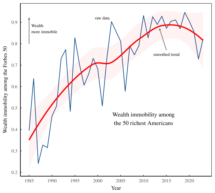
So that’s our wealth immobility metric. Now let’s get to the exciting part, which is seeing how this metric changes over time. With the Forbes 50 as our guinea pigs, let’s watch the rise of wealth immobility among the richest Americans. Figure 10 shows the trend. Admittedly, the raw data is fairly noisy. Still, the upward pattern is easy to spot. Among the richest Americans, it seems that the rat race has been turning into more of a rat regime. Wealth has steadily become more immobile.
Gatsby among the über rich
Now that we’ve crunched the numbers on Forbes wealth immobility, we’re ready to return to our friend the Great Gatsby curve — the tendency for social immobility to rise as social inequality increases.
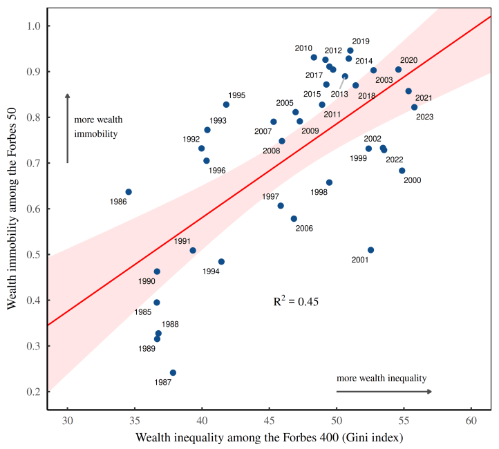
It turns out that the American über rich have their own version of this curve. Figure 11 shows its form. As Forbes wealth became more unequal (horizontal axis), it also become more immobile (vertical axis). And there we have it — the Great Gatsby curve among the über rich.
Power ensconced
So why does the Great Gatsby curve exist? Well, that’s a question with a book-length answer. But in principle, I think the phenomenon is quite simple. At the most basic level, enforcing inequality requires ensconcing power.
The reasoning here is that income and wealth stem from social control. In other words, if you give people power, they will use it to enrich themselves. And as that power becomes ensconced, social mobility declines and inequality grows.
To understand this principle, think of the extremes reached during feudalism. In his book Power and Privilege, sociologist Gerhard Lenski notes that feudal societies were among the most unequal to ever exist. And it’s not hard to understand why. The feudal class system — decreed at birth and rigidly enforced by religion — was a recipe for ensconcing power and thereby maintaining extreme inequality.
Speaking of feudalism, lately there’s been lots of talk that modern society is headed towards something that’s no longer ‘capitalism’. (Yanis Varoufakis has captured the zeitgeist with his new book Technofeudalism.) Whether this thinking is correct is ultimately a game of definitions. But there’s no denying that we’re headed in an unsavory direction.
For my part, I agree with Jonathan Nitzan and Shimshon Bichler, who argue that the fundamental feature of capitalism isn’t ‘the market’. It’s the regime of property rights. And the thing about property rights is that they have always been inherently regressive. They can be accumulated without end. And they can be handed to the next generation, thereby ensconcing power.
So in my view, capitalism has been ‘progressive’ to the degree that democratic society has placed limits on the accumulation of property-based power. It just happens that over the last forty years, elites have managed to dismantle much of this democratic oversight.
Hence big business is now ‘free’ to accumulate monopoly power. And corporate top brass are ‘free’ to enrich themselves through an endless loop of stock buybacks. It’s only fitting that the resulting extreme wealth inequality and turgid social immobility are evident in data collected by Forbes, a rabid cheerleader of unhinged capitalism.
Hi folks. I’m a crowdfunded scientist who shares all of his (painstaking) research for free. If you think my work has value, consider becoming a supporter.
