From Blair Fix The rich get richer. It’s a phrase that packs a lot of punch. It’s potent rhetoric, yet surprisingly accurate at describing how rising inequality plays out. Of course, there’s nothing inevitable about the rich getting richer. We just happen to live in an age of growing corporate despotism. And our friends at Forbes have been there to document the disease. Forbes. Forbes who loves the free market. Forbes who loves obscene wealth. Forbes … the unwitting social scientist? When Malcolm Forbes started publishing his rich list — the Forbes 400 — back in 1982, he surely wasn’t intending to do social science. By all accounts, Forbes simply loved opulence, and wanted to celebrate those who had the most of it. It was part of a 1980s trend that fetishized obscene fortunes. For the
Topics:
Editor considers the following as important: Uncategorized
This could be interesting, too:
tom writes The Ukraine war and Europe’s deepening march of folly
Stavros Mavroudeas writes CfP of Marxist Macroeconomic Modelling workgroup – 18th WAPE Forum, Istanbul August 6-8, 2025
Lars Pålsson Syll writes The pretence-of-knowledge syndrome
Dean Baker writes Crypto and Donald Trump’s strategic baseball card reserve
from Blair Fix
The rich get richer.
It’s a phrase that packs a lot of punch. It’s potent rhetoric, yet surprisingly accurate at describing how rising inequality plays out.
Of course, there’s nothing inevitable about the rich getting richer. We just happen to live in an age of growing corporate despotism. And our friends at Forbes have been there to document the disease.
Forbes.
Forbes who loves the free market. Forbes who loves obscene wealth. Forbes … the unwitting social scientist?
When Malcolm Forbes started publishing his rich list — the Forbes 400 — back in 1982, he surely wasn’t intending to do social science. By all accounts, Forbes simply loved opulence, and wanted to celebrate those who had the most of it.
It was part of a 1980s trend that fetishized obscene fortunes. For the middle class, there was the saccharine show ‘Lifestyles of the Rich and Famous’, which exalted the excesses of elite living. But for the upper class there was something less crass — a list that ignored the material trappings of wealth. It was called the Forbes 400, and it did nothing but report the raw numbers of capitalism — the capitalized wealth of the richest Americans.
In hindsight, Malcolm Forbes’ obsession with wealth seems ominous — kind of like the Sackler’s claim that OxyContin wasn’t addictive. But while Malcolm Forbes certainly cheerled the excesses of modern capitalism, he (and his magazine successors) also left an exquisite record of how US elites enriched themselves.
Sure, the enrichment left a big mess. But for the moment, let’s forget about cleaning it up and instead, investigate how it happened. Come, let’s look at how the American rich got richer.
Charting the Forbes 400
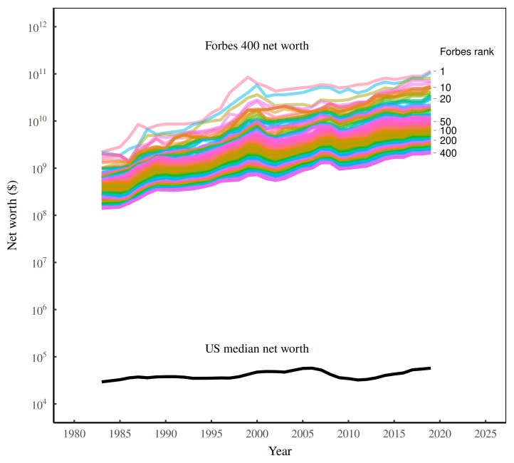
Whenever I get my hands on a new dataset (in this case, I spent weeks scraping Forbes data), the first thing I do is plot the whole shebang. To that end, Figure 1 shows the net worth of every person on the Forbes 400 list from 1983 to 2023. Behold, the Forbes rainbow!
Backing up a bit, each colored line in Figure 1 tracks the net worth of a particular wealth rank (and not the net worth of a specific individual). So by design, the chart produces a rainbow, with the richest American at the top, followed by the second richest, and so on, down to the 400th-richest spot.

There’s a lot of information in Figure 1. But for now, let’s focus on the trend, which is quite simple. The lines go up. In short, over the last four decades, the richest Americans got even richer.
Let’s use the top spot to illustrate the gains. In 1983, Gordon Getty topped the Forbes 400 with a net worth of roughly $2 billion. By 1999, Bill Gates lifted the number-one spot up to $85 billion. And in 2023, Elon Musk topped the charts with a net worth of over $200 billion. All told, the wealth of the richest American grew one-hundred-fold.
The rich got richer.
Riches in context
The caveat to Figure 1 is that I’ve plotted net worth in nominal dollars, which means the trend lacks context. Sure, the Forbes 400 got richer over the last forty years. But so what? It could be that over the same period, all Americans got richer. In that case, it’s not particularly meaningful to say that the rich got richer. Everyone got richer.
Except they didn’t.
It turns out that unlike the Forbes 400, the average American saw little change in their net worth over the last four decades. Figure 2 provides the context. To judge the net worth of the Forbes rainbow, compare it to the black line, which plots the net worth of the median American. Do you see what happened to the black line over time? That’s right … not much. For forty years, Americans’ median net worth hardly budged.1

So the Forbes 400 have gotten richer in dollar terms. But more importantly, they’ve gotten richer relative to everyone else.
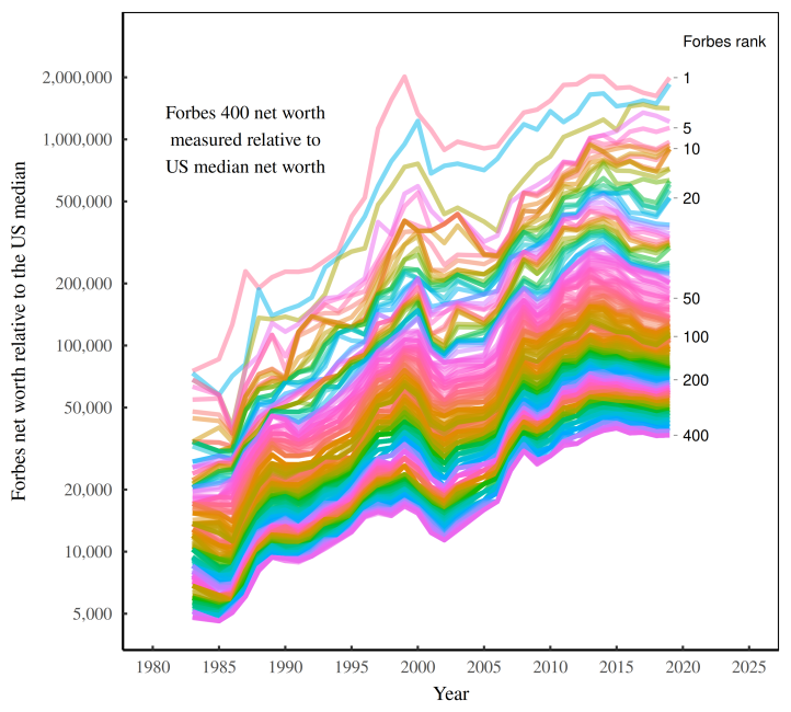
Back in 1983, Gordon Getty — then the richest American — was worth about 75,000 times the net worth of the median American. But by 2019, Jeff Bezos — the new number one — was worth an astonishing 2 million times the American median net worth. This, my friends, is what we call filthy rich.2
Figure 3 shows the filth in rainbow form — the net worth of the Forbes 400, measured relative to the US median wealth.

A barometer for inequality
What’s fascinating about rich lists like the Forbes 400 is that their authors seem oblivious to what they’re measuring. While ostensibly celebrating ‘wealth’, these lists are actually a barometer for social inequality.
You see, rich lists are only interesting when the richer get richer. On that front, they are similar to reports about murder rates. When murder rates go up, it’s front page news. But when murder rates go down, the trend is buried in the back of the paper.
And so it goes with rich lists. Had Malcolm Forbes created the Forbes 400 in the 1950s, he’d have received little attention. That’s because at the time, wealth inequality was trending down, meaning the richer were (in relative terms) getting poorer. While leftist social scientists might celebrate this downward trend, it’s not the kind of lurid news that sells magazines.
Fast-forward to the 1980s, and the stage was set for rich-list peddling. American elites were busy slashing taxes on the rich, gutting anti-trust laws, crushing unions, and deregulating Wall Street. As a new gilded class arose, Forbes was there to cheer it on. And in so doing, it documented how the rich got richer.
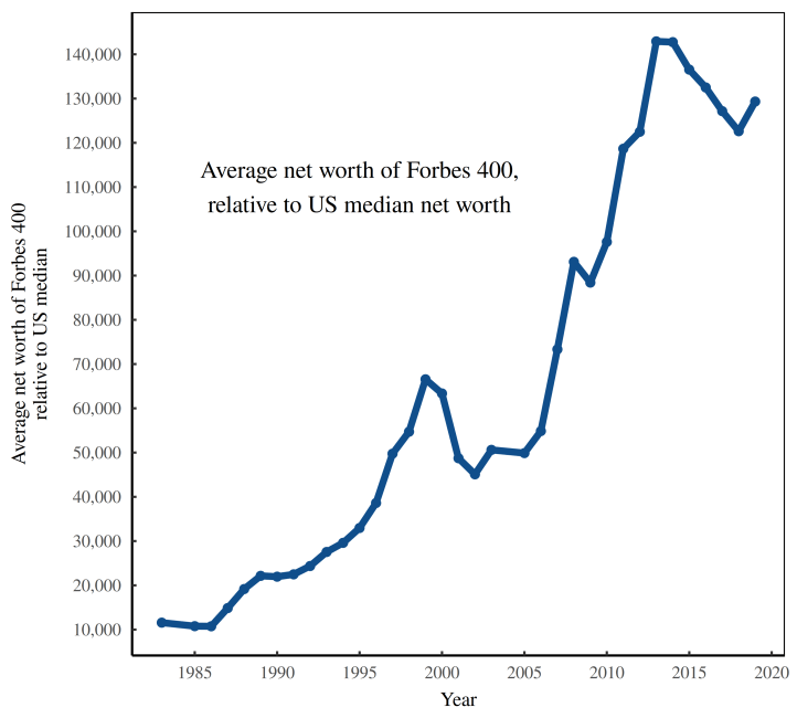
Figure 4 boils the story down to a single line. The blue curve shows the average wealth of the Forbes 400, measured relative to the net worth of the median American. The line goes up at an astonishing pace — increasing by a factor of ten over the last forty years.

Here’s the bottom line. While Malcolm Forbes was busy celebrating immense wealth, his data was serving as an archive of American inequality. And in hindsight, that’s important. However cavalier the Forbes rich list may seem, it serves as a consistency check against inequality data gathered by ‘serious’ social scientists.
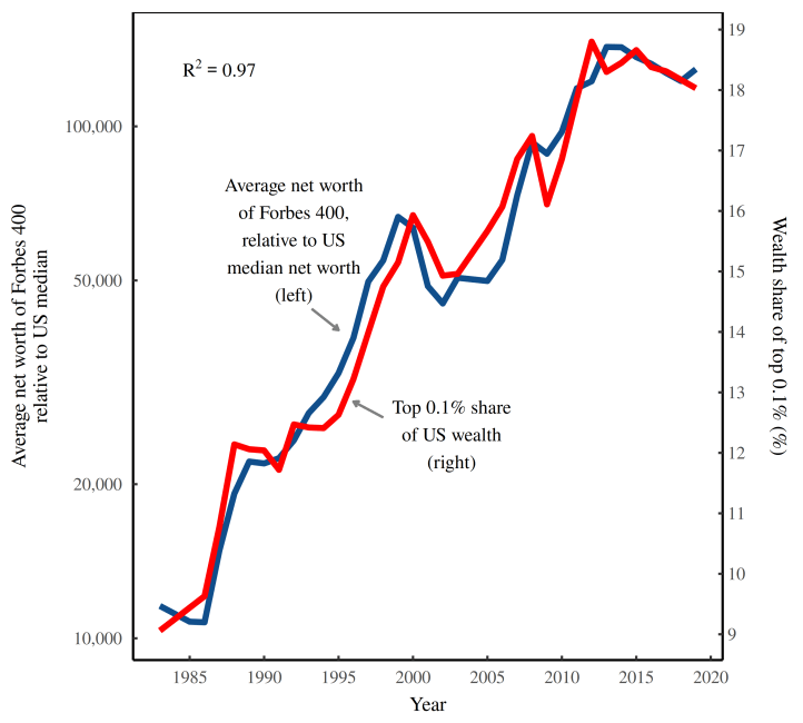
For example, the World Inequality Database now hosts a barrage of data about wealth inequality. Looking at Figure 5, the red curve shows one of their estimates — the share of wealth held by the top 0.1% of Americans. When we compare this ‘serious’ data to the wealth-cheerleading numbers from Forbes (blue line), we get a stunning correlation. In other words, the folks at Forbes are unwitting social scientists who documented the rise of American inequality with meticulous accuracy.

A fortuitous fetish
The funny thing about historical data is that it often gets used in ways that its creators could never imagine. Surely Malcolm Forbes had no interest in measuring inequality. Yet his fetish for documenting great fortunes left us with a pristine record of how US elites enriched themselves over the last four decades.
And there is more to this story. As it turns out, inequality is written everywhere in the Forbes data. When the rich get richer, it’s not just the Forbes 400 who pull away from everyone else. Within the Forbes 400, the stupendously rich pull away from the ultra rich, who pull away from the mega rich, who pull away from the considerably rich, and so on. At a certain point, we run out of adjectives to describe the hand of inequality. Fortunately, the story is easy to tell with charts.
Actually, the story is easy to read, but not particularly easy to write. Which is to say that I’m still crunching numbers. So for the tale of elite inequality, you’ll have to wait for my next look at the Forbes data.
