How close are we to “full employment”? As I pointed out Friday, there was a lot of good news underneath the headline jobs gain — primarily in labor force participation and underemployment. So, how close are we to “full employment,” based on the last few expansions? Let’s start with the simple, straightforward unemployment rate of 3.9%. This is already considerably below the best reading of the 2000s expansion, and only 0.1% above the best reading of the 1990s expansion, which was tied two months ago in May: But of course that isn’t the end of it. Much attention has been paid to the U-6 underemployment rate, which reached a new expansion low of 7.5%. To begin with, there are actually 6 “alternative measures of labor underutilization” in the
Topics:
NewDealdemocrat considers the following as important: Taxes/regulation, US/Global Economics
This could be interesting, too:
Joel Eissenberg writes How Tesla makes money
Angry Bear writes True pricing: effects on competition
Angry Bear writes The paradox of economic competition
Angry Bear writes USMAC Exempts Certain Items Coming out of Mexico and Canada
How close are we to “full employment”?
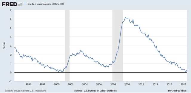
Let’s start with the simple, straightforward unemployment rate of 3.9%. This is already considerably below the best reading of the 2000s expansion, and only 0.1% above the best reading of the 1990s expansion, which was tied two months ago in May:
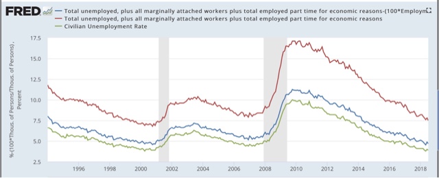
But of course that isn’t the end of it. Much attention has been paid to the U-6 underemployment rate, which reached a new expansion low of 7.5%.
To begin with, there are actually 6 “alternative measures of labor underutilization” in the jobs report, U-1 through U-6. U-6 consists of total unemployed (U-3, shown below in green) + “discouraged workers” (U-4) + “all persons marginally attached labor force” (U-5, blue) + those “employed part time for economic reasons” (red):
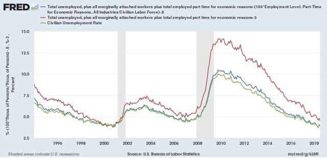
Even a cursory glance shows that U-3 and U-5 seem to move in tandem, with U-6 more variable. To show that better, the below graph takes the same three series and norms them to their readings at the peak of the 1990s tech boom:
You can see the U-5 is already right in line where it was then. It is only U-6 that remains elevated, i.e., only the percentage of those who are working part time involuntarily, which is about 0.8% higher than in 1999.
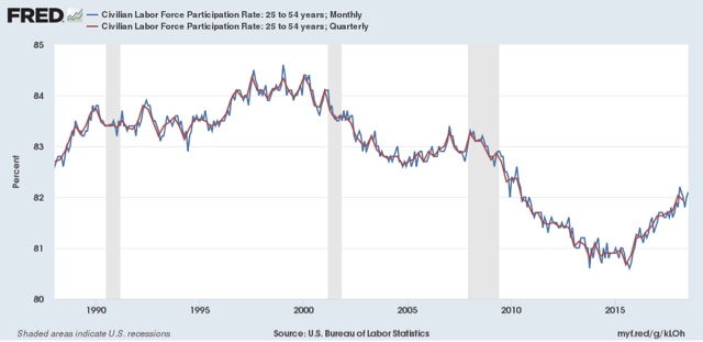
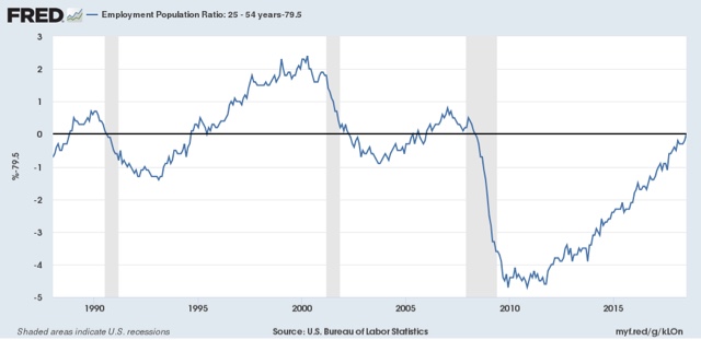
In addition to the higher percentage of involuntary part time workers, let’s look at prime age labor force participation (first graph below, red is quarterly average) and the prime age employment population ratio (second graph, normed to zero at its current reading of 79.5%):
The prime age employment population ratio in particular is 0.8% below its level at the peaks of both the 1980s and 2000s expansion. It is 2.4% below that of the 1990s tech boom.
I doubt that we have to go all the way to the levels of the tech boom, which was after all only the second real boom of the last 60 years. Since the population of those age 16 through 64 is 206.5 million, increasing employment by 0.8% will take 1.65 million jobs over and above further population growth. If the prime age employment ratio continues to grow at the 0.9% rate it has in the last year, we should arrive at “full employment” participation levels in the next 10-12 months.
Further, if involuntary part time employment continues to shrink at the -1% YoY level it has in the last 12 months, or about 1.3 million growth in full time vs. part time jobs, we should arrive at “full, full-time employment” in about 9 to 10 months.
I don’t know how much longer this expansion lasts before employment begins to fall at the outset of a recession, but based on my most recent long term forecast (slowdown but no recession in the next 12 months), it is a reasonable bet that, for at least some brief period, we will get to the above levels of “full employment.”

