Coronavirus dashboard: Groundhog Day Today is Groundhog Day, America’s version of the midwinter festival, where people can at least begin to look ahead to the coming of spring in the near future. That’s a good analogy for where we are in the COVID pandemic. Let me start with the ghastly news.First, there have been over 26 MILLION confirmed cases. Since many unsymptomatic cases have gone undiagnosed, it is very likely that over 33 million, or 1 in every 10 Americans, has been infected with the disease: Further, in the 10 worst hit States, roughly 1 in every 500 people in the entire population has died. In the case of New Jersey, it’s 1 in 400: As has been the case throughout the pandemic, panic has bred caution. The total number of
Topics:
NewDealdemocrat considers the following as important: coronavirus dashboard, Healthcare
This could be interesting, too:
Bill Haskell writes Families Struggle Paying for Child Care While Working
Joel Eissenberg writes RFK Jr. blames the victims
Joel Eissenberg writes The branding of Medicaid
Bill Haskell writes Why Healthcare Costs So Much . . .
Coronavirus dashboard: Groundhog Day
Today is Groundhog Day, America’s version of the midwinter festival, where people can at least begin to look ahead to the coming of spring in the near future. That’s a good analogy for where we are in the COVID pandemic.
Let me start with the ghastly news.
First, there have been over 26 MILLION confirmed cases. Since many unsymptomatic cases have gone undiagnosed, it is very likely that over 33 million, or 1 in every 10 Americans, has been infected with the disease:

Further, in the 10 worst hit States, roughly 1 in every 500 people in the entire population has died. In the case of New Jersey, it’s 1 in 400:

As has been the case throughout the pandemic, panic has bred caution. The total number of new infections in the past week has been at a 3 month low: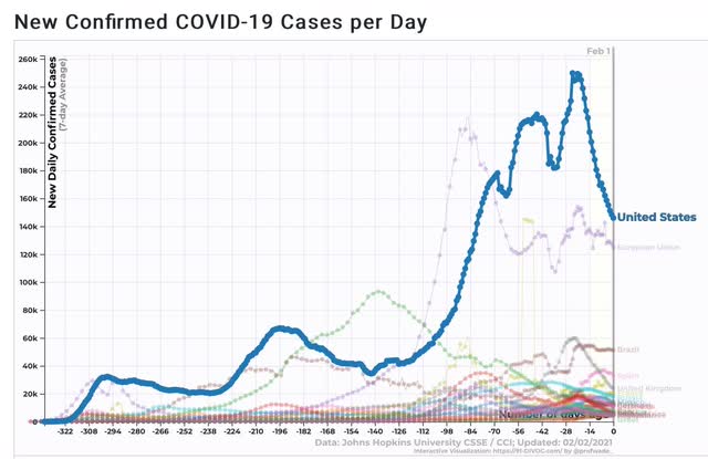
And all 4 regions of the country are showing a decline, with the lowest regions being the warmer ones of the South and West Coast, where presumably people are engaging in more activity outdoors rather than risky indoor groups:

The States which have historically done the best in this pandemic: Maine, Vermont, Oregon, and Alaska, continue to do well, as shown in the below graph of the 10 States and territories with the lowest death rates, plus Ontario, Canada for comparison:
 Finally, vaccine administration is continues to ramp up arithmetically, currently averaging 1.35 million doses daily for the past week:

At the current rate of increase, we will be at 2 million doses a day in about 3 weeks. That would enable us to vaccinate the entire population by the end of this year.
The best news of all comes from this spreadsheet. In the trials for the five leading vaccines, about 75,000 people were vaccinated. Exactly *ZERO* of the participants subsequently have been hospitalized or died of COVID:
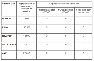
These are simply extremely effective vaccines.
Spring is coming.