Five graphs for 2017: mid year update – by New Deal democrat At the beginning of the year, I identified 5 trends that bore particular watching, primarily as potentially setting the stage for a recession next year. Now that we are halfway through the year, let’s take another look at each of them. #5 Gas Prices One potential pressure point on the economy was gas prices, which appear to have made a long- bottom in January of 2016. As they began to rise, consumer inflation has increased from non-existent to almost 3%. So the issue was, will they rise even further and drive inflation even higher? And the answer so far this yeear has been a resounding “No!” Typically it has taken a 40% YoY increase in gas prices to shock the consumer. Gas price increases did
Topics:
NewDealdemocrat considers the following as important: US/Global Economics
This could be interesting, too:
Joel Eissenberg writes How Tesla makes money
Angry Bear writes True pricing: effects on competition
Angry Bear writes The paradox of economic competition
Angry Bear writes USMAC Exempts Certain Items Coming out of Mexico and Canada
Five graphs for 2017: mid year update
– by New Deal democrat
At the beginning of the year, I identified 5 trends that bore particular watching, primarily as potentially setting the stage for a recession next year. Now that we are halfway through the year, let’s take another look at each of them.
#5 Gas Prices
One potential pressure point on the economy was gas prices, which appear to have made a long- bottom in January of 2016. As they began to rise, consumer inflation has increased from non-existent to almost 3%. So the issue was, will they rise even further and drive inflation even higher?
And the answer so far this yeear has been a resounding “No!” Typically it has taken a 40% YoY increase in gas prices to shock the consumer. Gas price increases did briefly approach that point early in the year, but since then they have retreated all the way to being negative YoY:
 This has actually helped boost real wages, as we will see further below.
#4 The US$
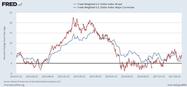
Another potential pressure point on the economy was a big increase in the relative value of the US$, which was part of the shallow industrial recession of 2015. The $ started to rise again after the November election. Here too after an initial spike, the data has calmed down again:
#3 Residential construction spending vs. mortgage rates
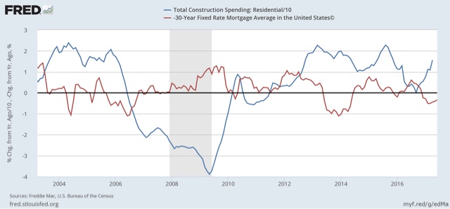
Another data point which rose sharply after the November election was interest rates. Generally speaking, home building changes in the opposite direction of interest rates. So would the increase in interest rates (e.g., mortgages) cause new residential construction to back off?
Although as I have written in the past several weeks, the slowdown has appeared in permits and housing starts — and new home sales have turned flat in the last few months, the slowdown hasn’t yet filtered through into actual residential construction spending:
Residential contruction spending is a very smooth, un-noisy series, but it does lag permits and starts by a few months,. Note that typically it has taken a big change in mortgage rates about 9 to 12 months to feed through into residential contructioni spending. It hasn’t yet this year.
#2 The Fed Funds rate vs. consumer inflation
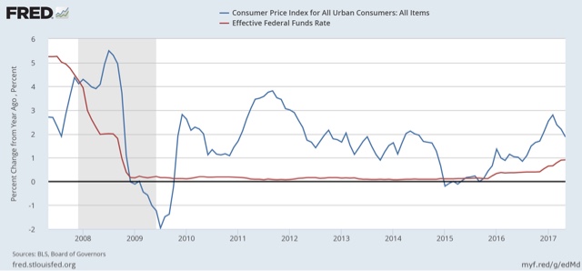
If consumer inflation rose past the magic 2% Fed target, would the Fed chase it? The Fed’s preferrred measure is personal consumption expenditures, but consumer inflation YoY as of March was up +2.8%, but due to gas prices as discussed above, inflation is now back down under 2%. Nevertheless the Fed has hiked interest rates twice:
The yield curve has begun to compress, but it is still positive. Still, it will be difficult to avoid an inversion in interest rates should the Fed stay on its current course with several more hikes.
#1 Real retail sales vs. real average hourly earnings
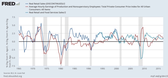
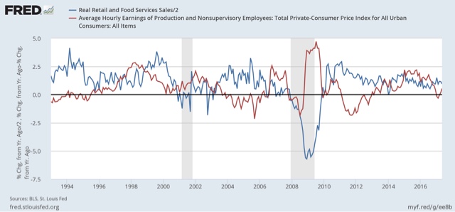
The final graph comes from my “alternate” recession forecasting model which turns on consumers running out of options to to continue increasing purchases (i.e., no interest rate financing, no wage real wage increases, and no increasing assets to cash in). The long term relationship has been that sales lead jobs, and jobs lead nominal wage increases, but real sales vs. wages are somewhat more nuanced. In the inflationary era, through the early 1990s, YoY wareal wage growth actually slightly led sales. In the deflationary era that dates from the alter 1990s, if anything the two are a mirror image, but in every case but 2001 (where real wage growth just decelerated rather than declined), both have been negative going into recessions:
Focusing on the last 20 years marking the deflationaary era, at present real retail sales continue to be positive, and with gas prices and overall inflation down, real YoY wages have turned positive again:
I would expect to see both sales and wages stall out before the onset of the next recession. Neither is presently the case.
This has been “the little expansion that could.” In its 8 year history, it has dodged all kinds of problems without being derailed. Like so much before them, the problems from the end of last year have been fading away. Only the problem of the Fed raising rates looks like a serious near-term issue.

