Summary:
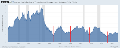
By Hale Stewart (originally published at Bonddadd blog) The Ugly Picture of US Wage Growth The chart above shows the Y/Y percentage change in the average hourly earnings of nonsupervisory employees. We can break this data down into two sections. Due to higher inflation and stronger unions, the pace of growth was far stronger before the 1980s. We see a different dynamic at work during the first three post-1982 expansions. Wages decline coming out of the recesssion, falling to ~2% Y/Y percentage growth rate. They then climb during the second half of the expansion, peaking ~4% Y/Y percentage growth rate. This probably explains why the Fed remains thoroughly convinced that the Phillip’s Curve is still in play: they’re assuing the past is prologue,
Topics:
Dan Crawford considers the following as important: Taxes/regulation, US/Global Economics
This could be interesting, too:
Joel Eissenberg writes How Tesla makes money
Angry Bear writes True pricing: effects on competition
Angry Bear writes The paradox of economic competition
Angry Bear writes USMAC Exempts Certain Items Coming out of Mexico and Canada
by Hale Stewart (originally published at Bonddadd blog)
The Ugly Picture of US Wage Growth
The chart above shows the Y/Y percentage change in the average hourly earnings of nonsupervisory employees. We can break this data down into two sections. Due to higher inflation and stronger unions, the pace of growth was far stronger before the 1980s.
We see a different dynamic at work during the first three post-1982 expansions. Wages decline coming out of the recesssion, falling to ~2% Y/Y percentage growth rate. They then climb during the second half of the expansion, peaking ~4% Y/Y percentage growth rate. This probably explains why the Fed remains thoroughly convinced that the Phillip’s Curve is still in play: they’re assuing the past is prologue, and with good reason.
However, this expansion we see a different growth dynamic at work. As before, the Y/Y percentage change dropped to 2% a little before the expansion was halfway over. But the pace of growth in the second half of the recovery is far weaker. Hence, we have weaker wage growth.
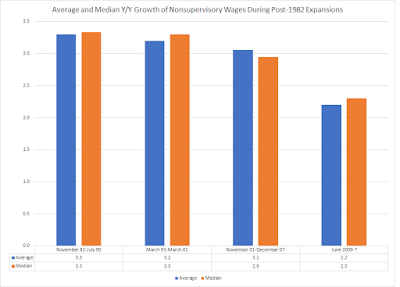
Here’s a graph of the average and median growth rate of wages for each of the expansions:
The pace is clearly declining.


