By New Deal democrat Four measures of wage growth: prospects for further meaningful wage growth are dimming In the last several years, I have written a number of posts documenting the stagnation in average and median wages, followed by their improvement due to the steep decline in gas prices, for example here and here. Since bottoming a year ago, gas prices have turned positive YoY, most recently up about 25%. Q4 2016 data on wages has been released, giving us a chance to take an updated look. We have a variety of economic data series to track both average and median wages: The most commonly known measure is that of average hourly pay for nonsupervisory workers, which is part of the monthly jobs report. The Bureau of Labor Statistics, which conducts the household employment survey, also reports “usual weekly earnings” for full time workers each quarter. The BLS also measures the Employment Cost Index quarterly. The BLS also measures “business sector compensation per hour” quarterly. Let’s start with nominal wages. The first graph below shows the YoY% growth in each of the four measures: While each is noisy, the overall trends are clear. First, in this cycle as in the last, wage growth declined coming out of recessions, then rose as the expansion continued.
Topics:
Dan Crawford considers the following as important: Uncategorized
This could be interesting, too:
tom writes The Ukraine war and Europe’s deepening march of folly
Stavros Mavroudeas writes CfP of Marxist Macroeconomic Modelling workgroup – 18th WAPE Forum, Istanbul August 6-8, 2025
Lars Pålsson Syll writes The pretence-of-knowledge syndrome
Dean Baker writes Crypto and Donald Trump’s strategic baseball card reserve
by New Deal democrat
Four measures of wage growth: prospects for further meaningful wage growth are dimming
In the last several years, I have written a number of posts documenting the stagnation in average and median wages, followed by their improvement due to the steep decline in gas prices, for example here and here. Since bottoming a year ago, gas prices have turned positive YoY, most recently up about 25%. Q4 2016 data on wages has been released, giving us a chance to take an updated look.
We have a variety of economic data series to track both average and median wages:
- The most commonly known measure is that of average hourly pay for nonsupervisory workers, which is part of the monthly jobs report.
- The Bureau of Labor Statistics, which conducts the household employment survey, also reports “usual weekly earnings” for full time workers each quarter.
- The BLS also measures the Employment Cost Index quarterly.
- The BLS also measures “business sector compensation per hour” quarterly.
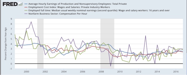
Let’s start with nominal wages. The first graph below shows the YoY% growth in each of the four measures:
While each is noisy, the overall trends are clear. First, in this cycle as in the last, wage growth declined coming out of recessions, then rose as the expansion continued. Second, secularly there has been an undeniable slowdown in wage growth, which was 4-6% in the late 1990s peak, 3-4% at the 2000s peak, and so far in this expansion is no better than 2-3%. I believe this is in part due to how weak the employment situation was for so long into this expansion, but also secularly due to shifts in bargaining power, as employers learn over time that employees can be retained with lower and lower annual increases in compensation.
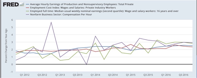
Next, let’s zoom in on the last 5 years:
Again, through the noise you can see that YoY wage growth was about 0.5%-2% in 2011-12, but has slowly improved to 2-3% in 2016. That’s the good news. The bad news is, none of these measures of wage growth show any accretion of the gains during the entire last year: despite a tighter job market, nominal wage growth *remained* at the +2% to +3% YoY level throughout the year.
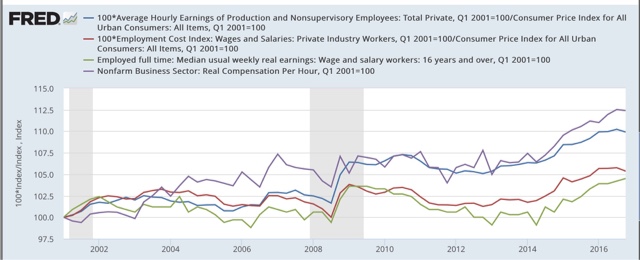
Now let’s turn to the real, inflation-adjusted measures. Our first graph starts out normed to 100 for each measure in 2001.
With the exception of real compensation per hour (purple), none of the measures made any real improvement during the 2000s expansion. After a spike during the Great Recession due entirely to the collapse of gas prices at that time, real wage growth declined into the 2013 time frame, and rose significantly since — again having much to do with the late 2014- early 2016 decline in gas prices. Note the divergence between the mean measure of the average hourly earnings (blue) and median measure in the employment cost index (red), showing that gains have been skewed towards the upper end of the income distribution.
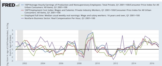
Finally, let’s look at the YoY% real growth in the four measures:
Here the picture is not good at all. After growing 2-3% in real terms during 2014-15, in 2016 real wage growth decelerated to only 0.5%-1.5% across the spectrum of measures. Since gas prices were still declining in Q1 2016, it is likely that real wage growth YoY as of the end of this quarter will have almost completely stalled.
In summary, our broad measures of wages showed continued nominal and real growth in 2016, but nominally failed to show any further acceleration despite a tightening job market, and in real terms decelerated sharply and are on the verge of stalling altogether. If my read on the labor market is correct — i.e., we are in late cycle and YoY job gains will continue to decelerate — and if inflation driven by gas prices and housing continues, the prospects for further meaningful wage growth for the broad mass of American workers during this cycle are dim.


