Summary:
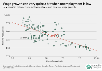
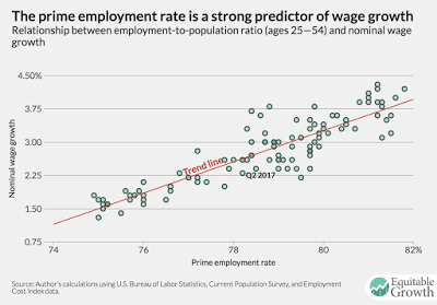
By Hale Stewart (originally published at Bonddad blog) Is This Why Wages Are Low? These are two graphs from a post over at the Center for Equitable Growth. The top chart shows that the relationship between unemployment and wage growth isn’t as strong as you’d think. Recent research highlighted by Fed President Bullard made the same observation. But the bottom chart — now that’s what a tight correlation looks like! I ran a quick, down-and-dirty calculation from FRED data using simple correlation analysis, but I used the employment to population rate and the Y/Y percentage change in average hourly earnings of all employees. Here’s the scatterplot: The correlation was .68 — pretty high. Here’s a chart of the prime age employment ratio:
Topics:
Dan Crawford considers the following as important: Taxes/regulation, US/Global Economics
This could be interesting, too:
Joel Eissenberg writes How Tesla makes money
Angry Bear writes True pricing: effects on competition
Angry Bear writes The paradox of economic competition
Angry Bear writes USMAC Exempts Certain Items Coming out of Mexico and Canada
by Hale Stewart (originally published at Bonddad blog)
Is This Why Wages Are Low?
These are two graphs from a post over at the Center for Equitable Growth.
The top chart shows that the relationship between unemployment and wage growth isn’t as strong as you’d think. Recent research highlighted by Fed President Bullard made the same observation. But the bottom chart — now that’s what a tight correlation looks like!
I ran a quick, down-and-dirty calculation from FRED data using simple correlation analysis, but I used the employment to population rate and the Y/Y percentage change in average hourly earnings of all employees. Here’s the scatterplot:
The correlation was .68 — pretty high.
Here’s a chart of the prime age employment ratio:
It’s still low; it only just attained levels seen at the low of the last recession, meaning this analysis could be on to something.


