By New Deal democrat What’s behind stalled nonsupervisory wage growth? Wage growth for nonsupervisory workers nominally has been stuck in the +2.3% to +2.5% range (or worse) for three years. Why? Over the weekend I was cleaning out some old graphs, and came across this one from the Atlanta Fed, suggesting that the Phillips Curve (the tradeoff between unemployment and inflation) is very much alive, with the tweak that the amount of wage growth follows a decline in the unemployment rate with a one year lag: The red line is the progression of the Phillips Curve since the beginning of 2011. The dotted line indicates that the Altanta Fed’s model was calling for a significant acceleration of wage growth between the spring of 2016 and spring this year. [NOTE: all of the discussion in this post is about nominal, not inflation-adjusted wage growth, which has an awful lot to do with the volatility of gas prices.] Except when we look at wages for nonsupervisory workers, that really hasn’t happened, at least not through February. The below graph compares the YoY change in the unemployment rate (blue) and YoY wage growth for nonsupervisory workers (red): As noted above, wage growth has been stuck at between 2.3% YoY and 2.5% YoY with some (mainly negative) exceptions since the end of 2013.
Topics:
Dan Crawford considers the following as important: Taxes/regulation, US/Global Economics
This could be interesting, too:
Joel Eissenberg writes How Tesla makes money
Angry Bear writes True pricing: effects on competition
Angry Bear writes The paradox of economic competition
Angry Bear writes USMAC Exempts Certain Items Coming out of Mexico and Canada
by New Deal democrat
What’s behind stalled nonsupervisory wage growth?
Wage growth for nonsupervisory workers nominally has been stuck in the +2.3% to +2.5% range (or worse) for three years. Why?
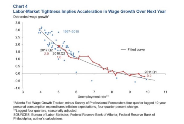
Over the weekend I was cleaning out some old graphs, and came across this one from the Atlanta Fed, suggesting that the Phillips Curve (the tradeoff between unemployment and inflation) is very much alive, with the tweak that the amount of wage growth follows a decline in the unemployment rate with a one year lag:
The red line is the progression of the Phillips Curve since the beginning of 2011. The dotted line indicates that the Altanta Fed’s model was calling for a significant acceleration of wage growth between the spring of 2016 and spring this year. [NOTE: all of the discussion in this post is about nominal, not inflation-adjusted wage growth, which has an awful lot to do with the volatility of gas prices.]
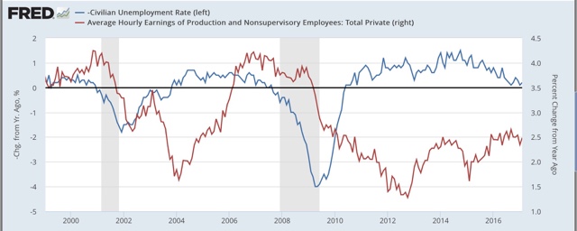
Except when we look at wages for nonsupervisory workers, that really hasn’t happened, at least not through February. The below graph compares the YoY change in the unemployment rate (blue) and YoY wage growth for nonsupervisory workers (red):
As noted above, wage growth has been stuck at between 2.3% YoY and 2.5% YoY with some (mainly negative) exceptions since the end of 2013.
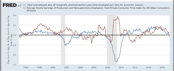
Using the U6 underemployment rate to capture the broader picture doesn’t change the outcome:
I suspect that the change in the labor force participation rate (i.e., that portion of the population actually in the job market, whether employed or unemployed) is the answer.
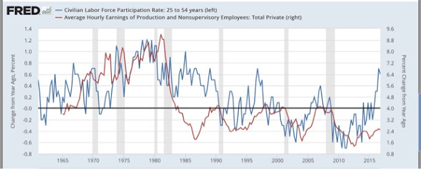
When I use the labor force participation rate for the prime working age population (ages 25-54) (blue) and measure that YoY vs. wage growth, even going all the way back over half a century to 1964, here’s what I get:
With the very significant exception of most of the 1980s, the trend in prime age labor force participation appears to lead the trend in wage growth by one to two years.
What is most interesting is that in the era of labor force bargaining power (up until about 1982), a big increase in the labor force lead to a considerably larger amount of wage growth. Once labor’s bargaining power was broken during the early part of the Reagan Administration, the big secular increase in labor force participation did not show up as wage growth inflation, but rather as more job growth with outright *decreases* in the average hourly wage.
Note further that since the late 1980s, twice an increase of +0.6% YoY in prime age labor force participation has led to nominal wage growth of +4.0 YoY about one year later.
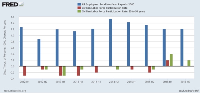
Now let’s zoom in on the last 5 years. The below graph compares the growth in employment (blue) averaged over each half year, with that of the overall labor force participation rate (red) and the prime age participation rate (green):
What is interesting is that over that entire time, average employment gains over each period have not varied that much. What *has* happened, especially notably with those of prime working age, is a temporary pause in the decline in early 2014 and 2015, coincident with the first stalling and then decline in wage growth, and then a surge of participation in 2016, especially during the first half of the year.
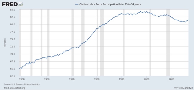
To put this in perspective, the participation among the prime 25 – 54 age group plateaued beginning in 1989 (after the secular rise due to women entering the labor force):
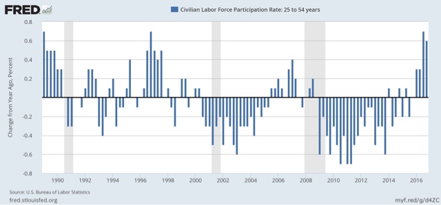
So here is the YoY change in the participation by those in prime age since that time:
The YoY change in participation in the last two quarters of 2016 (the last two bars) averaged +0.65%. That is the biggest such increase in participation in the last 30 years!
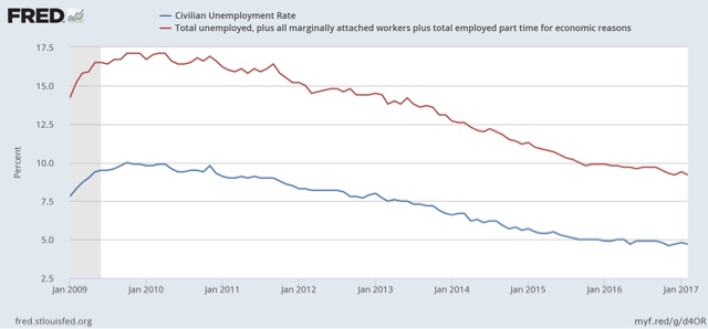
Putting this together, it appears that the surge in new participation in the labor force, with no surge of employment growth, showed up in a pause in the decline of the unemployment and underemployment rates. As shown below, in the year from September 2015 through September 2016, the unemployment rate only fell -0.1%, from 5.0% to 4.9%. The U6 underemployment rate only fell -0.3%, from 10.0% to 9.7%:
This surge in competition for new jobs acted to depress wage growth.
If the long-term graph comparing wage growth and the prime age LFPR is correct, however, and particularly if the same pattern of the late 1980s and 1990s is followed, then the surge in the LFPR does portend a significant acceleration in wage growth for nonsupervisory employees — finally — later this year. That the U6 underemployment rate has declined significantly again in the last 3 months is supportive of that suggestion.
We’ll find out soon enough.
cross posted with Bonddad blog

