The 2020 Presidential and Senate races: a postmortem Way back in June I started writing nowcasts for the 2020 elections. Here’s what my very first map looked like: And here’s what the last one looked like: When I pushed the “toss-ups”, by lowering the threshold from 3% to 1%, NC, GA, and FL also became “lean Biden” States. Here’s how the election actually turned out, based on results through today (note: Alaska has only counted 50% of its votes, so the outcome there is still unknown): Two weeks ago, I wrote “The “blue wall” is extremely likely to hold. And if it does, Trump’s chances of victory are foreclosed.” That turned out to be right on point. Further, last week, and almost every week beforehand, I included a sentence like this:
Topics:
NewDealdemocrat considers the following as important: politics
This could be interesting, too:
Robert Skidelsky writes Lord Skidelsky to ask His Majesty’s Government what is their policy with regard to the Ukraine war following the new policy of the government of the United States of America.
Joel Eissenberg writes No Invading Allies Act
Ken Melvin writes A Developed Taste
Bill Haskell writes The North American Automobile Industry Waits for Trump and the Gov. to Act
The 2020 Presidential and Senate races: a postmortem
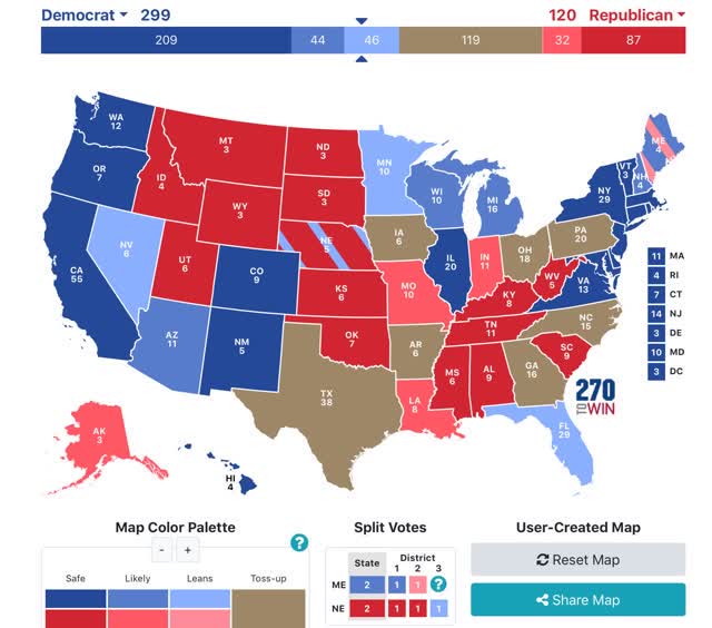
Way back in June I started writing nowcasts for the 2020 elections. Here’s what my very first map looked like:
And here’s what the last one looked like:
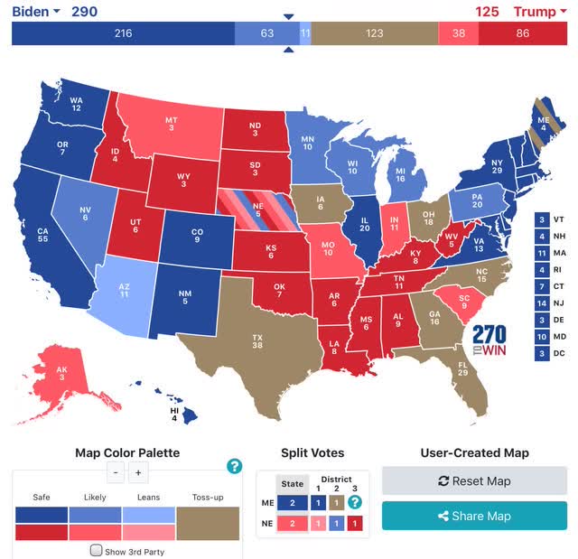
When I pushed the “toss-ups”, by lowering the threshold from 3% to 1%, NC, GA, and FL also became “lean Biden” States.
Here’s how the election actually turned out, based on results through today (note: Alaska has only counted 50% of its votes, so the outcome there is still unknown):
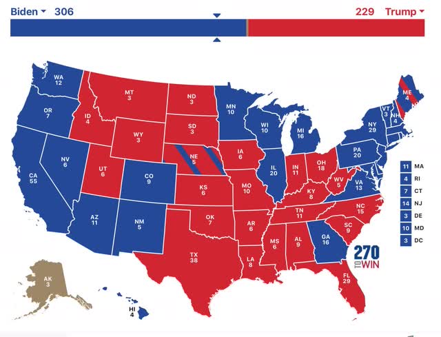
“The “blue wall” is extremely likely to hold. And if it does, Trump’s chances of victory are foreclosed.”
That turned out to be right on point.
Further, last week, and almost every week beforehand, I included a sentence like this:
“Even so, Biden still has 279 “solid” or “likely” Electoral votes, enough to win without any “leaning” or toss-up States.”
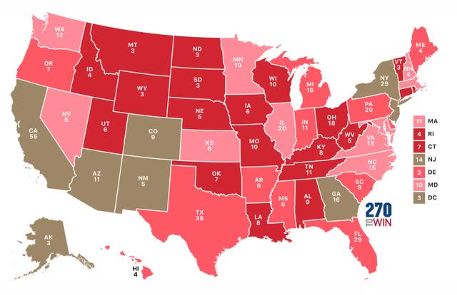
That turned out to be the most prudent caution, as on average the polls missed very badly this year. The below 2 maps contrast the actual results with Nate Silver’s polling average for each State, 1st for the Presidency and 2nd for the Senate races, using the following color code:
Here’s the deviations from Nate’s numbers for the Presidency:
And here they are for the Senate:
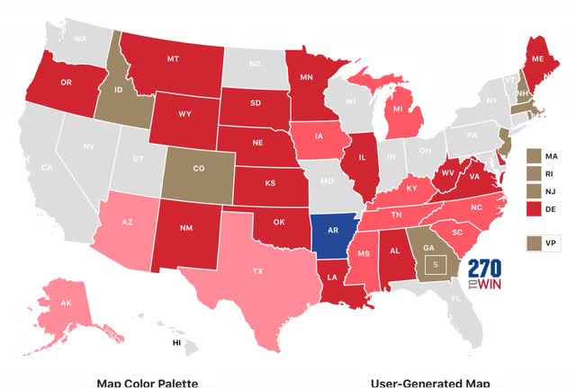
The median deviation in his percentages for Biden was -5.2%. In not even a single State was the deviation 2% or more in favor of Biden. The median deviation in his percentages for Democrats running for the Senate was even worse, at -6.6%.
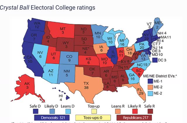
By contrast, Larry Sabato’s final Presidential forecast only missed on North Carolina:
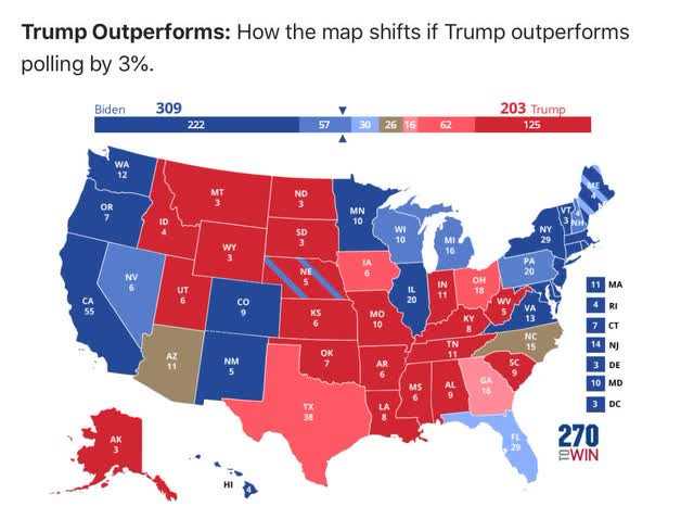
The median forecast in Sam Wang’s model at the Princeton Election Consortium was also too optimistic, but he correctly always included a map of what would happen if Trump outperformed the polls by 3%:
And yet another alternative approach that was much better was the Cook Political Report’s “Swingometer,” which was explained thusly:
“How it Works: Start with the results of the previous election, adjusted for demographic change since 2016. Then, adjust the sliders below to see how shifts in turn out and support among five demographic groups could swing the Electoral College.”
Using their turn-out assumptions, this is the map they generated:
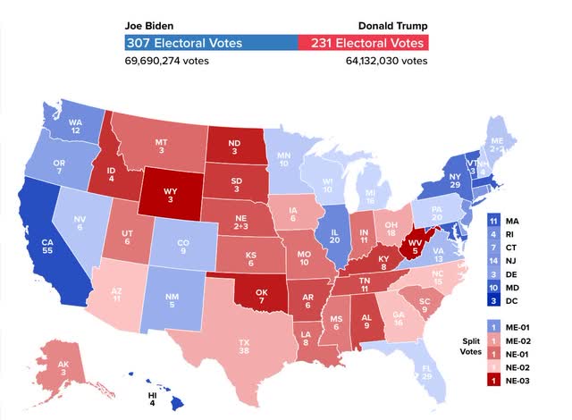
The map only misses Arizona, Florida and Georgia. Further, note that it correctly shows the “blue wall” holding, but being very close. Using the same criteria as I used for Nate Silver’s projections, here’s how close the “Swingometer” came in each State:
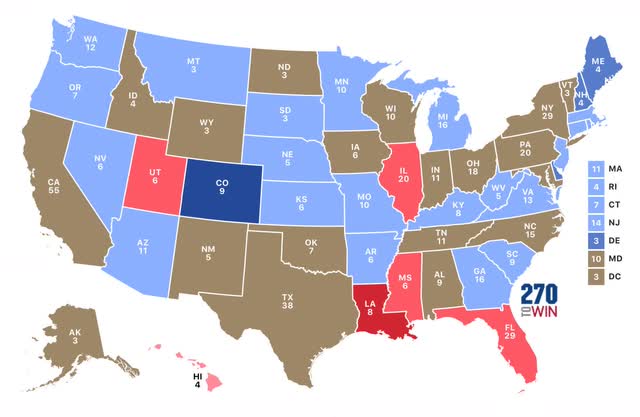
The median deviation from the actual 2020 results known so far is only 2.0% in favor of Biden. In other words, simply projecting the same demographics 4 years forward, and estimating increased (or decreased) turnout based on the past turnout for each age, on average only 2% of voters either changed their mind in favor of Biden, or groups favorable to Biden turned out an average of 2% more of the total.
Finally, to see how closely Trump’s results matched results in the Senate races, I applied the same metrics to the actual Presidential and Senate results. Blue (Red) means a result more favorable to, or less unfavorable to (less favorable to, or more unfavorable to), Biden than the Democratic Senate candidate:
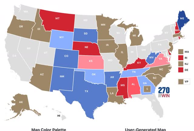
The median deviation between the Senate and Presidential results was only +0.3% overall. When we ignore the direction of the deviation, it is about 3.5%.
To summarize: there are some very serious shortcomings in Nate Silver’s model. Both he and the Economist (G. Elliott Morris) would be well advised to pick up Sam Wang’s approach and create maps for significant poll deviations. Further, the “Swingometer” looks like a very promising tool.
In terms of the 2020 election, it looks like very few voters actually changed their minds in the past 4 years in their opinion of Trump. It appears that new voters or increased turnout among some demographics were the biggest factors in the different outcome this year. And a significant percentage of “never Trump” GOP voters split their ticket, voting the GOP Senate candidate down-ballot.
