Coronavirus dashboard for May 31: comparing US States and regions with European countries – by New Deal democrat Among all countries in the world, Sweden has the worst death rate from coronavirus: 5.9 per million per day over the past week. But, even with massive declines from their peaks, most of the States in the US’s eastern megalopolis are worse. To begin, here’s Kevin Drum’s dashboard of major European countries, plus Canada, as of May 27: He doesn’t show it, but since Spain had the worst outbreak among major Western European countries, here it is: And here, by comparison, is the US: From worst to best, here are the death rates per million over the past week: Sweden: 5.9 UK: 3.8 US: 3.0 Canada: 2.6 Italy: 1.5 Spain: 1.2 France: 1.1
Topics:
NewDealdemocrat considers the following as important: Healthcare
This could be interesting, too:
Bill Haskell writes Families Struggle Paying for Child Care While Working
Joel Eissenberg writes RFK Jr. blames the victims
Joel Eissenberg writes The branding of Medicaid
Bill Haskell writes Why Healthcare Costs So Much . . .
Coronavirus dashboard for May 31: comparing US States and regions with European countries
– by New Deal democrat
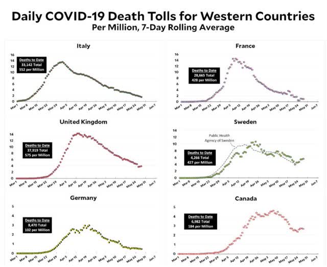
Among all countries in the world, Sweden has the worst death rate from coronavirus: 5.9 per million per day over the past week. But, even with massive declines from their peaks, most of the States in the US’s eastern megalopolis are worse.
To begin, here’s Kevin Drum’s dashboard of major European countries, plus Canada, as of May 27:

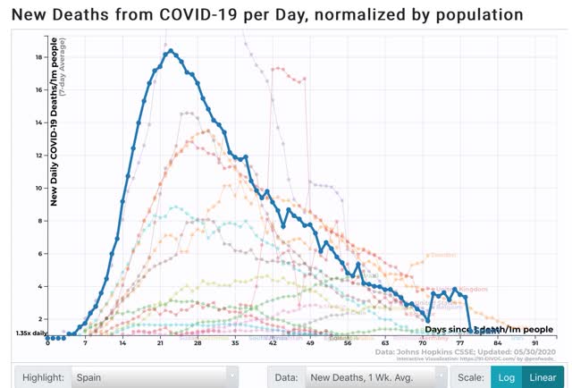
He doesn’t show it, but since Spain had the worst outbreak among major Western European countries, here it is:

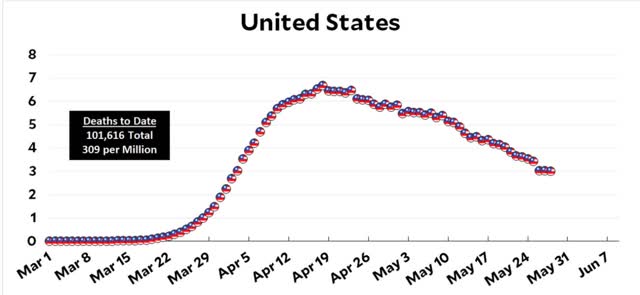
And here, by comparison, is the US:

From worst to best, here are the death rates per million over the past week:
At its worst, the US as a whole had a death rate of 8.1 per million.
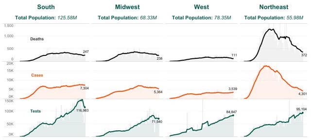
Now let’s see how US States fare compared with the above national averages. First, here is Conor Kelly’s breakdown of tests, infections, and deaths broken down by region. The West includes all of the mountain and Pacific West plus Alaska and Hawaii. The South includes all of the Confederate States plus WV, KY, and OK:

You can easily see that the Northeast had the worst outbreak, and has made the most progress. But even so, the Northeast’s death rate, at 6.6 per million, is the worst. The other three are, in order from worst to best:
The West is doing quite well, on par with Italy, France, and Spain. The South isn’t too far behind. The Midwest is problematic.
Now let’s use the same metric for the Northeastern States of the megalopolis as I used for countries above. The second number, in parentheses, represents their respective peak death rates. The declines have varied from 46% (MD) to 85% (NY):
Only the last three States – NY, PA, and DE – have death rates lower than Sweden’s. And their death rates are worse than those of any other major country.
UPDATE: Here’s the list of the other US State with more than 3 deaths per million daily over the past seven days:
IL: 6.1
MS: 5.1
MN: 4.1
IA: 3.8
LA: 3.6
VA: 3.5
MI: 3.5
IN: 3.4
NM: 3.3
NH: 3.2
