Coronavirus dashboard for July 7, 2020: deaths as a *very* lagging statistic Total diagnosed US coronavirus cases: 2,928,418 7 day average: 50,135 Total US coronavirus deaths: 122,915 7 day average: 480 The renewed exponential spread of coronavirus cases is continuing. We will probably be over 3 million cases within 48 hours. Including all of the undiagnosed cases (especially in April and May), probably about 2.5%-3% of the entire US population has been infected by this point. There is still not enough medical mask production. There is still not a thorough testing program in place. There is still not a significant tracing or isolation protocol in place. There will be none of these until at least January 20, 2021. The big paradox remains why deaths have
Topics:
NewDealdemocrat considers the following as important: Healthcare
This could be interesting, too:
Bill Haskell writes Families Struggle Paying for Child Care While Working
Joel Eissenberg writes RFK Jr. blames the victims
Joel Eissenberg writes The branding of Medicaid
Bill Haskell writes Why Healthcare Costs So Much . . .
Coronavirus dashboard for July 7, 2020: deaths as a *very* lagging statistic
7 day average: 50,135
Total US coronavirus deaths: 122,915
7 day average: 480
The renewed exponential spread of coronavirus cases is continuing. We will probably be over 3 million cases within 48 hours. Including all of the undiagnosed cases (especially in April and May), probably about 2.5%-3% of the entire US population has been infected by this point.
There is still not enough medical mask production. There is still not a thorough testing program in place. There is still not a significant tracing or isolation protocol in place. There will be none of these until at least January 20, 2021.
The big paradox remains why deaths have continued to decline, albeit very slowly, even while new cases have skyrocketed for at least the last 3 weeks. A detailed look at the top 10 states for new infections per capita, and comparing them with the Northeast megalopolis, is especially telling.
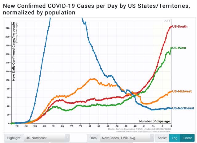
To begin, here are the 4 regions of the US by new cases per capita:
And here are the same 4 regions by deaths per capita:
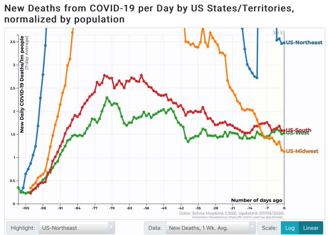
Cases have been exploding in the South and West, increasing significantly in the Midwest, and essentially have been flat in the Northeast. Meanwhile deaths have been flat in the South and West, declining in the Midwest, and are still elevated but declining in the Northeast (the last being complicated by data dumps of past cases from both NY and NJ in the past 10 days).
As an aside, comparing the US to the EU as to deaths shows that the US is now where the EU was 2 months ago:
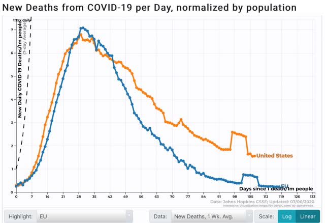
Had most governors had the patience for just one more month before reopening, the US would probably be in reasonably good shape.
But to return to my main theme, while reckless reopening in the Confederacy, Arizona, and a few other places together with reckless behavior by the young, leading to a change in disease demographics explains a lot of the continued decline in deaths, it doesn’t explain all of it. The significance here is what has happened – or not happened – in the Northeast.
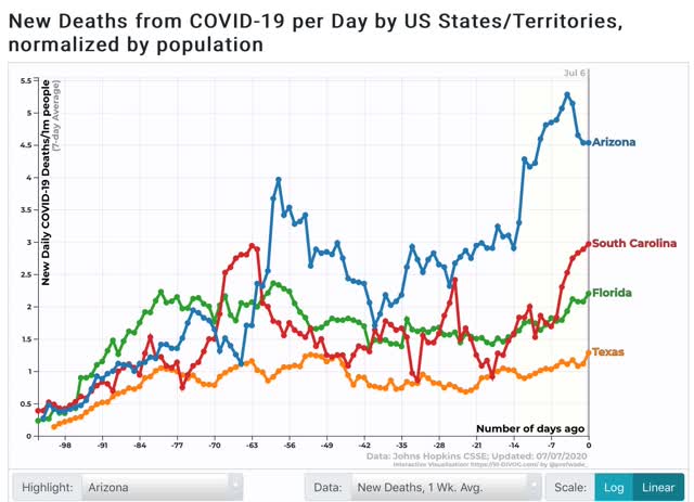
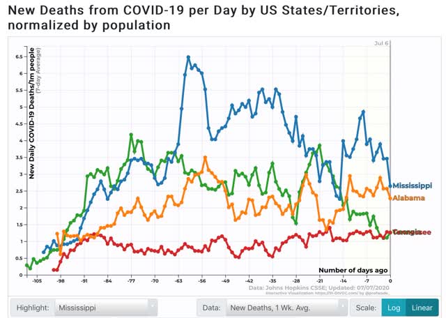
Here are the top 10 States for new infections:
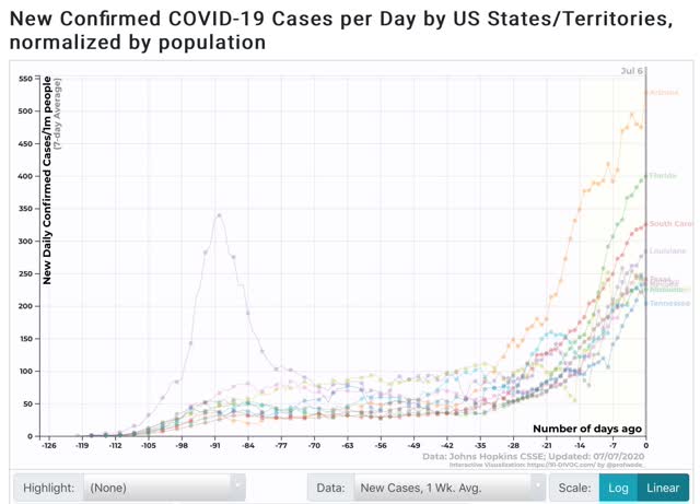
Eight of these are in the Deep South; the other two are Arizona and Nevada. All of them are showing big increases.
Now here are the top 10 Jurisdictions for deaths:
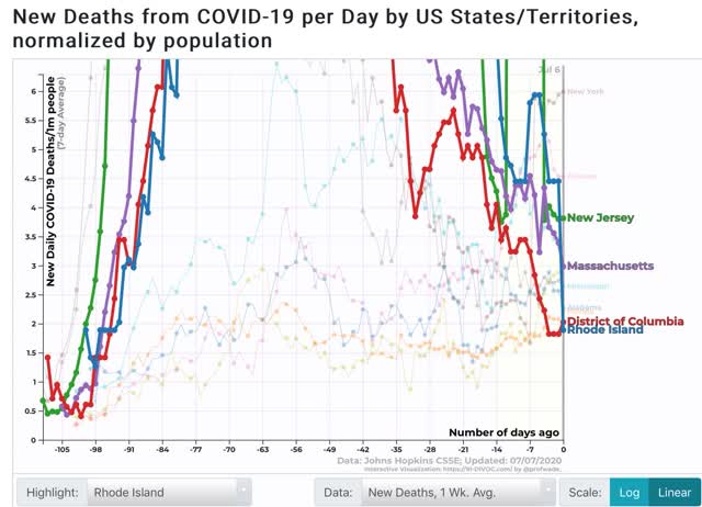
Due to its data dump 6 days ago, NY temporarily leads the way, but more importantly, note that the highlighted 3 States plus DC remain in the top 10 – despite all having had their infectious peaks over 2 months ago!
In other words – and this is what I want to emphasize – it isn’t just taking a long time for big increases in infections to show up in death rates. It’s also taking a long time for big DECREASES in infections to show up in death rates. On a per capita basis, the Northeast is still leading the pack, even with relatively draconian lockdown policies that were in place for a long time.
Meanwhile, while some of the recklessly reopened States are showing increases in deaths:
Others among the top 10 for new infections, including Alabama, Georgia, Mississippi, Tennessee, and (not shown) Louisiana are *not* showing significant increases in infections – and in the case of Georgia an incomprehensible decrease:
Although it is too noisy to graph, when we expand out to the top 25 for new infections that have increased significantly in the past 3 weeks, 10 of them – Idaho, Arkansas, California, Utah, North Carolina, Delaware, Wisconsin, Ohio, Washington State, Nebraska, and Missouri – are still showing flat or even decreasing deaths.
The lag time for new increases in deaths, plus the lag time for the low incidence of deaths in the Northeast where cases peaked over 2 months ago, suggests that more is going on than just younger demographics and better medical treatments. The delay in deaths works both ways.