Coronavirus dashboard for July 8: deaths in the South and West finally suggest increasing trend Coronavirus death statistics have been plagued recently by State data dumps, where months of deaths have been released on a single day. In the past 2 weeks, both NJ and NY’s such releases had skewed the numbers. As of today, both are out of the 7 day statistics, so I thought I would update again. One bit of good news, statistics-wise, is that the COVID tracker now has the ability to include hospitalizations (although FL still isn’t fully releasing its numbers). So here are hospitalizations per capita in the 4 US regions: In the past few weeks, hospitalizations have continued to decline in the Northeast, stayed flat in the Midwest, risen slightly in the West
Topics:
NewDealdemocrat considers the following as important: Healthcare
This could be interesting, too:
Bill Haskell writes Families Struggle Paying for Child Care While Working
Joel Eissenberg writes RFK Jr. blames the victims
Joel Eissenberg writes The branding of Medicaid
Bill Haskell writes Why Healthcare Costs So Much . . .
Coronavirus dashboard for July 8: deaths in the South and West finally suggest increasing trend
Coronavirus death statistics have been plagued recently by State data dumps, where months of deaths have been released on a single day. In the past 2 weeks, both NJ and NY’s such releases had skewed the numbers. As of today, both are out of the 7 day statistics, so I thought I would update again.
One bit of good news, statistics-wise, is that the COVID tracker now has the ability to include hospitalizations (although FL still isn’t fully releasing its numbers). So here are hospitalizations per capita in the 4 US regions:
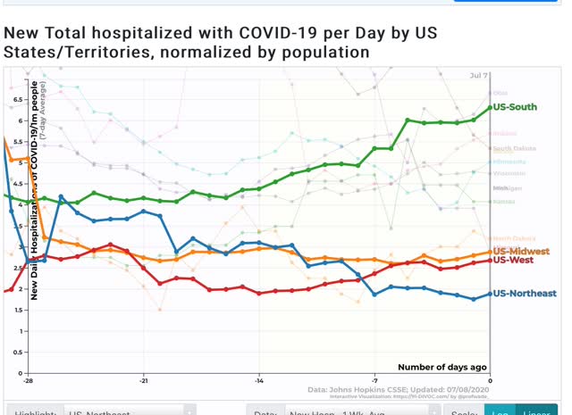
In the past few weeks, hospitalizations have continued to decline in the Northeast, stayed flat in the Midwest, risen slightly in the West starting 14 days ago, and increased by more than 50% in the South starting 19 days ago.
Has the bad news started to translate into deaths in the South and West? Maybe.
Here are deaths per capita in the Northeast and Midwest:
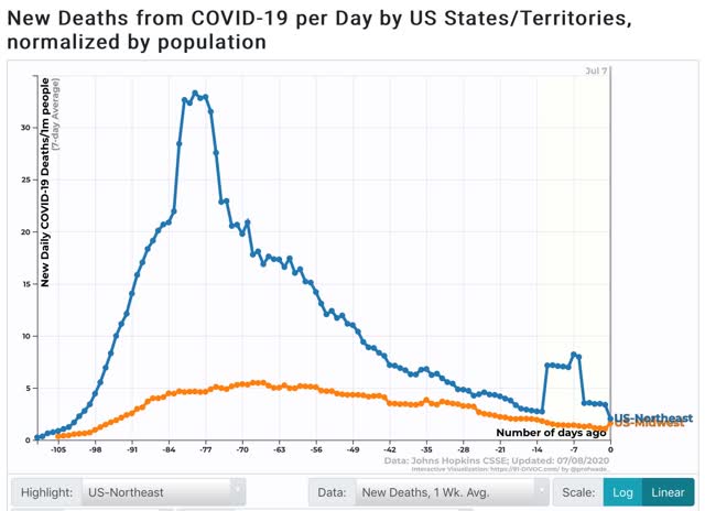
With the NJ and NY data dumps out of the 7 day average, the Northeast average has now decreased to 2.0 per million. This, believe it or not, still makes the Northeast the worst region, due to NJ (4.0 per million), MA (3.3), and RI (2.6). NY has declined to 1.5 per million and is no longer even in the top 25 per capita. The jump in the Midwest in the past day is due to – sigh – a data dump by Illinois, which will slightly skew the national average for the next week.
Here are deaths per capita in the South and West:
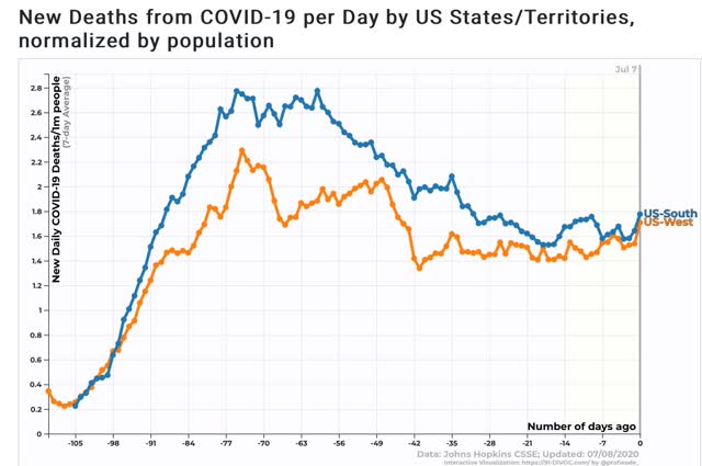
The big question is, are the increases in the past 2 days the start of a trend? If so, then it would appear that deaths per capita in both the South and West bottomed a little over 2 weeks ago.
Even so, at 5.5 deaths per million, the worst State, Arizona, still has less than 10% the rate of deaths that NY had (close to 70) at the worst of the outbreak there. God willing, even with all of their reckless mistakes, Florida, Texas, and Arizona hopefully will never get that bad.