“33 Months of COVID in one image: One more look at the Red/Blue Death Rate Divide,” ACA Signups, Charles Gaba. Charles lives in Michigan, one county over from where I lived. While my County head Democrat was touting me for a great knowledge on healthcare to Slotkin, I was pushing Charles. He knew more about the ACA then I did. I believe what Charles is going for here is the split between political parties on Covid. Many more Republicans were out there in public, up close, maskless and many unvaccinated. And died. Hell of a way to go. ~~~~~~~~ I wasn’t really planning on doing another red/blue COVID death rate analysis. The point has been pretty much beaten into the ground by now. However, given how much interest there’s been in the
Topics:
run75441 considers the following as important: ACA Signups.net, Charles Gaba, Healthcare, Hot Topics, politics
This could be interesting, too:
Robert Skidelsky writes Lord Skidelsky to ask His Majesty’s Government what is their policy with regard to the Ukraine war following the new policy of the government of the United States of America.
NewDealdemocrat writes JOLTS revisions from Yesterday’s Report
Joel Eissenberg writes No Invading Allies Act
Ken Melvin writes A Developed Taste
“33 Months of COVID in one image: One more look at the Red/Blue Death Rate Divide,” ACA Signups, Charles Gaba. Charles lives in Michigan, one county over from where I lived. While my County head Democrat was touting me for a great knowledge on healthcare to Slotkin, I was pushing Charles. He knew more about the ACA then I did.
I believe what Charles is going for here is the split between political parties on Covid. Many more Republicans were out there in public, up close, maskless and many unvaccinated. And died. Hell of a way to go.
~~~~~~~~
I wasn’t really planning on doing another red/blue COVID death rate analysis. The point has been pretty much beaten into the ground by now. However, given how much interest there’s been in the impact (or lack thereof) of the red/blue divide on the 2022 midterms, I figured I’d dust off the spreadsheet one more time.
First, a final summary of the actual impact on the midterms:
- Statewide races: In the end, while there were around 18 partisan statewide races in which the Democratic candidate won by less than 50,000 votes, there’s only one where the final winning margin was smaller than my estimate of the GOP vs. Dem voter COVID death gap: Arizona Attorney General, where Democrat Kris Mayes ended up beating Republican Abe Hamadeh by just 510 votes. This was well within my estimated statewide partisan COVID death gap of 4,100 voters for Arizona, even if you knock ~30% off of that to account for the midterms having a lower voter turnout than the 2020 Presidential election.
- U.S. House races: There’s still two House races which have yet to be officially called, but in both cases (CA-13 and CO-03), the Republican is currently ahead by around 600 votes. In CO-03 Democrat Adam Frisch has already conceded although there will still be an automatic recount conducted. In the extremely unlikely event that Frisch were to win the recount by less than ~600 votes, that would fall within my estimate for this district. I’m not sure what the situation is in CA-13, but if a recount were to flip it to Democrat Adam Gray by less than ~130 votes, that would fall within my estimate as well. Neither of these are likely, however.
There’s likely a handful of other local races (countywide, state legislative, etc) where this was a decisive factor, but I don’t have the data or resources to get that granular.
Having said that, I had estimated that nationally, around 150,000 more Republican voters died of COVID-19 between the 2020 & 2022 U.S. elections than Democratic voters, give or take. My rough estimate of ~70% more GOP voters died than Democratic voters was strongly supported by a much more sophisticated analysis by the National Bureau of Economic Research.
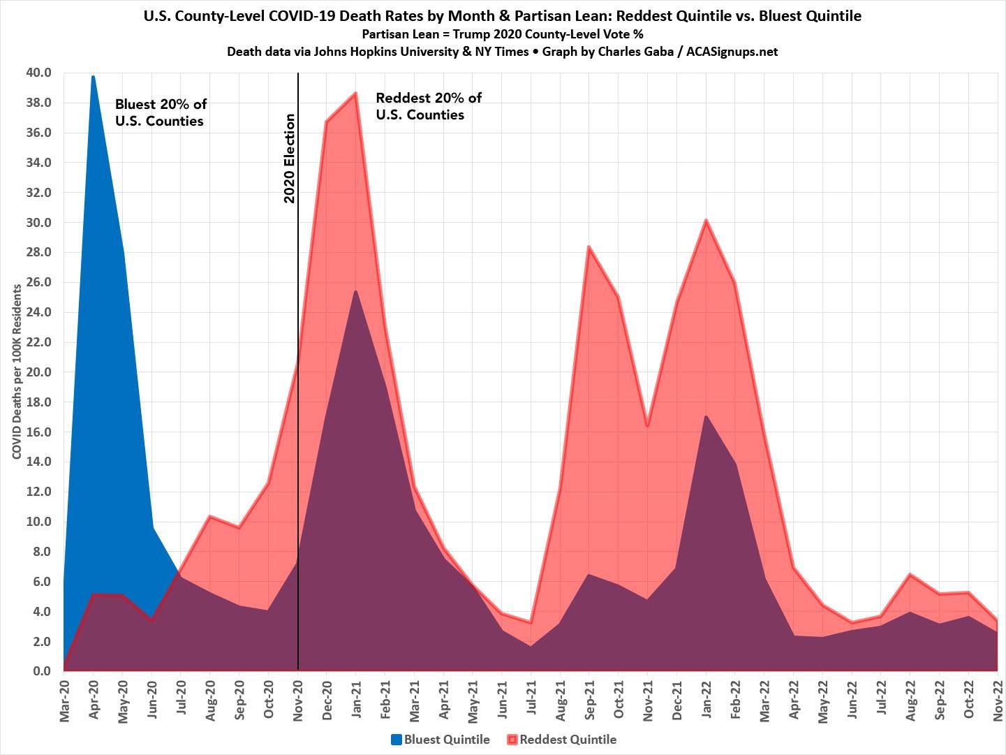
The graph below shows the partisan COVID death rate gap for every month since the pandemic began in March 2020 (only a handful of Americans had been officially reported as having died of COVID prior to 3/01/2020). Specifically, it looks at the reddest 20% and bluest 20% of the total U.S. population based on the 2020 Presidential election results at the county level.
The reddest quintile includes roughly 65.1 million people living in counties where Donald Trump received 62.4% or more of the vote in 2020; the bluest quintile includes around 66.8 million living in counties where Trump received less than 31.6%. While the raw numbers aren’t quite equal, both have been adjusted for actual population.
As you can see, the initial COVID wave in March – May 2020 devastated Blue America, primarily densely populated (and heavily Democratic) New York and New Jersey, while leaving Red America (mostly sparsely populated, rural Republican counties) relatively unscathed.
This would easily explain the Trump Administration’s decision (via Jared Kushner in particular) to essentially blow off the response, as documented by Katherine Eban in Vanity Fair later that summer:
Six months into the pandemic, the United States continues to suffer the worst outbreak of COVID-19 in the developed world. Considerable blame belongs to a federal response that offloaded responsibility for the crucial task of testing to the states. The irony is that, after assembling the team that came up with an aggressive and ambitious national testing plan, Kushner then appears to have decided, for reasons that remain murky, to scrap its proposal.
…But no nationally coordinated testing strategy was ever announced. The plan, according to the participant, “just went poof into thin air.”
…the effort ran headlong into shifting sentiment at the White House. Trusting his vaunted political instincts, President Trump had been downplaying concerns about the virus and spreading misinformation about it—efforts that were soon amplified by Republican elected officials and right-wing media figures. Worried about the stock market and his reelection prospects, Trump also feared that more testing would only lead to higher case counts and more bad publicity.
…Most troubling of all, perhaps, was a sentiment the expert said a member of Kushner’s team expressed: that because the virus had hit blue states hardest, a national plan was unnecessary and would not make sense politically. “The political folks believed that because it was going to be relegated to Democratic states, that they could blame those governors, and that would be an effective political strategy,” said the expert.
Of course, this situation quickly began to reverse itself only a few months later. Starting in July 2020–the same month the Vanity Fair expose was published, as it happens–the situation had already reversed itself: The reddest fifth of the U.S. was already experiencing a higher COVID death rate than the bluest fifth…and it has stayed that way ever since.
That’s right: While the COVID death rate ratio between the reddest and bluest parts of the country has grown larger and smaller at various points (reaching an all-time high of nearly 4.5:1 during the height of the Delta wave in September 2021), there has never been a single point in time that the bluest quintile has seen a higher death rate than the reddest quintile since July 2020. And this graph only includes official COVID deaths, not the “likely COVID excess deaths” which were never officially recognized as such . . . and which ran over 11 times higher in the reddest fifth of the U.S. than the bluest fifth in 2021.
As for where things go going forward, that’s a complete unknown. COVID death rates have (thankfully) dropped to perhaps ~350/day or so nationally in recent weeks. The red/blue ratio is down to being “only” ~50% higher in the reddest quintile than the bluest. There’s no way of knowing how long either the total death rate or the relatively small red/blue ratio will last, of course.
In short: Get vaccinated, get your bivalent booster, and still wear a mask when attending crowded indoors public events if possible.
Well, I guess us Democrats lost bigly on the issue of Covid. I am happy we did lose this one. Mask up, get your vaccinations, and stay the hell away from crowds. Best to you all!