Coronavirus dashboard for January 11: good news and bad news With no new economic releases today, let me give you a brief update on the fast-moving Omicron wave.First, the good news: as I pointed out yesterday, several States that were hit hardest first by Omicron look like they are hitting or have already hit peak: This is an increase from just several days ago. In fact, right now the only early hit State that has not peaked is Hawaii (not shown). Several other countries that were hit hard early by Omicron also appear to have peaked: the UK and Portugal, in addition to South Africa, where the strain was identified first:” If the Omicron wave peaks in 30 to 45 days after onset, then the US as a whole is likely to peak between
Topics:
NewDealdemocrat considers the following as important: Healthcare, omicron
This could be interesting, too:
Bill Haskell writes Families Struggle Paying for Child Care While Working
Joel Eissenberg writes RFK Jr. blames the victims
Joel Eissenberg writes The branding of Medicaid
Bill Haskell writes Why Healthcare Costs So Much . . .
Coronavirus dashboard for January 11: good news and bad news
With no new economic releases today, let me give you a brief update on the fast-moving Omicron wave.
First, the good news: as I pointed out yesterday, several States that were hit hardest first by Omicron look like they are hitting or have already hit peak:
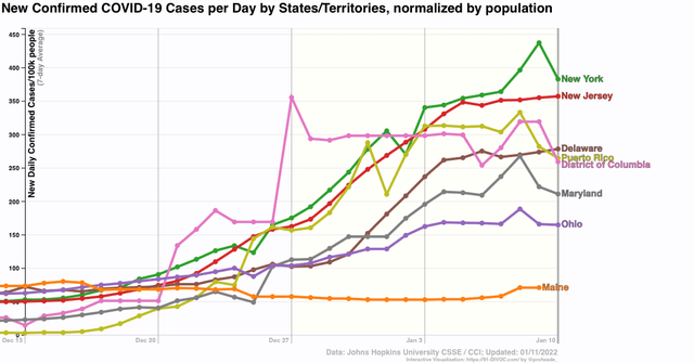
This is an increase from just several days ago. In fact, right now the only early hit State that has not peaked is Hawaii (not shown).
Several other countries that were hit hard early by Omicron also appear to have peaked: the UK and Portugal, in addition to South Africa, where the strain was identified first:”
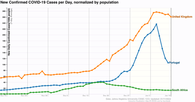
If the Omicron wave peaks in 30 to 45 days after onset, then the US as a whole is likely to peak between this coming weekend and the end of this month.
That’s the good news.
The question becomes, what happens next?
I have been hopeful that between vaccinations and prior infections, we would reach a point where any subsequent wave would be much less in severity. The State that has been the best candidate for a bellwether of this hypothesis is Rhode Island, which has both a very high vaccination rate (1st graph below), and a very high rate of previous infections (2nd graph below).
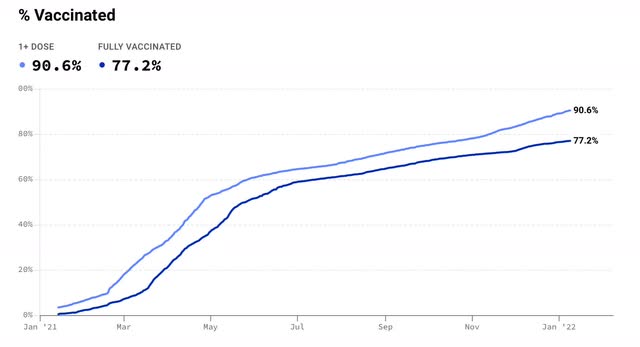
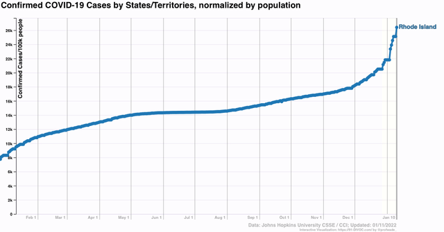
Despite the fact that over 75% of Rhode Island’s population was fully vaccinated, and perhaps 40% or more of its population having been infected even before December, Omicron hit it hard, with over 8% of the entire State’s population having *confirmed* infections in the last 45 days. That in itself is not such a big deal. Portugal, with 90% of its population fully vaccinated, also got hit hard by Omicron infections.
The problem is the next graph, which shows deaths:
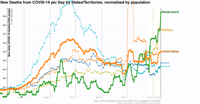
Rhode Island has had a higher death rate in the past month than the US as a whole, or any Census Region. In fact, it is in the top 10 States for rate of deaths at the moment.
I should point out this has not been true of Portugal, which has not had any increase in deaths at all during the Omicron wave – at least not so far:
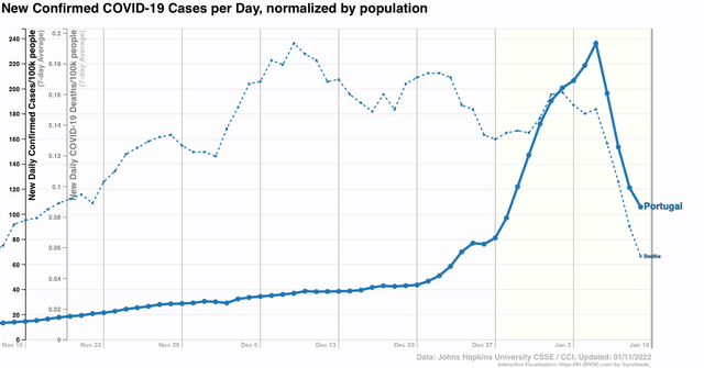
But if prior infections do not build up appreciable resistance to reinfection, at least over the medium term, then with about 1/4 or more of its population dead set against being vaccinated, the US is in some real long term trouble.
