A “Big Picture” look at housing at Seeking Alpha; plus an in-depth look at existing home sales and inventory I have one of my periodic “Big Picture” looks at housing up over at Seeking Alpha. One economic relationship – whether sales lead inventory for existing homes as well as new ones – has been extremely difficult to nail down, since for the past number of years the NAR has only allowed FRED to post the last one year of its data. Well, after much digging, including going back and re-reading an article I wrote eight years ago, plus some painstaking month-by-month reading of old NAR reports, I finally have some decent graphs, plus an answer. To wit, what is below . . . First, here is a graph I created eight years ago, showing existing
Topics:
NewDealdemocrat considers the following as important: A “Big Picture” look at housing, US EConomics
This could be interesting, too:
NewDealdemocrat writes JOLTS revisions from Yesterday’s Report
Bill Haskell writes The North American Automobile Industry Waits for Trump and the Gov. to Act
Bill Haskell writes Families Struggle Paying for Child Care While Working
Joel Eissenberg writes Time for Senate Dems to stand up against Trump/Musk
A “Big Picture” look at housing at Seeking Alpha; plus an in-depth look at existing home sales and inventory
I have one of my periodic “Big Picture” looks at housing up over at Seeking Alpha.
One economic relationship – whether sales lead inventory for existing homes as well as new ones – has been extremely difficult to nail down, since for the past number of years the NAR has only allowed FRED to post the last one year of its data.
Well, after much digging, including going back and re-reading an article I wrote eight years ago, plus some painstaking month-by-month reading of old NAR reports, I finally have some decent graphs, plus an answer. To wit, what is below . . .
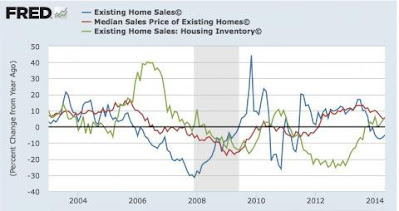
First, here is a graph I created eight years ago, showing existing home sales, prices, and inventory for the decade between 2004-2014:
It’s pretty clear for the Housing Bubble and Bust: existing home sales led prices, which in turn led inventory.
What about since then? There’s no good single updated graph, but the below two on sales (from Wolf Street) and two on inventory tell just the tale.
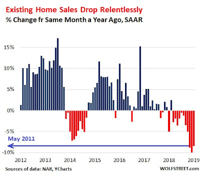
Here are YoY sales from 2012-19:
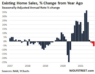
And here is the update from 2017-21:
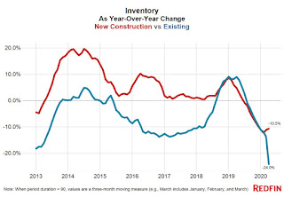
Here is existing home inventory YoY from 2012-20:
Finally, here is the update from 2018-22:
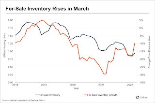
To comparison of existing home sales and inventory beginning in 2013 is as follows:
In 2013, sales turned negative YoY in December. Meanwhile, inventory turned positive YoY in October (two months’ lead).
In 2014, sales turned positive YoY in October. Inventory did not turn negative again until December (two months’ lag).
That situation continued through 2017.
In 2018, sales turned negative YoY in March. Inventory did not turn positive until June (3 months lag).
In 2019, sales turned positive YoY in July. Inventory turned positive YoY in July as well (coincident).
Next, in 2021, sales turned negative YoY in August. Inventory is still negative YoY as of April 2022 (at a minimum 8-month lag).
Overall, from 2004 to the present, existing home inventory more often than not lags sales, and in the case of major price advances and declines, it lags by many months.
The current situation looks close to, although not identical, to that of the Housing Bubble. There, inventory continued to decline slightly in 2004-05 even as sales growth decelerated and ultimately turned, but prices boomed. Now, Sales have already turned down, but with prices booming, inventory declines still exist, although they are abating and probably on the cusp of turning.

