On Labor Day 2022, how well is labor doing? This is Labor Day, so let’s take a look at a few metrics of how labor is doing. As an initial aside, occasionally I get asked why I write about expansions and recessions. An important reason is, pretty much by definition during recessions jobs and income decline. During expansions they, well, expand. So forecasting whether the period ahead will feature better or worse conditions for job-holding and income for average workers is a social good in my book. Last Friday in the jobs report, there was an apparent anomaly in that the unemployment rate went up (bad), but the labor force participation rate increased (good). How could that be, and what does it mean? Not everybody participates in the labor
Topics:
NewDealdemocrat considers the following as important: politics, US EConomics
This could be interesting, too:
Robert Skidelsky writes Lord Skidelsky to ask His Majesty’s Government what is their policy with regard to the Ukraine war following the new policy of the government of the United States of America.
NewDealdemocrat writes JOLTS revisions from Yesterday’s Report
Joel Eissenberg writes No Invading Allies Act
Ken Melvin writes A Developed Taste
On Labor Day 2022, how well is labor doing?
This is Labor Day, so let’s take a look at a few metrics of how labor is doing.
As an initial aside, occasionally I get asked why I write about expansions and recessions. An important reason is, pretty much by definition during recessions jobs and income decline. During expansions they, well, expand. So forecasting whether the period ahead will feature better or worse conditions for job-holding and income for average workers is a social good in my book.
Last Friday in the jobs report, there was an apparent anomaly in that the unemployment rate went up (bad), but the labor force participation rate increased (good). How could that be, and what does it mean?
Not everybody participates in the labor force. People are retired, or homemakers, or full-time students, or disabled. Or discouraged, thinking they can’t get a job. All other adults – those who are in the labor force – either have a job (employed) or they don’t (unemployed). The LFPR measures the combined total of the two, while the unemployment rate only measures the latter.
There is a problem working with the long term LFPR, because the cyclical trends are swamped by the secular tsunami of women entering the labor force between the 1960s and 1990s, together with the very slow ebbing of male participation that has been going on ever since the 1950s. So I only measure beginning in the mid-1990s.
Since 1994, the LFPR has been a “long lagging” indicator coming out of recession. It only bottoms significantly *after* the unemployment rate peaks, sometimes by years. Generally speaking, people don’t bother entering the work force unless they think there is a likely prospect of landing a job. There isn’t a magic number, but over the past 30 years, that has been about once the U6 underemployment rate has fallen below 10%. In the below graph, I subtract the U6 rate from 10% so that any number below 10% shows as a positive and any number above it shows as a negative:
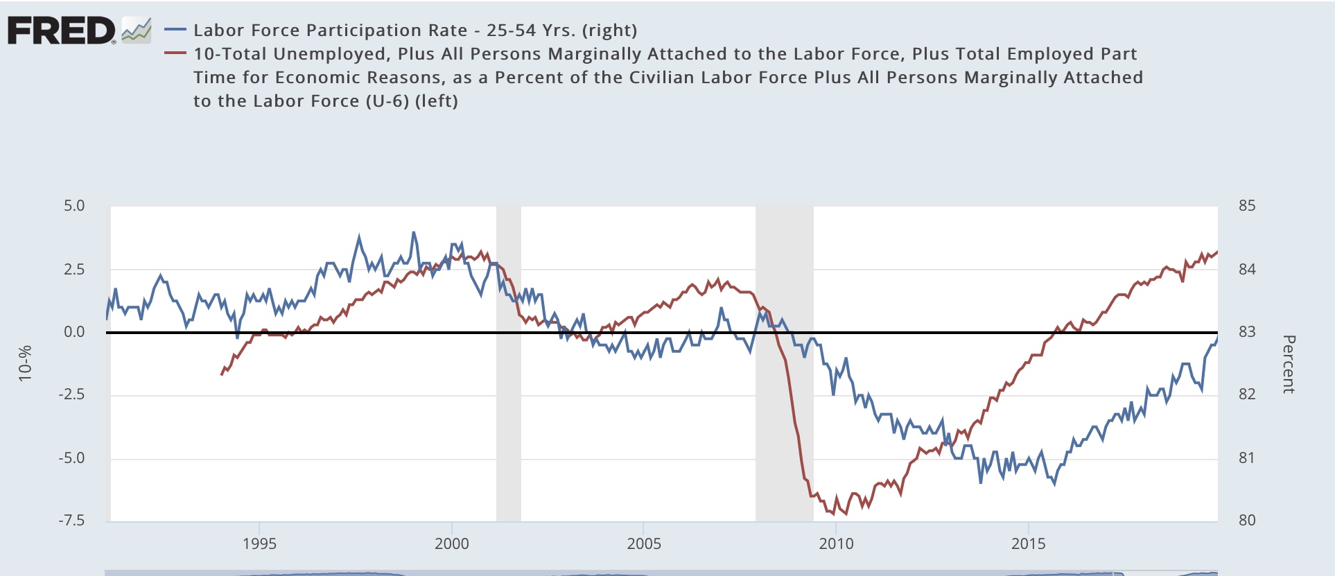
The LFPR bottomed in 1994, 2005, and 2015, *long* after the last recession had ended, and also several *years* after the underemployment rate was at its worst. At peaks the behavior is different, as the LFPR peaks coincident with or even slightly *before* the underemployment rate. This is particularly true if we use a 3 month average of the LFRP rather than noisy monthly data.
Now here is the same graph for the last 2 years:

This last Friday’s report looks like an anomaly, because the underemployment rate worsened, but the LFPR increased. But because the LFPR is noisy, if we look at the 3 month average, the peak of the LFPR as of now is still March through May. In other words, the pattern of the last 3 expansions may repeat in this one, although the jury is still out.
Another way of looking at the LFPR is to decompose it into the monthly change in employment vs. unemployment, which is what the below graph does for the past 21 months (before that the #s would be off the scale):

The decelerating trend in the gains in the number employed (blue) is apparent, as is the decelerating trend – and perhaps reversal of trend – in the decreases in the number of unemployed. I suspect the big increase in the number of employed in August is going to prove to be a positive outlier, but we’ll have to wait a month or two to find out.
One other metric I wanted to address this Labor Day is “real aggregate payrolls” for nonsupervisory workers. This is the total income reaped by the working and middle class, after adjusting for inflation. This information goes back almost 60 years, so I am splitting it into 2 graphs; first, 1964-1993:

And here is 1994-2022:

This metric has lots of signal and not much noise. With the exception of the 2020 pandemic, it always decelerated for months before the onset of recessions, and with one exception also turned down for about 6 months or more before a recession began (in 1969, it peaked one month before the recession).
Now here are the past 2 years:

We see clear deceleration beginning in September 2021, and an actual downturn this past spring, before rebounding in July.
The spring downturn was primarily about the spike in gas prices due to the Ukraine invasion, and the July rebound due to the big decline in gas prices that month. *Nominally,* according to Friday’s report, aggregate payrolls increased 0.3%. Because gas prices continued to decline in August, that will probably turn into another month of real aggregate income gains, but we’ll have to wait for the CPI report next week to be sure.
Bottom line, we could yet see a new record high in real aggregate income, but the trend of sharp deceleration at least will likely remain intact. This series continues to warn of a likely recession in the coming months.