– by New Deal democrat We’ll get weekly unemployment claims tomorrow, and the very important personal income and spending report Friday, before we begin the slew of reports for the beginning of June next week. But since there’s a slow news day today, let’s take a bigger picture look at the state of the economy. As always, you can find optimistic data if you look for it, and DOOOMish data as well. Usually – and right now is one of those usual periods – you can find a mix of both. So let me begin with some large-scale data on the producer and consumer sides of the economy all together. That’s what this first graph below does. It includes manufacturing production (light blue) and real manufacturing and trade sales (dark blue) from the producer
Topics:
NewDealdemocrat considers the following as important: bad news, good news, May 2024, US EConomics
This could be interesting, too:
NewDealdemocrat writes JOLTS revisions from Yesterday’s Report
Bill Haskell writes The North American Automobile Industry Waits for Trump and the Gov. to Act
Bill Haskell writes Families Struggle Paying for Child Care While Working
Joel Eissenberg writes Time for Senate Dems to stand up against Trump/Musk
– by New Deal democrat
We’ll get weekly unemployment claims tomorrow, and the very important personal income and spending report Friday, before we begin the slew of reports for the beginning of June next week. But since there’s a slow news day today, let’s take a bigger picture look at the state of the economy.
As always, you can find optimistic data if you look for it, and DOOOMish data as well. Usually – and right now is one of those usual periods – you can find a mix of both.
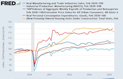
So let me begin with some large-scale data on the producer and consumer sides of the economy all together. That’s what this first graph below does. It includes manufacturing production (light blue) and real manufacturing and trade sales (dark blue) from the producer side of the economy, real aggregate payrolls (dark red)and real spending (light red) on goods from the consumer side, and building units under construction (gold) from housing, which straddles the middle. All are normed to 100 as of just before the pandemic, and also I’ve cut volatility on the housing construction metric by half so that it doesn’t reduce all the other data to squiggles:
Immediately we see that the producer side is not doing so well. Production is down, and real sales may still be rising slightly, or may have stalled. Meanwhile housing under construction, which rose 40% in the first two years of the pandemic (remember I cut the volatility by half), stalled out and has now turned down.
But the consumer side is a different story entirely. Real aggregate payrolls have continued to rise strongly, and real consumer spending on goods has risen even more strongly.
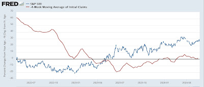
It’s also worth re-upping my “quick and dirty” economic indicator of stock prices and (inverted) initial jobless claims, both of which are still positive:
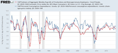
Because real aggregate payrolls has had a perfect record of leading the economy as a whole by at least several months for the entire past half century, and because real spending on goods also has generally peaked before a recession begins, here are the YoY% changes in both of them, first historically before the pandemic:
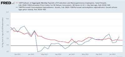
And here since the onset of the pandemic:
Both of these are currently running in the 2%-2.5% YoY growth range, typically the sign of continued economic growth in the near term, unless there is sharp deceleration, which there has not been.
On Friday we’ll get updates on two of the five data series in the first graph – real spending on goods and real manufacturing and trade sales. Next Friday, of course, will be the jobs report. Additionally, next week I’ll be paying close attention to the ISM reports, to see if the weighted average of manufacturing (25%) and services (75%) are above or below their “50” level tipping point, and what the trend is. Since the turn of the Millennium, it has only been when this weighted average has declined below 50 that a recession has been in the offing.
Producer prices flat, commodities decline, shelter is sole inflationary pressure, Angry Bear, by New Deal democrat


