Here are some pretty pictures I think I am thinking about: 1. The USA is bankrupt, part 3,478. It’s been at least 1 or 2 blog posts since I talked about the USA being bankrupt so I would be remiss if I didn’t remind you that the USA is actually not bankrupt at all. This chart comes to us courtesy of Mary Meeker’s annual internet report. Now, the annoying thing about this chart is how the government is being compared to a corporation. This doesn’t make sense. The government is more like a non-profit. For instance, let’s pretend we live on the Island of Pragcap and the neighboring residents at the Island of Mises.org find us to be intolerable defenders of fiat money and attack us. In response, we form a government to organize our defense and fund that war operation by pooling our
Topics:
Cullen Roche considers the following as important: Most Recent Stories
This could be interesting, too:
Cullen Roche writes Understanding the Modern Monetary System – Updated!
Cullen Roche writes We’re Moving!
Cullen Roche writes Has Housing Bottomed?
Cullen Roche writes The Economics of a United States Divorce
Here are some pretty pictures I think I am thinking about:
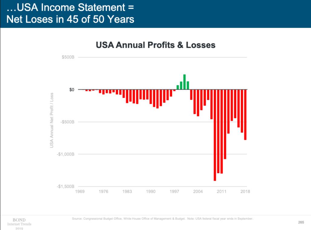
1. The USA is bankrupt, part 3,478. It’s been at least 1 or 2 blog posts since I talked about the USA being bankrupt so I would be remiss if I didn’t remind you that the USA is actually not bankrupt at all.
This chart comes to us courtesy of Mary Meeker’s annual internet report. Now, the annoying thing about this chart is how the government is being compared to a corporation. This doesn’t make sense. The government is more like a non-profit. For instance, let’s pretend we live on the Island of Pragcap and the neighboring residents at the Island of Mises.org find us to be intolerable defenders of fiat money and attack us. In response, we form a government to organize our defense and fund that war operation by pooling our capital. We spend millions of fiat dollars and defeat the fools at Mises.org because they tried to fund their operation with gold bars and they couldn’t mine the gold fast enough to keep up with their financial needs.¹
Anyhow, the point is, this war would obviously be a money losing operation for the government. It is hard to earn a positive return on investment when your workforce dies and you blow up your inventory. But this is basically what a government is – it is a pooled entity that we use to finance things we need that the private sector economy probably can’t earn a profit doing. Whether or not these things earn a profit does not tell us whether or not these things had a positive ROI for our society. Just like the way that winning a war might be a financially harmful operation that has a very beneficial outcome for society.²
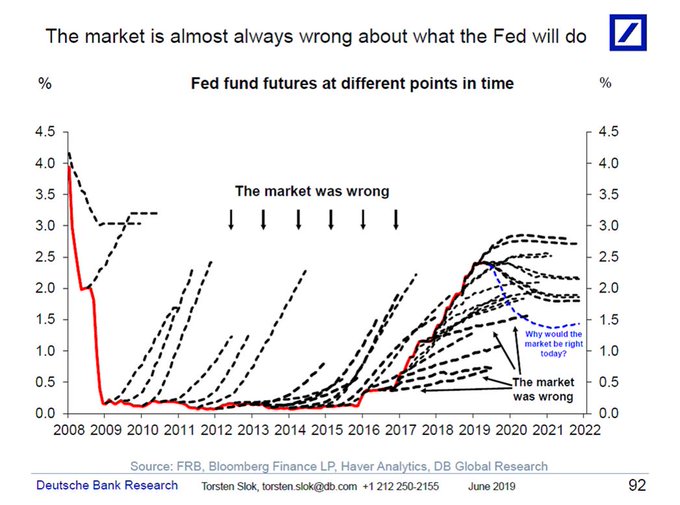
2. Forecasters suck, part 1. Here’s a chart from Deutsche Bank showing how bad Fed Funds Futures are at predicting future rate changes. As you can see, the futures curve is pretty much always curving upwards and interest rates haven’t followed. So, DB concludes that forecasters are bad at predicting rates. Except that’s not at all what the futures curve actually depicts. The futures curve depicts the potential change in the curve based on expected future inflation. In other words, the curve is really just a different way to expressing short-term interest rate risk relative to inflation.
Now, the important data point on the curve is the high point which has pretty much always been right around 2-2.5% for the last 10 years. This depicts the bond market’s prediction that short rates will, in the long-term reflect the risk of inflation. That range of outcomes has actually been pretty much spot on as the curve has flattened over the years to match the high side of inflation risks. So, I guess these forecasters aren’t so stupid after all.³
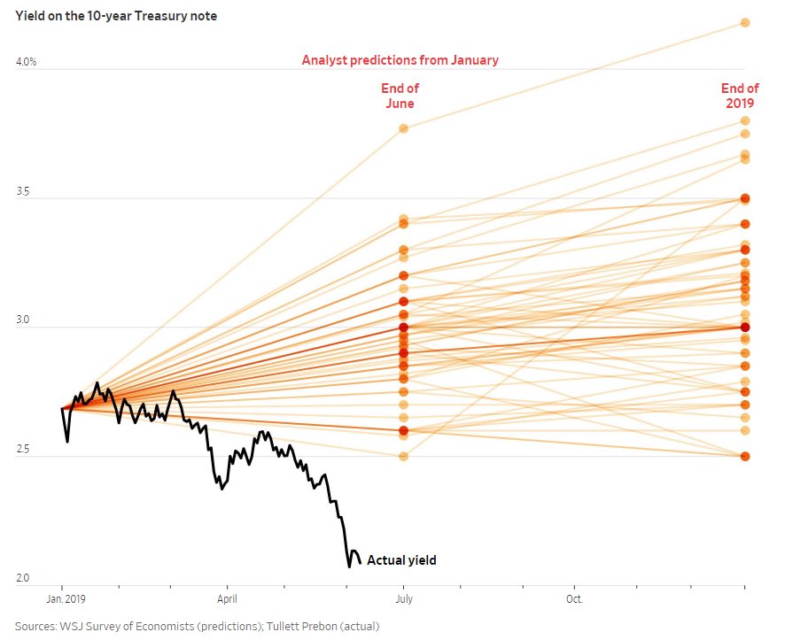
3. Forecasters suck, part 2. Here’s another chart showing how much people suck at forecasting interest rates. Now, this one’s a bit different than the chart above. This chart just shows predictions of where the 10 year yield will be in the future. While short rates usually reflect the short-term risk of inflation long-term rates are much harder to predict because they reflect the risk of inflation over a 10 year period thereby resulting in a much wider range of outcomes and a wider price buffer.
This is important to understand because it is actually somewhat irrational to constantly try to predict the short-term movements of this long-term instrument. For instance, I know almost exactly what a 10 year T-Note will return over the next 10 years, but I really have no idea what it will do in the next 6 months. So, I don’t know why people play this game where they try to predict the short-term movements of a long-term instrument.
Long story short, I guess forecasters really do suck after all.
¹ – Just kidding of course. We didn’t defeat them because we have fiat money. We defeated them because the readers of Pragcap have big brains and the highest IQs. But also because I know a lot of Navy Seals in San Diego.
² – I am not making an excuse for any level of government debt. There could become a point where high levels of debt are bad and cause high inflation. I am just pointing out that the comparison to a corporation is a bad starting point for understanding how a government should spend.
³ – [insert hilarious joke about how DB is a failing bank that seems to be unable to predict the future]