Summary:
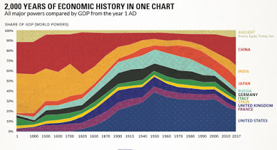
A graph that shows, for a longer span, essentially the same information presented in Robert Allen's graph of manufacturing production, and discussed before here. It is evident that the rise of China (India is not quite yet visible, even if its share did increase) represents a certain rebalancing, which is inevitable as the income per capita grows in that country, even if it does not scape what mainstream economists refer to as the middle income trap. Source here, and the data is, as expected from Maddison. Note that the first millennia, where Asia (China and India essentially) is much smaller in terms of the graph, which is a result of the paucity of data. In a sense, the graph shows the relatively brief rise, and now relative decline of Western GDP dominance, as Asia regains a
Topics:
Matias Vernengo considers the following as important: China, GDP
This could be interesting, too:
Angry Bear writes GDP Grows 2.3 Percent
Dean Baker writes Donald Trump is badly nonfused # 67,218: The story of supply and demand
Merijn T. Knibbe writes Peak babies has been. Young men are not expendable, anymore.
Robert Skidelsky writes In Memory of David P. Calleo – Bologna Conference
A graph that shows, for a longer span, essentially the same information presented in Robert Allen's graph of manufacturing production, and discussed before here. It is evident that the rise of China (India is not quite yet visible, even if its share did increase) represents a certain rebalancing, which is inevitable as the income per capita grows in that country, even if it does not scape what mainstream economists refer to as the middle income trap. Source here, and the data is, as expected from Maddison.
Note that the first millennia, where Asia (China and India essentially) is much smaller in terms of the graph, which is a result of the paucity of data. In a sense, the graph shows the relatively brief rise, and now relative decline of Western GDP dominance, as Asia regains a space more proportional to its population share.
PS: On issues with GDP measures see here.

