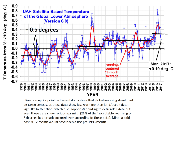
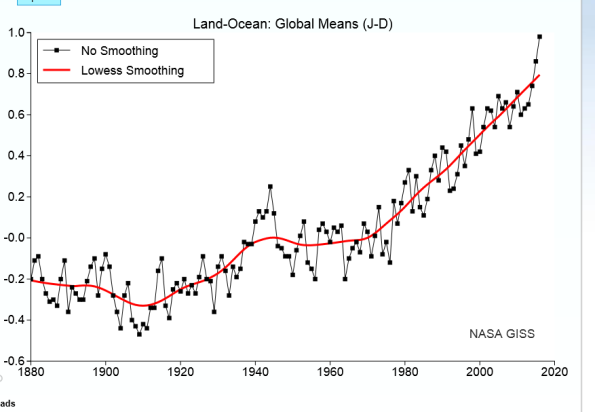
What do you get when you apply a 13 year smoothing function to the yearly data on global temperature? The graph above. According to ‘climate optimists’ the graph above is misleading, as, for one thing, these surface data are supposed to show a different pattern of development than the ‘satellite data’. The point: they don’t. The graph above shows about 0,7 to 0,8 degrees warming after 1979 and a pattern of relentless increase. The ‘satellite data’ (graph below) show 0,5 degrees warming after 1979 and a pattern of relentless increase (visualize a 12*13 = 156 months running average, couldn’t track the original data). Yes, that’s a difference. But even the 0,5 degrees is, considering the warming which took place before 1979, quite a problem. And more so when we consider the 2,0 degrees of ‘acceptable’ warming. Even based upon this rather short period and these conservative data, while not taking 1880-1980 developments into account we’ve already spent *at least* 25% of our wiggle room. The graph below is used by climate optimists to defend their position… Delusional. It’s maybe less alarming than the graph above. But it is alarming, too.
Topics:
Merijn T. Knibbe considers the following as important: Uncategorized
This could be interesting, too:
tom writes The Ukraine war and Europe’s deepening march of folly
Stavros Mavroudeas writes CfP of Marxist Macroeconomic Modelling workgroup – 18th WAPE Forum, Istanbul August 6-8, 2025
Lars Pålsson Syll writes The pretence-of-knowledge syndrome
Dean Baker writes Crypto and Donald Trump’s strategic baseball card reserve
What do you get when you apply a 13 year smoothing function to the yearly data on global temperature? The graph above. According to ‘climate optimists’ the graph above is misleading, as, for one thing, these surface data are supposed to show a different pattern of development than the ‘satellite data’. The point: they don’t. The graph above shows about 0,7 to 0,8 degrees warming after 1979 and a pattern of relentless increase. The ‘satellite data’ (graph below) show 0,5 degrees warming after 1979 and a pattern of relentless increase (visualize a 12*13 = 156 months running average, couldn’t track the original data). Yes, that’s a difference. But even the 0,5 degrees is, considering the warming which took place before 1979, quite a problem. And more so when we consider the 2,0 degrees of ‘acceptable’ warming. Even based upon this rather short period and these conservative data, while not taking 1880-1980 developments into account we’ve already spent *at least* 25% of our wiggle room. The graph below is used by climate optimists to defend their position… Delusional. It’s maybe less alarming than the graph above. But it is alarming, too.