At this moment, there’s quite some ‘graphology’ when it comes to inflation. Here, an example by Paul Krugman. Here, Larry Summers. And an example by a younger chap, Joey Politano. (Caveat: ‘X’ kicked out some links when I was writing this blog (or at least they disappeared), it might happen again)). All of these economists are really ahead of the pack when it comes to knowledge of economic statistics (methodology as well as results). They also know a thing or two about economic theory. Look here for a paper by Bolhuis, Cramer, and Summers (the same!) in which they argue that inflation around 1980 inflationary spell was not as bad as indicated by their measure of consumer price inflation and (as they admit) about as high as indicated by the data in the graph below (meaning, in their
Topics:
Merijn T. Knibbe considers the following as important: Uncategorized
This could be interesting, too:
tom writes The Ukraine war and Europe’s deepening march of folly
Stavros Mavroudeas writes CfP of Marxist Macroeconomic Modelling workgroup – 18th WAPE Forum, Istanbul August 6-8, 2025
Lars Pålsson Syll writes The pretence-of-knowledge syndrome
Dean Baker writes Crypto and Donald Trump’s strategic baseball card reserve
At this moment, there’s quite some ‘graphology’ when it comes to inflation. Here, an example by Paul Krugman. Here, Larry Summers. And an example by a younger chap, Joey Politano. (Caveat: ‘X’ kicked out some links when I was writing this blog (or at least they disappeared), it might happen again)). All of these economists are really ahead of the pack when it comes to knowledge of economic statistics (methodology as well as results). They also know a thing or two about economic theory. Look here for a paper by Bolhuis, Cramer, and Summers (the same!) in which they argue that inflation around 1980 inflationary spell was not as bad as indicated by their measure of consumer price inflation and (as they admit) about as high as indicated by the data in the graph below (meaning, in their view, that interest rates have to rise more even when it’s common knowledge that the increases around 1980 were, considering debt levels, too high…). Despite the outstanding qualities of the economists mentioned, their analysis is wanting. Why?
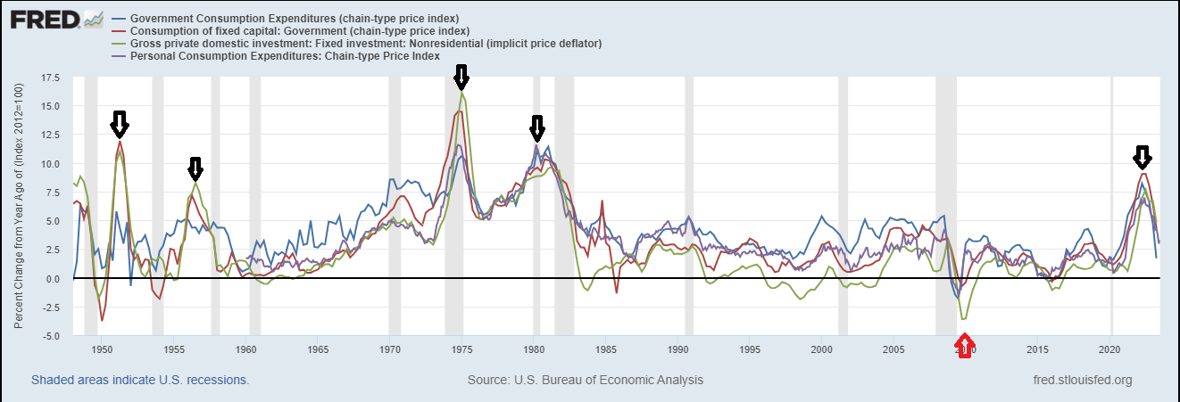
They use a limited set of prices. They look at rather short periods. They use a limited 1-dimensional concept of inflation (only consumer expenditure prices: a subset of a subset of prices and often even a subset of this subset of a subset). And they look at the wrong question: ‘Will inflation be a roller coaster or a bump in the road’? I will return to the right question. But using graphology, it’s already clear that inflation does not show a roller coaster pattern. Fast and unexpected increases are typically followed by fast and unexpected declines (‘bump-inflation’) which are however not followed by related subsequent increases (roller-coaster inflation). There is (US experience) one example of a fast decline followed by a fast increase (pothole-inflation, red arrow) but this was not preceded by a fast and unexpected increase. Meaning that it might well be possible that the recent inflationary episode will turn out to be a bump, too. There can be reasons why this time will be different, like the twilight of the Pax Americana and the related consequences for energy and food prices. My personal opinion is however that global supply chains have largely recovered from the Covid and Ukraine shock: food, energy, and transport prices are significantly lower than one and two years ago (yup, the Baltic dry index is rising again and oil prices are up, but prices of natural gas are still way lower than they used to be). This might change, of course (Panama canal). Even then, these changes will be new shocks, not reverberations of the recent spell of inflation. Graphology indicates that such reverberations are limited.
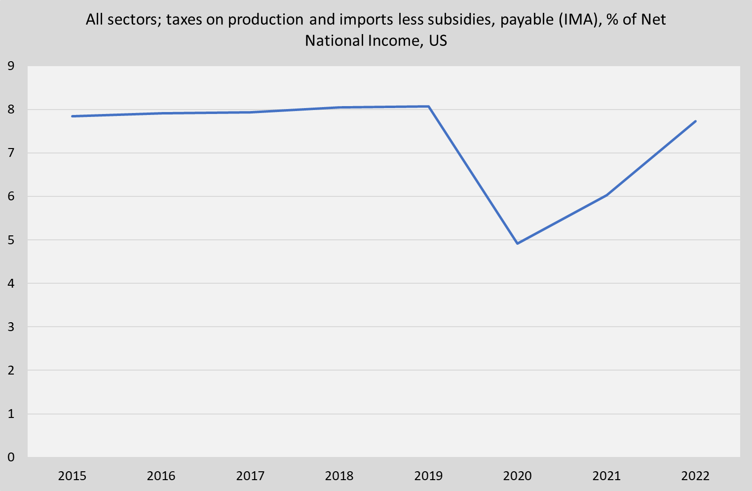
Prices paid are prices received. This means, in periods of high and unexpected inflation: somebody gets paid more. As economic accountants state: total expenditure is total income. This means that when total nominal expenditure increases by 10%, total income (rents, wages, ‘operational surplus’ or profit plus the income of the self-employed) and the like). We can look at this using the financial accounts of the United States, asking the question which sector gains and which sector loses. This was, after all the talk of greedflation, quite a surprise to me. Net government taxes on production and imports declined in 2020 and increased in 2021 and 2022. At the same time, the labor and ‘operational surplus’ share of net national income declined after 2020 (labor: -2%, operational surplus -1%). Mind that operational surplus is not the same thing as ‘profits’, it includes the labor income of your local plumber. The year 2020 was of course an election as well as a lock-down and Covid year. The decline of taxes on production must have mitigated inflation. The opposite must have happened in 2021 and 2022. As there does not seem to be any reason why the level of taxes on imports and production will increase further, one major source of inflation accounting for maybe as much as 20 to 25% is gone (mind: this is not about disposable income!). Absent this development 2020 inflation would have been higher and 2021 and 2022 inflation would have been lower. Now, look at the first graph, again.
.
In this blog I’ve looked at inflation, using data based on expenditure, production (food, transport and energy prices), and income. This enables us to restate the questions Summers, Krugman, Politano and many others try to answer. It’s not: ‘What is happening to prices and what will happen to consumer prices?’ it’s: ‘Are there any shocks to either income or production which, considering the historical record and relations between sectors, will feed through in expenditure prices?’.