Coronavirus dashboard: updating the 52 Petri Dishes of democracy [Note: There is no significant economic data today (Dan here…May 13) Thursday we’ll get initial claims, and on Friday retail sales and industrial production for April, both of which will be important] Here is the update through yesterday (May 12). I will restart giving the daily increase in infections if States that have “reopened” start to increase significantly again. The preliminary evidence is that customers are largely staying away from reopened businesses in those States. Number of new and total reported Infections (from Johns Hopkins via arcgis.com and 91-divoc.com): Number: 22,080, total 1,370,016 (vs. day/day high of +36,161 on April 24) There has been a 1/3 decrease in the
Topics:
NewDealdemocrat considers the following as important: Featured Stories, Journalism, US/Global Economics
This could be interesting, too:
Ken Melvin writes A Developed Taste
Joel Eissenberg writes How Tesla makes money
Angry Bear writes True pricing: effects on competition
Angry Bear writes The paradox of economic competition
Coronavirus dashboard: updating the 52 Petri Dishes of democracy
[Note: There is no significant economic data today (Dan here…May 13) Thursday we’ll get initial claims, and on Friday retail sales and industrial production for April, both of which will be important]
Here is the update through yesterday (May 12).
I will restart giving the daily increase in infections if States that have “reopened” start to increase significantly again. The preliminary evidence is that customers are largely staying away from reopened businesses in those States.
Number of new and total reported Infections (from Johns Hopkins via arcgis.com and 91-divoc.com):
- Number: 22,080, total 1,370,016 (vs. day/day high of +36,161 on April 24)
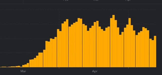
There has been a 1/3 decrease in the number of new cases in the US from peak. The US nevertheless has the worst record in the world, by far.
Number of deaths and rate of increase in testing (from COVID Tracking Project)
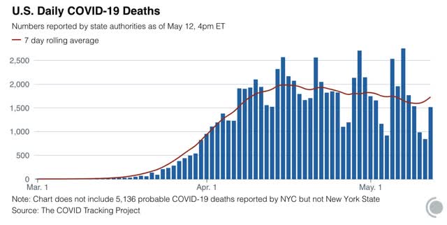
- ***Number of deaths: 1,510, total 76,617 (vs. day/day peak of +2,700 April 29)
- Seven day average of deaths: 1,616 (vs. 2,058 peak on April 21)
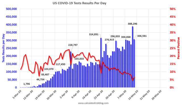
- Number of tests: 289,472 (vs. 318,720 daily peak on May 7*)
- Ratio of positive tests to total: 14.3:1 (new high* – target is 15:1)
- 7 day average of tests: 283,000* (new high)
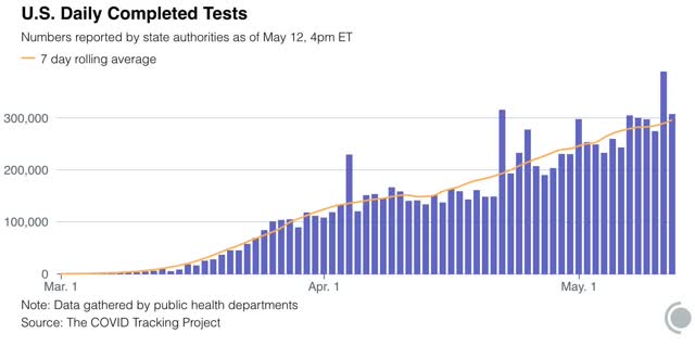
- 7 day average of positive tests to total: (11.3:1* vs. target of 15:1)
*These numbers exclude 113,489 past negative tests reported by NJ on May 11
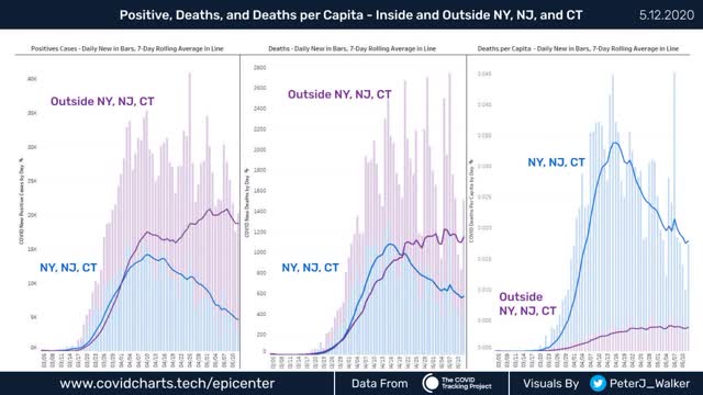
Note several things:
1. The number of new infections in the rest of the US increases dramatically starting on April 20, the same date that testing nationwide broke out of its 150-160,000 range and increased to nearly 300,000/day. This shows that the increased cases outside of NYC were mainly an artifact of increased testing.
2. The number of new infections in the rest of the US has *decreased* in the past week. Once we hit enough tests, the underlying trend – a slight but significant decrease in new infections – came through.
. While the NYC metro decline is the lion’s share of the nationwide decline, in absolute and even per capita terms, the NYC still has far more new cases than the rest of the country as a whole.
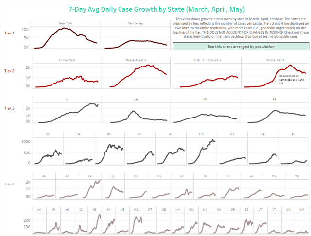
This clearly shows that, for the scale of outbreak, NY and NJ have been in a scale all their own, and that their huge decrease still shows them having a large number of cases.
On the other hand, down at the very bottom line “Tier 4,” we see Hawaii plus 5 rural States (AK, MT, VT, WV, WY) “crushing the curve.” Based on the criteria I set forth yesterday, and including this graphic, I rate the States in the below summary.
Summary for May 6
- The number of daily new infections, adjusted for testing, appears to have peaked three weeks ago. There has been a decline of about 1/3 in new infections since then.
- The number of daily new deaths appears have peaked about 2 weeks ago.
- The trend number of daily tests has improved dramatically in the past 3 weeks to nearly 300,000. Better still, for the last 2 weeks, new infections have declined, even with higher testing – a very positive sign.
- The increase in infections in the rest of the US in late April and early May was mostly an artifact of the dramatic increase in testing in the rest of the country.
- My personal suspicion remains that the actual number of total infections in the US is about 5x the official number, or roughly 6.8 million, over 2% of the total population.
- Based on testing, a significant portion of the rest of the US outside of the NYC and other large metro areas could soon transition to a “test, trace, and isolate” regimen, but with few exceptions there is no sign whatsoever of the necessary preconditions being put in place. States’ conditions are rated below.
- Grade A” States (crushing the curve): AK, HI, MT, WY (4)
- Grade “A-“ States (close to crushing the curve): ID, WV (2)
- Grade “B” States (50%+ declines from peak, but not yet “crushing the curve”): AR, FL, LA, MI, NJ^, NY, WA (7)
- Grade “C” States (20%-49% declines from peak): CO^, CT^, IA^, MA^, MO, NV, OK, PA^, RI^, TN (10)
- Grade “D” States+DC and PR (insignificant declines from peak): DC^, DE^, GA, IL^, IN^, KS^, NH, NM, ND, OH^, OR, SC, PR^ (13)
- Grade “F” States: (failing: new highs in infections): AL, AZ^, CA, KY^, MD^, ME, MN^, MS^, NC, NE^, SD^, TX, UT, VA^, WI^ (15)
^= significant shortfall in testing, thus missing cases
