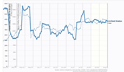
Coronavirus dashboard for August 3: is this what endemicity looks like? – by New Deal democrat Confirmed cases nationwide (dotted line below) declined to 121,700, still within their recent 120-130,000 range. Deaths (solid line) are also steady at 431, within their recent 400-450 range as well: Hospitalizations have plateaued in the past 10 days reported in the 45-47,000 range, and as of July 30 were 46,100. A commenter at Seeking Alpha who works in a hospital wrote to me that the big increase in the past several months has been people showing up with unrelated issues testing positive for COVID, I.e., “patients with COVID:” Biobot has not updated since one week ago, showing as of then a 10% drop in COVID virus in wastewater, consistent
Topics:
NewDealdemocrat considers the following as important: coronavirus dashboard, Healthcare, politics
This could be interesting, too:
Robert Skidelsky writes Lord Skidelsky to ask His Majesty’s Government what is their policy with regard to the Ukraine war following the new policy of the government of the United States of America.
Joel Eissenberg writes No Invading Allies Act
Ken Melvin writes A Developed Taste
Bill Haskell writes The North American Automobile Industry Waits for Trump and the Gov. to Act
Coronavirus dashboard for August 3: is this what endemicity looks like?
– by New Deal democrat
Confirmed cases nationwide (dotted line below) declined to 121,700, still within their recent 120-130,000 range. Deaths (solid line) are also steady at 431, within their recent 400-450 range as well:
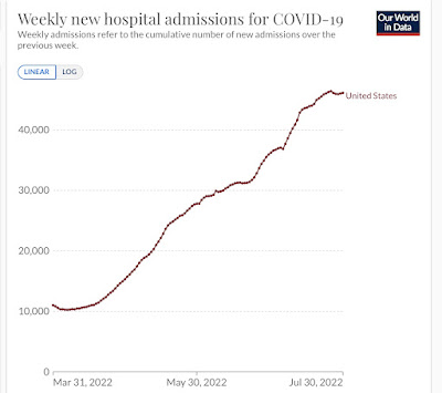
Hospitalizations have plateaued in the past 10 days reported in the 45-47,000 range, and as of July 30 were 46,100. A commenter at Seeking Alpha who works in a hospital wrote to me that the big increase in the past several months has been people showing up with unrelated issues testing positive for COVID, I.e., “patients with COVID:”
Biobot has not updated since one week ago, showing as of then a 10% drop in COVID virus in wastewater, consistent with a “real” case count of about 360,000.
The CDC updated its variant tracker yesterday, showing BA.4&5 making up 97% of all cases. They also included a new subvariant, BA.4.6, in their analysis, indicating it constituted 4% of all cases, or 1/3rd of the BA.4 total:

It is primarily a factor in the northern Great Plains, where it makes up 9% of all cases.
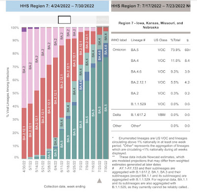
But it has not been particularly growing in the past month, nor does it seem to be replacing BA.5. Similarly, while a few cases of BA.2.75 are showing up in most States, they are not showing up in the CDC data at all. I have not seen any medical commentary on either subvariant in the past week.
Regionally there has been a small decline of confirmed cases in the West, while the other three regions are steady:
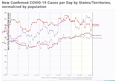
In fact, the only noteworthy changes in any State are that NY and NJ both show small declines:
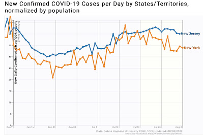
Unless a new variant shows up imminently, I suspect we are entering a period of decline in cases and deaths.
