Five graphs for 2017:final update At the beginning of the year, I identified 5 trends that bore particular watching, primarily as potentially setting the stage for a recession in 2018. Now that the year is ending, how did they turn out? #5 Gas Prices One potential pressure point on the economy was gas prices, which appear to have made a long- bottom in January of 2016. As they began to rise, consumer inflation has increased from non-existent to almost 3%. So the issue was, will they rise even further and drive inflation even higher? Typically it has taken a 40% YoY increase in gas prices to shock the consumer. Gas price increases did briefly approach that point early in the year, but then, with the exception of a brief spike after the Texas hurricane,
Topics:
NewDealdemocrat considers the following as important: US/Global Economics
This could be interesting, too:
Joel Eissenberg writes How Tesla makes money
Angry Bear writes True pricing: effects on competition
Angry Bear writes The paradox of economic competition
Angry Bear writes USMAC Exempts Certain Items Coming out of Mexico and Canada
Five graphs for 2017:final update
At the beginning of the year, I identified 5 trends that bore particular watching, primarily as potentially setting the stage for a recession in 2018. Now that the year is ending, how did they turn out?
#5 Gas Prices
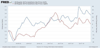
One potential pressure point on the economy was gas prices, which appear to have made a long- bottom in January of 2016. As they began to rise, consumer inflation has increased from non-existent to almost 3%. So the issue was, will they rise even further and drive inflation even higher?
Typically it has taken a 40% YoY increase in gas prices to shock the consumer. Gas price increases did briefly approach that point early in the year, but then, with the exception of a brief spike after the Texas hurricane, they retreated. They are only a little higher YoY now:
There’s no pressure on customer’s wallets at all from gas prices.
#4 The US$
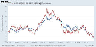
Another potential pressure point on the economy in 2015 was a big increase in the relative value of the US$, which was part of the shallow industrial recession of 2015. The $ started to rise again after the November election. Here too the data has calmed down again, and indeed gone the other way:
#3 Residential construction spending vs. mortgage rates
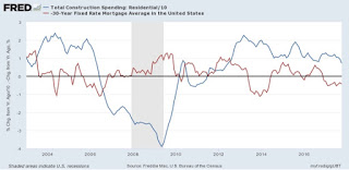
Another data point which rose sharply after the November election was interest rates. Generally speaking, home building changes in the opposite direction of interest rates. So would the increase in interest rates (e.g., mortgages) cause new residential construction to back off?
The slowdown duly appeared after the first couple of months of 2017, and continued through September. In the last two months, housing has increased strongly. This hasn’t quite filtered through to residential construction spending:
Residential contruction spending is a very smooth, un-noisy series, but it does lag permits and starts by a few months,. Note that typically it has taken a big change in mortgage rates about 9 to 12 months to feed through into residential contructioni spending. so we are probably at about peak impact now. This isn’t going to roll over either.
#2 The Fed Funds rate vs. consumer inflation
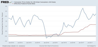
If consumer inflation rose past the magic 2% Fed target, would the Fed chase it? Apparently it didn’t matter. Inflation briefly did spike close to 3% YoY due to the increase in gas prices early this year, and the Fed duly hiked. But it hiked again even after consumer inflation fell back down under 2%, which increasingly looks like a real ceiling in the Fed’s calculations:
The yield curve has begun to compress, but it is still positive. Still, it will be difficult to avoid an inversion in interest rates should the Fed stay on its current course with several more hikes.
#1 Real retail sales vs. real average hourly earnings
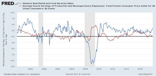
The final graph came from my “alternate” recession forecasting model which turns on consumers running out of options to to continue increasing purchases (i.e., no interest rate financing, no wage real wage increases, and no increasing assets to cash in). The long term relationship has been that sales lead jobs, and jobs lead nominal wage increases, but real sales vs. wages are somewhat more nuanced. In the inflationary era, through the early 1990s, YoY wareal wage growth actually slightly led sales. In the deflationary era that dates from the alter 1990s, if anything the two are a mirror image, but in every case but 2001 (where real wage growth just decelerated rather than declined), both have been negative going into recessions. The below graph shows the last 20 years::
I would expect to see both sales and wages stall out before the onset of the next recession. Wage growth has weakened in recent months, and wage growth is now barely above zero. Meanwhile consumer spending has increased YoY, as the personal savings rate has decreased by about 1% in the past year. While consumers are incresingly vulnerable to any inflationary shock, none has happened yet.
This has been “the little expansion that could,” dodging bullet after bullet in the 8 1/2 years since it started. If it continues another 15 months or so, it will become the longest expansion in history. None of the potential concerns from 12 months ago have come to fruition.
Next week we’ll start looking at five noteworthy graphs for 2018.

