Gimme shelter Q1 2018 update: rents and house prices all at or near new extremes This post is a comprehensive update as to the cost of new and existing homes vs. renting, all measured compared with median household income. As such it is epistolary in length. So here is the TL:DR version: as a multiple of median household income, new home prices are at an extreme beyond even the peak of the housing bubble, while existing home prices are about 5% under theirs but unlike then, when apartment vacancies were high and rents cheap, now rents are *also* at an extreme as compared with median household income even with their recent increase, interest rates are still lower now than during the housing bubble, so the median monthly mortgage payment adjusted for median
Topics:
NewDealdemocrat considers the following as important: Taxes/regulation, US/Global Economics
This could be interesting, too:
Joel Eissenberg writes How Tesla makes money
Angry Bear writes True pricing: effects on competition
Angry Bear writes The paradox of economic competition
Angry Bear writes USMAC Exempts Certain Items Coming out of Mexico and Canada
Gimme shelter Q1 2018 update: rents and house prices all at or near new extremes
This post is a comprehensive update as to the cost of new and existing homes vs. renting, all measured compared with median household income. As such it is epistolary in length. So here is the TL:DR version:
- as a multiple of median household income, new home prices are at an extreme beyond even the peak of the housing bubble, while existing home prices are about 5% under theirs
- but unlike then, when apartment vacancies were high and rents cheap, now rents are *also* at an extreme as compared with median household income
- even with their recent increase, interest rates are still lower now than during the housing bubble, so the median monthly mortgage payment adjusted for median household income is even still about 10% less than it was at the peak of the housing bubble
- if the trends of rising prices and interest rates continue, at some point they will overcome the demographic tailwind of the large Millennial generation having reached typical home-buying age. At that point there may be another deflationary bust
_____________________
Half a year ago I wrote a long post discussing “the real cost of shelter,” by which I meant not just the downpayment on a house, but the monthly carrying cost for a mortgage, and comparing both of those with median rent.
That comparison showed that, while the “real” cost of a house downpayment was at a new high, the “real” cost of median asking rent was even higher. By contrast, the monthly carrying cost of a mortgage was quite moderate. This meant that, if a buyer could find a way to put together a downpayment, home-owning was a bargain compared to renting.
As I’ll show below, six months of price and interest rate increases later, there is even more stress on both homebuyers and renters.
By way of a quick recap, I wrote six months ago that I had never seen a discussion of the relationship between the relative cost of homeownership vs. renting, particularly as a function of the household budget. The choice (or ability) to live in the residence one desires isn’t a matter of its cost by itself, but also the relative cost of the type of residence. What is the cost of a house compared with the cost of an apartment? How expensive are each of them compared with a household’s income? If both are too expensive, maybe the choice is made to live with mom and dad as an extended family.
So, here are the three relationships I’ll look at again in this post
1. the “real cost” of a downpayment on a house.
2. the “real cost of renting
3. the “real monthly carrying cost” of a mortgage
The best metric for calculating these “real” costs on a household is median household income
1. The “real cost” of a downpayment on a house
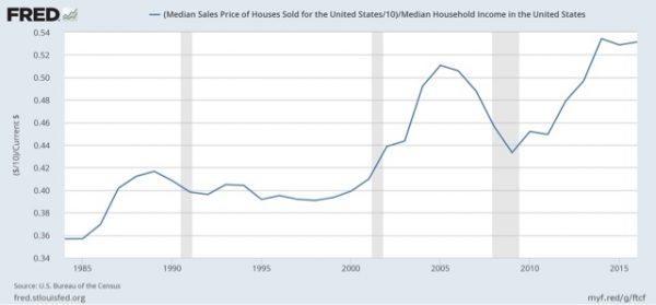
In order to generate the “real cost” of buying a house, the best way is to compare the median household income with the median house price.
One drawback is that the Census Bureau only publishes median household income annually in September — so there is as much as a 21 month lag. Here’s what the most recent data — through 2016! — looks like:
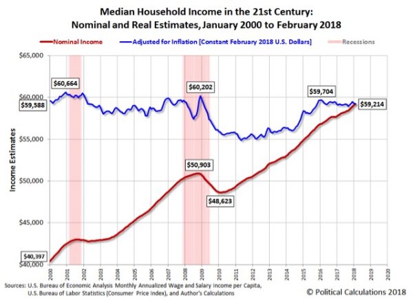
The good news is that Sentier Research published monthly estimates based on the Household Survey into 2017. The bad news is that they discontinued this service a year ago.
The renewed good news is that the website Political Calculations has picked up the mantle and continued to estimate the monthly change in median household income. Here’s what that looks like as of their most recent update through February:
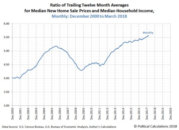
After I engaged in some correspondence with them, last week they updated their metric on “real” house prices making use of their monthly median household income estimates (NOTE: here nominal values are used for both median income and median prices):
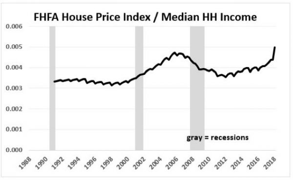
While they use new home sales for their median house prices, we get the same result if we use the FHFA house price index:
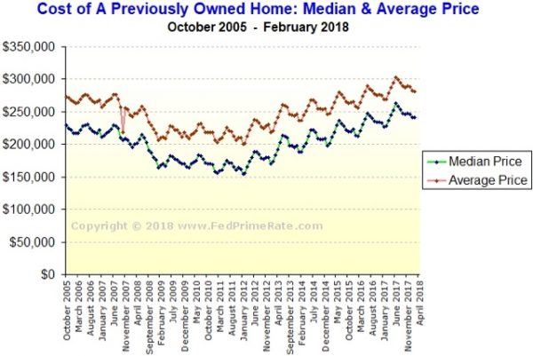
Meanwhile, the median price for an existing home, which peaked at $230,000 in summer 2005, has continued to appreciate at nearly 6% a year this year:
If that pace continues, by this summer the median price will be about $280,000, 22% above the bubble peak. Since nominal median household income has increased about 25% over that same period of time, they will be only aabout $7500, or about 3% below their “real” bubble peak.
In short, no matter how you measure, in real terms house prices are at or near their most expensive ever, even including the peak of the housing bubble.
So, why haven’t home sales rolled over? Part of the reason is the demographic tailwind I discussed last week. Because Millennials of peak first-home-buying age now number about 15% more than the Gen Xers of 2005, a build-up that has grown year after year for the last decade, it presumably takes even more financial stress to overcome that tailwind.
But there are two other reasons why home sales haven’t turned negative yet: the relative (un)attactiveness of renting, and the monthly carrying cost of mortgage payments. Let’s look at each of them in turn.
2. The “real cost” of renting
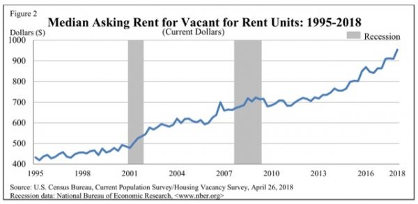
Here is the median asking monthly rent for an apartment in the US since 1995 (note: the series goes back to 1988):
In 1988 the median rent averged $343 per month. In the first quarter of this year it was $954.
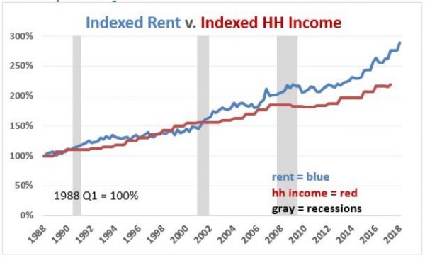
Now, here is what it looks like in comparison with median household income:
So one very big difference between the present situation and that at the peak of the housing bubble is that renting was a *much* more attractive option 12 years ago than it is at present.
3. The “real monthly carrying cost” of a mortgage
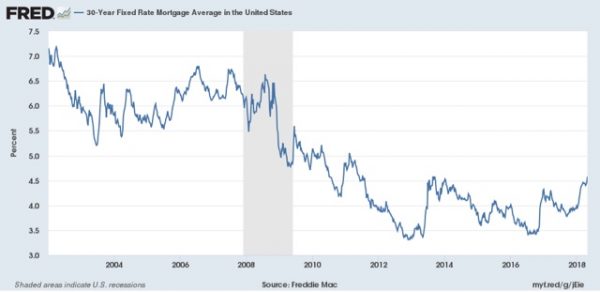
A second big difference between the present and the housing bubble is that mortgage interest rates generally ranged between 5.5% and 7% then, but quickly fell below 5% in this expansion, all the way to a low of 3.3% in 2013:
Recently they have risen significantly.
With that in mind, let’s take a look at the monthly cost of living in a house. The below graph shows the median monthly mortgage payment for a house (blue) compared with median household income (red). Median monthly mortgage payment is calculated by using the median house price and the 30 year mortgage rate for each quarter, and consulting an amortization table using those values. This is done by showing the percentage of median monthly income (1/12 of the annual) that one month’s mortgage payment consituted (note: I am assuming a 10% down payment, with 90% mortgaged to be consistent. Using a different down payment does not change the shape of the comparison at all, only the nominal values):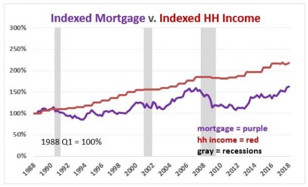 Figure 10
Last year, when I first posted this metric, the monthly payment for the median house wasn’t extreme at all, but rather very moderate in terms of the long term range.
- Going back to 1988, the median mortgage payment was slightly over 40% of median monthly household income.
- This fell back under 28% at the end of 1998 before rising to 32% in 2000.
- After falling briefly, at the peak of the housing bubble in 2005 it had risen to 31.4%, and actually reached a secondary peak in Q2 of 2006 of just over 35% of median monthly income.
- At the bottom of the bust at the end of 2011 it made a new low of 23%.
- As of Q2 of last year, the median monthly mortgage payment was still less than 24% of median household income.
- BUT, with the increase in both house prices of over 5% YoY, and the increase in mortgage interest rates to 4.28% as of Q1 2018, that has now risen to 29.5%
Mortgage payments for new buyers in 2018 and not nearly so moderate as they had been earlier in this expansion. But they are not yet at the extremes they were in 2005 and 2006.
4. Comparing rent and mortgage payments
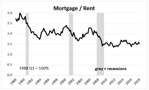
In our final comparative graph, let’s see how median monthly rent compares with median monthly mortgage payment:
The overall trend in the last 30 years has been that monthly mortgage payments have fallen from over 3 times median rent to about 1.5 time median rent now. Put another way, even at the peak of the housing bubble, the monthly carrying cost of a house was about 2.3 times the median cost of renting an apartment. At the bottom of the bust, that fell to 1.4 times the cost to rent. For the last five years, monthly mortgage payments have hovered near 1.5 times the median asking rent.
What is particularly noteworthy is that *even with* the recent big increase in mortgage payments, rents have also increased so much so that the 1.5 ratio still holds.
CONCLUDING REMARKS
By comparing the “real” cost of housing to renting, both in terms of down payments and monthly mortgage payments, we can make sense of some of the biggest trends in the market for shelter.
Record down payments are keeping an increasing number of prospective buyers, especially first time buyers, shut out of the market for buying a house. An enormous number are living in apartments instead. This explains both the multi-decade lows in the homeownership rate as well as the recent 30 year lows in the apartment vacancy rates, as a disproportionate number of adults are forced out of home ownership and into apartment dwelling.
But even with the recent increase in mortgage payments, in relative terms they are still lower than they were at the peak of the housing bubble, and a relative bargain compared with their historical multiple of rental payments. In short, if one can get past the down payment, home ownership still looks like the better choice.
Along with the demographic tailwind, the *relative* inexpensiveness of monthly mortgage payments vs. rental payments goes a long way towards explaining why single family home construction has continued to increase in the face of higher mortgage rates.
That being said, with increasing financial stress showing up across the board in the costs of both buying and renting, we can only expect to see even more involuntary extended family households and involuntary unrelated housemates. Further, *if* interest rates and housing costs increase much further — most importantly, if home builders continue to focus on only the most expensive segment of the market — at some point they will overwhelm the increased numbers of home-buying age Millennials who have been buoying up the market. Sales will turn down, followed by home values, leading to another deflationary bust.
[Special thanks to Mike Kimel for preparing the customized comparative graphs used in this article.]

