Thursday , November 28 2024
Home / The Angry Bear / Initial jobless claims: the single most positive aspect of the entire economy

Initial jobless claims: the single most positive aspect of the entire economy

Summary:
I haven’t been bothering to comment on initial jobless claims reports lately, for the simple fact that every week it’s the same story:  they’re good! In fact, the initial jobless claims reports are probably the single most positive aspect of the entire economic expansion.  For all intents and purposes, nobody is being laid off! For initial jobless claims even to be giving a “caution signal” about the economy, I would need the YoY comparison to increase: Note that this frequently but not always happens several years in advance of any downturn.  By contrast, current numbers are running on the order of 5% less than last year. One dismissal that it occasionally heard is that the number is bogus because there are fewer “covered employees,” i.e.,

Topics:
NewDealdemocrat considers the following as important: ,

This could be interesting, too:

Steve Roth writes How Units of Account “Came About”

Angry Bear writes Discussing the Impact of Tariffs

NewDealdemocrat writes New Deal democrats Weekly Indicators November 18 – 22

Angry Bear writes U.S. Defense Spending

I haven’t been bothering to comment on initial jobless claims reports lately, for the simple fact that every week it’s the same story:  they’re good! In fact, the initial jobless claims reports are probably the single most positive aspect of the entire economic expansion.  For all intents and purposes, nobody is being laid off!
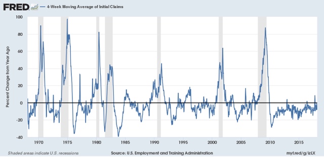
For initial jobless claims even to be giving a “caution signal” about the economy, I would need the YoY comparison to increase:
Initial jobless claims: the single most positive aspect of the entire economy
Note that this frequently but not always happens several years in advance of any downturn.  By contrast, current numbers are running on the order of 5% less than last year.
One dismissal that it occasionally heard is that the number is bogus because there are fewer “covered employees,” i.e., employees entitled to make a claim for unemployment benefits, in this expansion than previously.

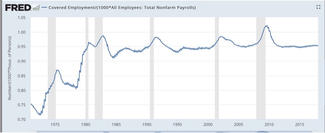
While the absolute numbers of employees who are not covered has grown, as a percentage of all employees the share in this expansion is similar to that of the last few expansions:
Initial jobless claims: the single most positive aspect of the entire economy
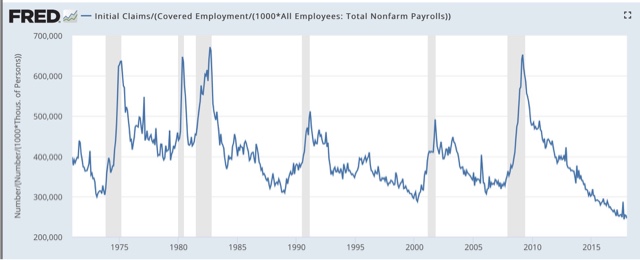
So, what happens to initial jobless claims if we norm by the percentage of covered employees?  This:
Initial jobless claims: the single most positive aspect of the entire economy
The number is still at multi-decade lows. but would be more on the order of 250,000 per week than 225,000 per week. Still very good for workers.

WEDNESDAY, FEBRUARY 21, 2018

Conflicting reports on the “rental affordability crisis”

 by New Deal democrat

Almost four years ago HUD warned of “the worst rental affordability crisis ever,” citing statistics that

About half of renters spend more than 30 percent of their income on rent, up from 18 percent a decade ago, according to newly released research by Harvard’s Joint Center for Housing Studies. Twenty-seven  percent of renters are paying more than half of their income on rent.

This is a serious real-world issue. I have been tracking rental vacancies, construction, and rents ever since.  The Q4 2017 report on vacancies and rents was released a few weeks ago, so let’s take an updated look.

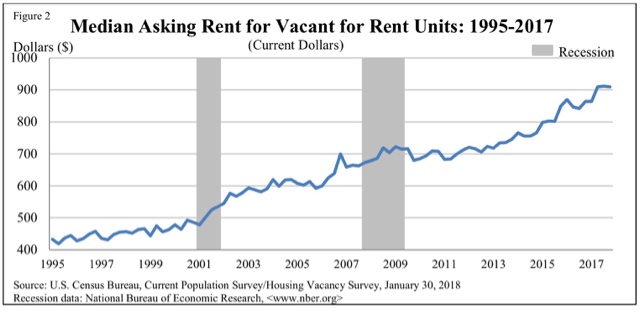
In the second quarter of last year, median asking rents zoomed up over 5% from $864 to $910. In the two quarters since, they have remained at that level:

Initial jobless claims: the single most positive aspect of the entire economy

Here is an updated look at real. inflation adjusted median asking rents, showing that rent pressures on household budgets continued to rise in 2017:

Year Median
Asking Rent
Usual weekly
earnings
Rent as %
of earnings
1988 330 382 86
1992 401 437 92
1993 422 450 88
2000 478 568 84
2002 545 607 90
2004 599 629 95
2009 680 739 92
2012 717 768 93
2013 734 778 94
2014 762 791 96
2015 813 809 100
2016 859 832 103
2017 H1 887 860 103
2017 Q3 912 866 105
2017 Q4 910 854 107

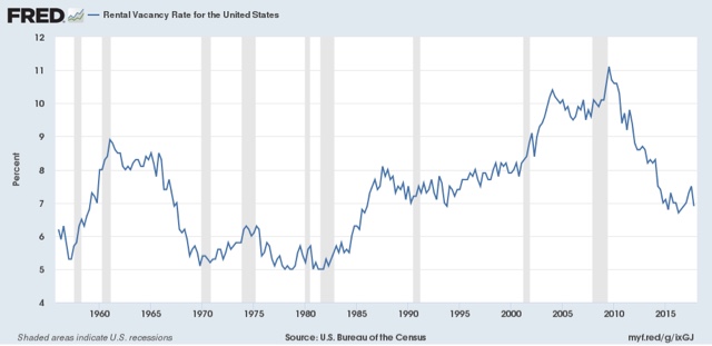
The big increase in unaffordability is unfortunately of a piece with the rental vacancy rate which, after appearing to have bottomed in 2016, tightened again in this report:

Initial jobless claims: the single most positive aspect of the entire economy
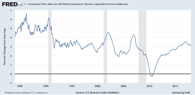
Meanwhile the CPI for owner’s equivalent rent, the major component of inflation, remains near the highest levels in a decade, at over 3% YoY:
Initial jobless claims: the single most positive aspect of the entire economy
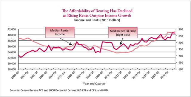
Recently, HUD premiered a Rental Affordability Index, using the ACS data. Similar to my chart above, it compares median renter income with median asking rent. Please note, however, that this has only been updated through Q1 of this year:

Like the median household income data, this shows renters’ income bottoming out in 2011-12, and rising since relative to rents as calculated by the ACS.

Initial jobless claims: the single most positive aspect of the entire economy
Unlike my calculation above, HUD’s shows that rental affordability actually *improved* (!) in 2016, and remained stable in 2017 as the recent spike in rents was more than matched by a big increase in renters’ median incomes.
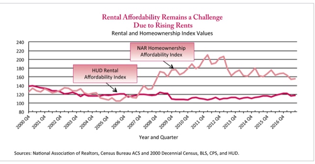
As a result, the trend in “rental affordability index,” according to HUD, has been one of easing since 2011, as shown below:

.

Initial jobless claims: the single most positive aspect of the entire economy
Note in contrast that their measure of housing affordability declined a little in 2017, making home-buying the least affordable since 2008, although better than during the bubble years.
I’m not sold on HUD’s method, mainly because it relies upon annual data released with a lag. In other words, the entire last year plus is calculated via extrapolation.
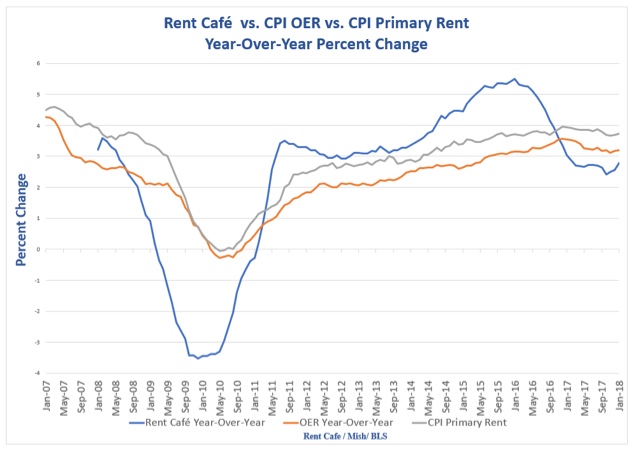
Finally, there is a monthly rental index calculated by Rent Cafe.  This has the benefit of being much more timely.  Since it is not seasonally adjusted, the index must be compared YoY. While Zumper only includes 12 months of data in their releases, Mike Shedlock was able to obtain the entire history of their data, and published the result graphically last week:
Initial jobless claims: the single most positive aspect of the entire economy
Rent Cafe’s measure of rent shows that the surge occurred in 2015 and early 2016, and has abated to less than YoY since, in complete contrast to HUD’s and the Census Bureau’s data.
Parenthetically, now that I have the full history of Rent Cafe’s Index, I can follow it monthly, which will make for a much more timely measure than the quarterly Census Bureau report.
So unfortunately the conclusion here is messy. This quarter’s Census report indicates no relief from the “rental affordability crisis.” HUD (from the 3rd quarter), shows stability at a level of improved affordability due to income growth, and unlike either of the two government sources, Rent Cafe shows rent increases abating throughout 2017.

Leave a Reply

Your email address will not be published. Required fields are marked *