JOLTS revisions paint brighter labor market picture Last Friday’s JOLTS report for January included some important revisions, particularly with regard to hiring. So let’s take a closer look.As a refresher, unlike the jobs report, which tabulates the net gain or loss of hiring over firing, the JOLTS report breaks the labor market down into openings, hirings, firings, quits, and total separations. I pay little attention to “job openings,” which can simply reflect that companies trolling for resumes, or looking for the perfect, cheap candidate, and concentrate on the hard data of hiring, firing, quits and layoffs. The first important relationship in the data is that historically, hiring leads firing. While the one big shortcoming of this report is that
Topics:
NewDealdemocrat considers the following as important: Taxes/regulation, US/Global Economics
This could be interesting, too:
Joel Eissenberg writes How Tesla makes money
Angry Bear writes True pricing: effects on competition
Angry Bear writes The paradox of economic competition
Angry Bear writes USMAC Exempts Certain Items Coming out of Mexico and Canada
JOLTS revisions paint brighter labor market picture
Last Friday’s JOLTS report for January included some important revisions, particularly with regard to hiring. So let’s take a closer look.As a refresher, unlike the jobs report, which tabulates the net gain or loss of hiring over firing, the JOLTS report breaks the labor market down into openings, hirings, firings, quits, and total separations.
I pay little attention to “job openings,” which can simply reflect that companies trolling for resumes, or looking for the perfect, cheap candidate, and concentrate on the hard data of hiring, firing, quits and layoffs.
The first important relationship in the data is that historically, hiring leads firing. While the one big shortcoming of this report is that it has only covered one full business cycle, during that time hires have peaked and troughed before separations.
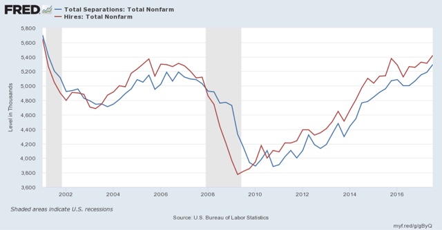
And here, there has been an important revision. Here is the historical relationship on a quarterly basis between hiring (red) and total separations (blue) as it existed through the end of the third quarter of 2017:
Note that hiring had just gotten around to equalling its peak from late 2015.
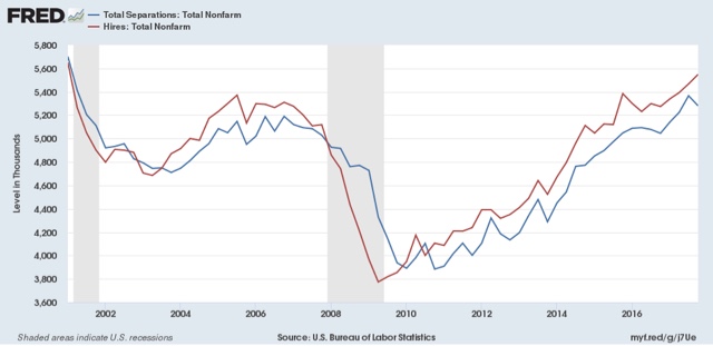
Now here is the same data, with revisions, through the fourth quarter of 2017:
Our update graph shows hiring exceeding its prior peak in the third quarter and clearly establishing a new high in Q4 2017. That is unequivocal good news, since in the last expansion, hiring was the first metric to peak.
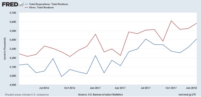
Here is the monthly breakdown over the last 2 years:
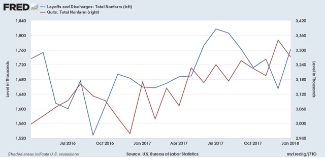
[Note: above graph show quarterly data to smooth out noise]Here are voluntary quits vs. layoffs and discharges on a monthly basis for the last 2 years:
With hiring increasing in the past few months, I expected the number of voluntary quits to improve as well, and they have:again, if the pattern from the last decade holds, I would expect quits to improve somewhat as well. As in the last business cycle, quits are still rising. The only divergence is that involuntary separations remain off their bottom.


